I spent the past couple of days pulling apart every spec sheet and hands-on test I could find on Nano Banana 2 and Nano Banana 2 Lite. I wrote this so you don't have to do that work yourself.
Google's naming makes these sound like minor variants. They're not. Below, I'll give you:
Key Takeaways
gemini-3.1-flash-image) launched February 26, 2026 and supports 512px through native 4K across 14 aspect ratios.gemini-3.1-flash-lite-image) launched June 30, 2026 and is capped at 1K — there is no 2K or 4K tier at all.What Nano Banana 2 and Nano Banana 2 Lite Actually Are
Google runs four models under the Nano Banana name. Here's how I think about where each one sits:
The decision most of you actually face isn't Lite vs. Pro. It's Lite vs. Standard: speed and cost versus resolution and precision.
Nano Banana 2 vs Nano Banana 2 Lite: The Comparison Table
| Dimension | Nano Banana 2 (Standard) | Nano Banana 2 Lite | Source |
|---|---|---|---|
| Model ID | gemini-3.1-flash-image | gemini-3.1-flash-lite-image | DeepMind |
| Release date | February 26, 2026 | June 30, 2026 | Google Blog |
| Max resolution | 512px / 1K / 2K / 4K | 1K only, no higher tier | AIReiter |
| Aspect ratios | Up to 14, including 4:1 / 1:4 | Standard 1K formats | Google Cloud |
| Reference images | Up to 14 per prompt | Same limit | Google Cloud |
| Price at 1K | $0.067 / image | $0.034 / image | AIReiter |
| Price at 2K | $0.101 / image | Not available | AIReiter |
| Price at 4K | $0.151 / image (~$0.075 batch) | Not available | Apiyi |
| Speed | ~4-8 seconds | ~4-6 seconds | AIReiter |
| Web search grounding | Yes, real-world subjects | Yes, real-world subjects | Google Blog |
| Google's framing | "Generalist workhorse" | "Built for speed" | Google Blog |
| Watermarking | SynthID + C2PA | SynthID + C2PA | Google Blog |
For context, Nano Banana Pro costs roughly 1.6x-2x more per image than Standard, takes 10-20 seconds per generation, and hits the ceiling Standard gets 95% of the way to at a fraction of the price.
How I Broke This Down, Use Case by Use Case
I didn't want to just repeat spec sheets. I wanted to know what actually happens when I ask each model to do something specific. So I built 11 fully detailed test prompts — one per use case — and scored a winner for each.
Here's the full verdict table first. Details, prompts, and my reasoning are below it.
| # | Use Case | Winner | Verdict Basis |
|---|---|---|---|
| A | Fine art / illustration | Tie, slight edge Standard | Pattern-based |
| B | Text-heavy composition | Tie | Confirmed — AIReiter |
| C | Infographics | Tie, verify both | Pattern-based |
| D | YouTube thumbnail (your photo) | Lite (for drafting volume) | Pattern-based |
| E | Practical photo editing | Nano Banana 2 | Pattern-based |
| F | Real-world data image | Tie, verify both | Pattern-based |
| G | Public figure / celebrity style | Tie, policy-limited either way | Pattern-based |
| H | Cartoon / stylized conversion | Nano Banana 2 | Pattern-based |
| I | Anime / manga, multi-pose | Nano Banana 2 | Pattern-based |
| J | Multilingual text | Tie, test non-Latin scripts yourself | Pattern-based |
| K | Instruction-following stress test | Nano Banana 2, clearly | Confirmed — AIReiter |
A. Fine Art and Illustration
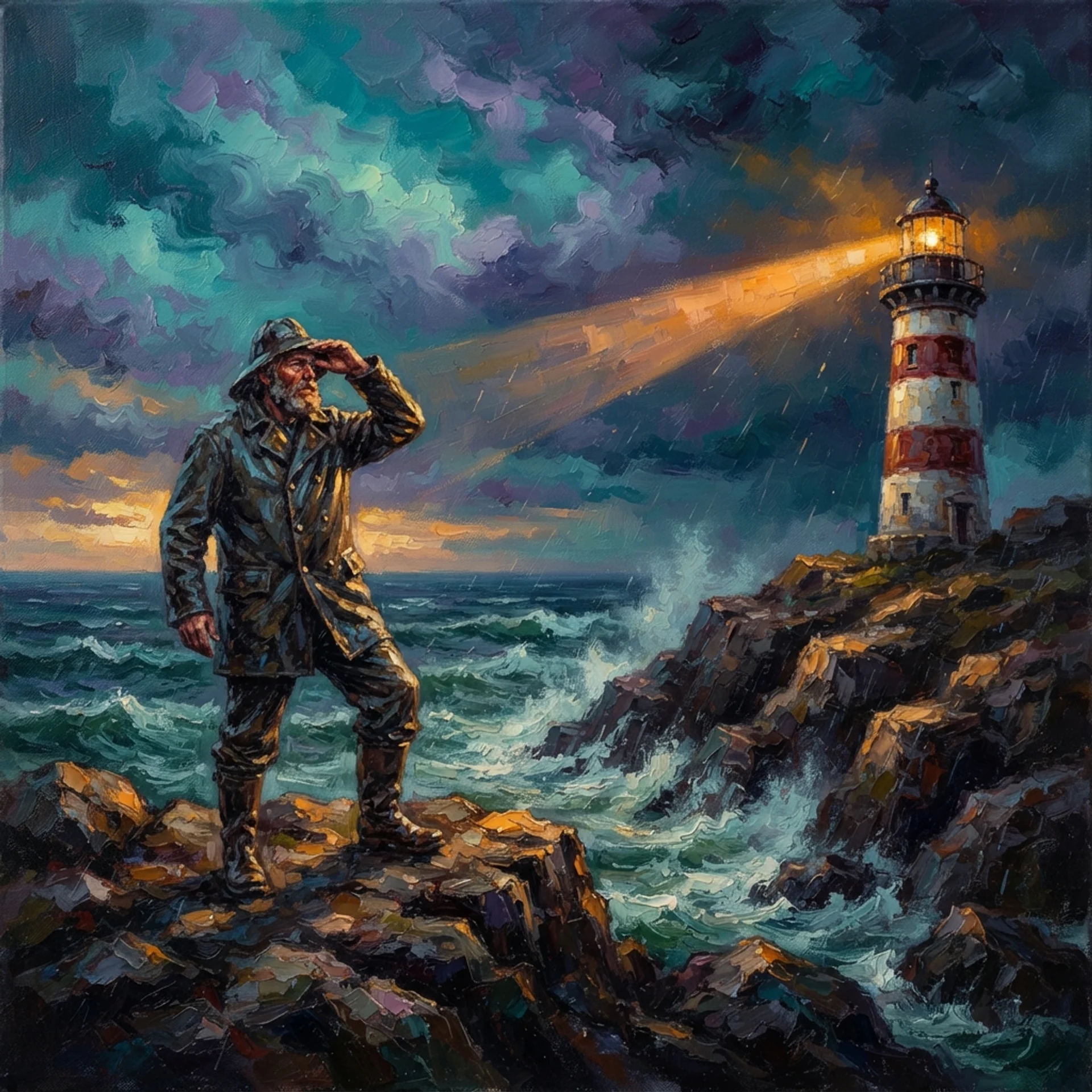
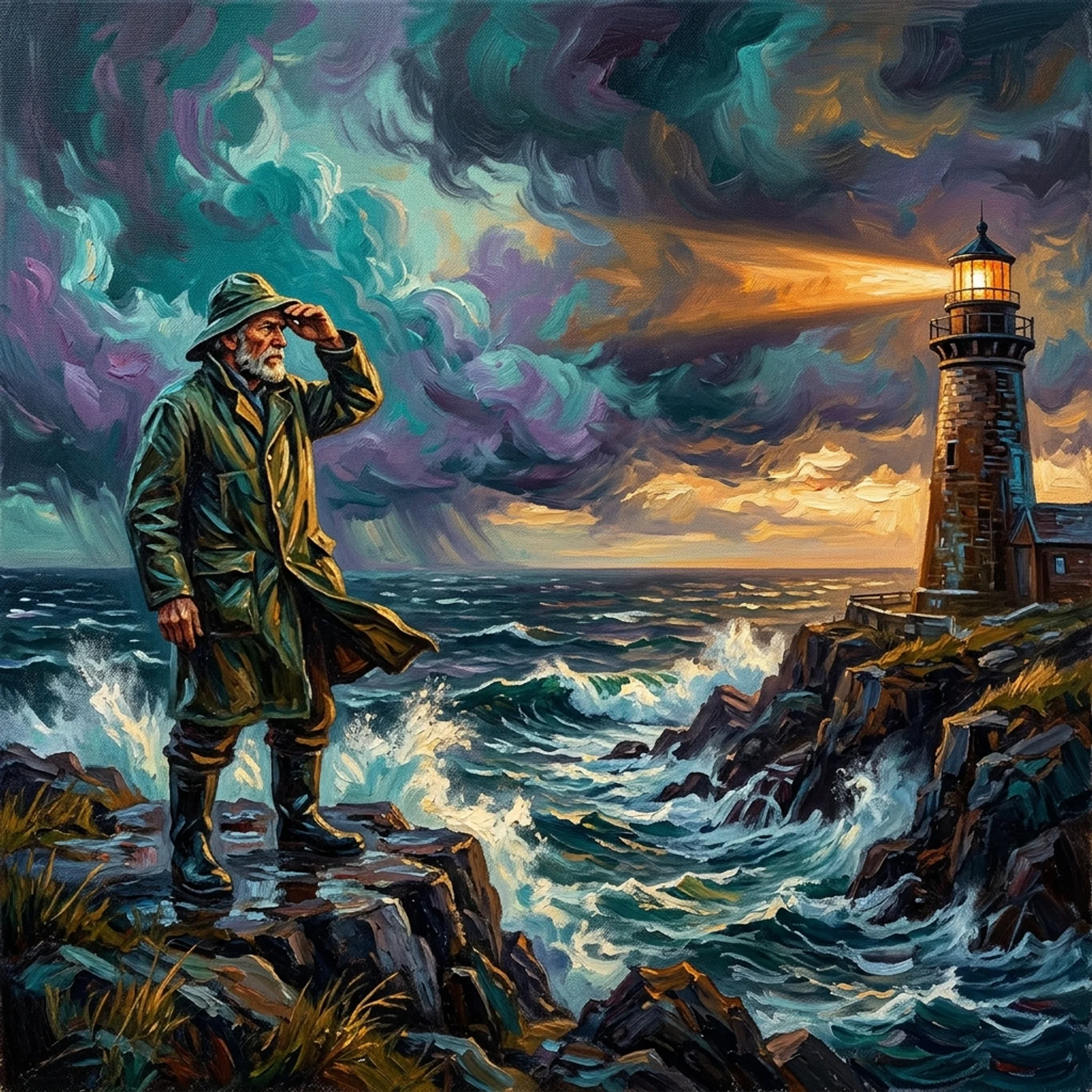
A weathered lighthouse keeper stands at the edge of a rocky sea cliff, one hand shielding his eyes as he scans a stormy horizon, wearing a thick oilskin coat and a sou'wester hat whipped by the wind. Painted in a Post-Impressionist oil style with thick, visible impasto brushstrokes, swirling teal-and-violet storm clouds fill the sky, and a warm amber lighthouse beam cuts across the frame from the right. Wide establishing shot in 16:9, the keeper positioned on the left third and the lighthouse on the right third following the rule of thirds. Dramatic golden-hour side lighting rakes across the wet rocks, rich saturated color palette, textured canvas grain visible throughout the entire painting, no text or watermark anywhere in the frame.
B. Text-Heavy Composition
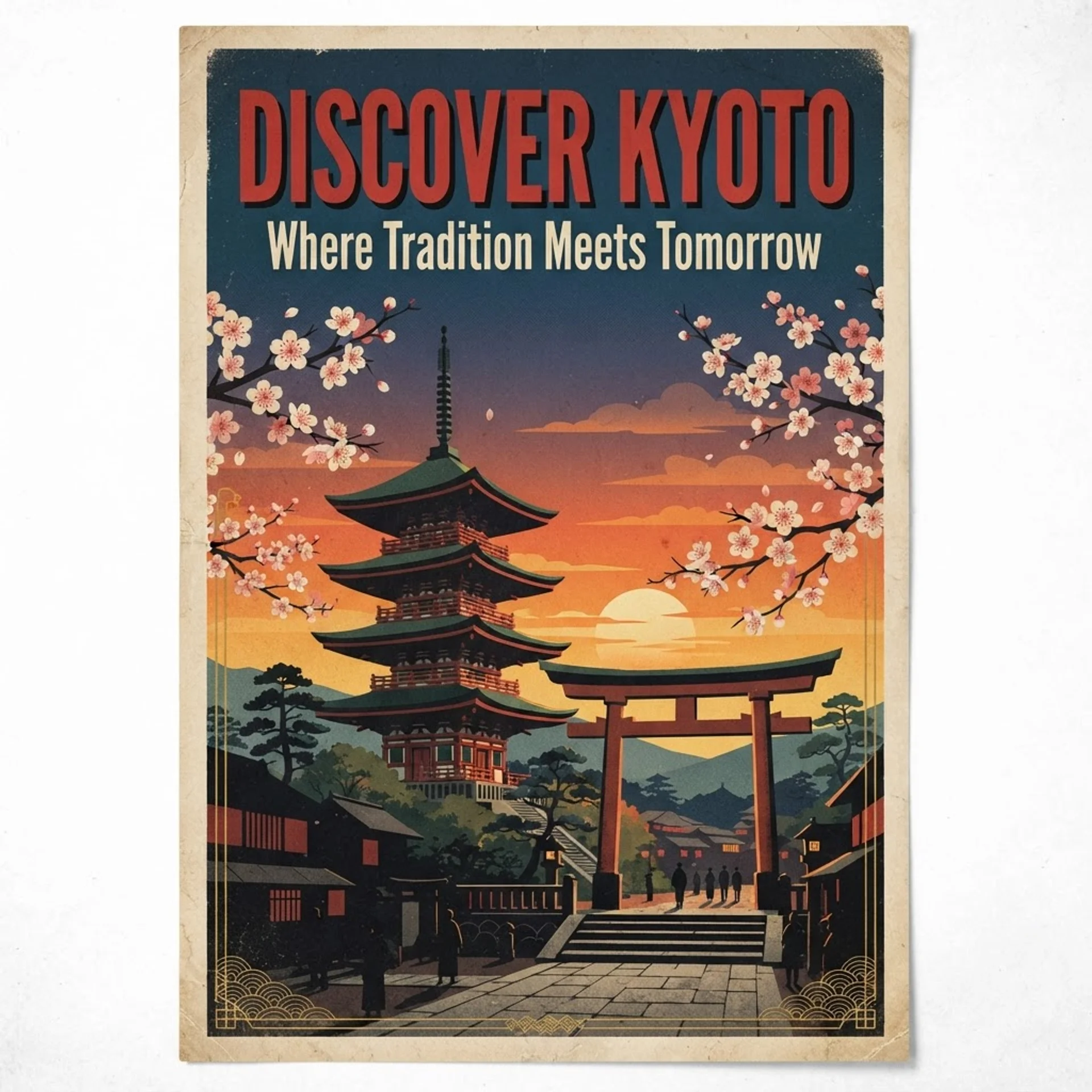
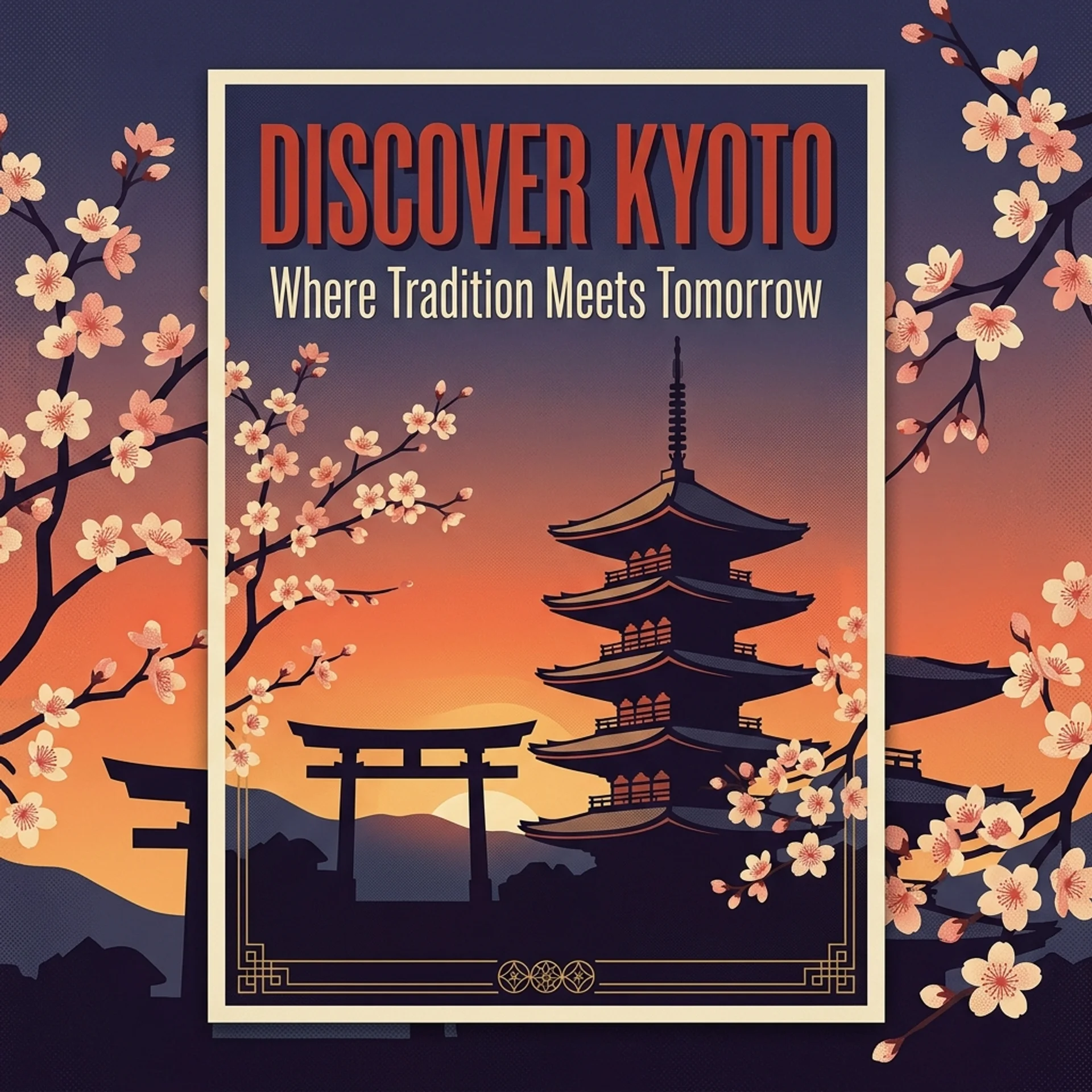
A vintage-style travel poster for 'KYOTO, JAPAN,' designed as a mid-century screen print in a vertical 2:3 aspect ratio. In the upper third, render the headline 'DISCOVER KYOTO' in a bold, condensed retro serif font in deep vermillion red with a subtle drop shadow. Beneath it, render the subheading 'Where Tradition Meets Tomorrow' in a slim, elegant cream-white sans-serif font. The background illustration shows a stylized five-story pagoda beside a torii gate under a gradient sunset sky fading from orange to deep indigo, with cherry blossom branches framing the left and right edges. Along the bottom, add a thin gold linework border with small Japanese-inspired geometric patterns. Flat poster-illustration style with visible halftone texture and a muted retro color palette; all text must be perfectly legible, correctly spelled, and sharply in focus.
C. Infographics
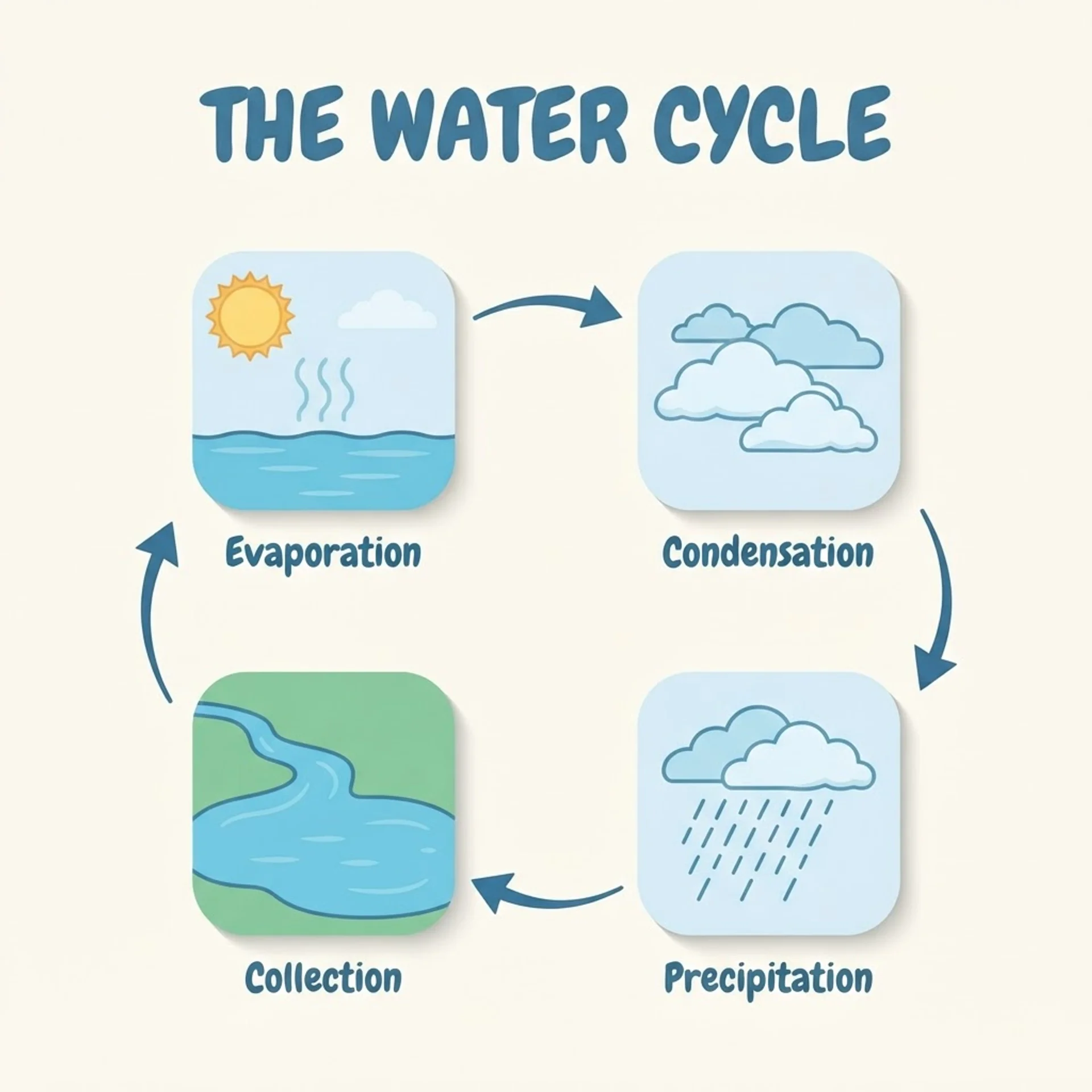
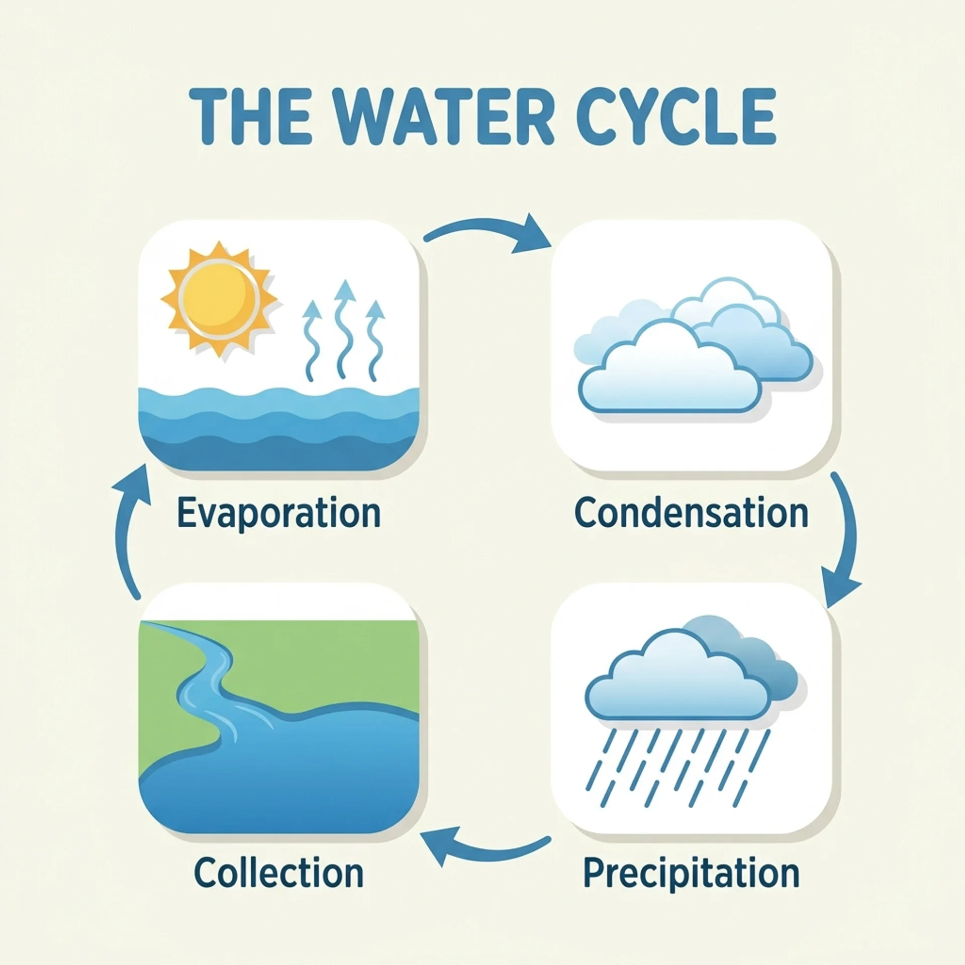
A clean, modern flat-design infographic titled 'THE WATER CYCLE,' rendered in a widescreen 16:9 layout on a soft off-white background with a cohesive blue-and-green color palette. At the top, render the title in a bold, rounded sans-serif font. Below it, illustrate four stages connected in a clockwise circular flow by curved arrows, each inside its own rounded icon card: Stage 1 labeled 'Evaporation' with the sun heating water and wavy vapor lines rising; Stage 2 labeled 'Condensation' with fluffy clouds forming; Stage 3 labeled 'Precipitation' with rain falling in diagonal lines; Stage 4 labeled 'Collection' with a river flowing into a lake. Use one consistent flat-vector icon style with soft drop shadows throughout, evenly balanced composition, all four labels and the title spelled correctly and clearly legible, no extraneous text or decoration outside the four labeled stages.
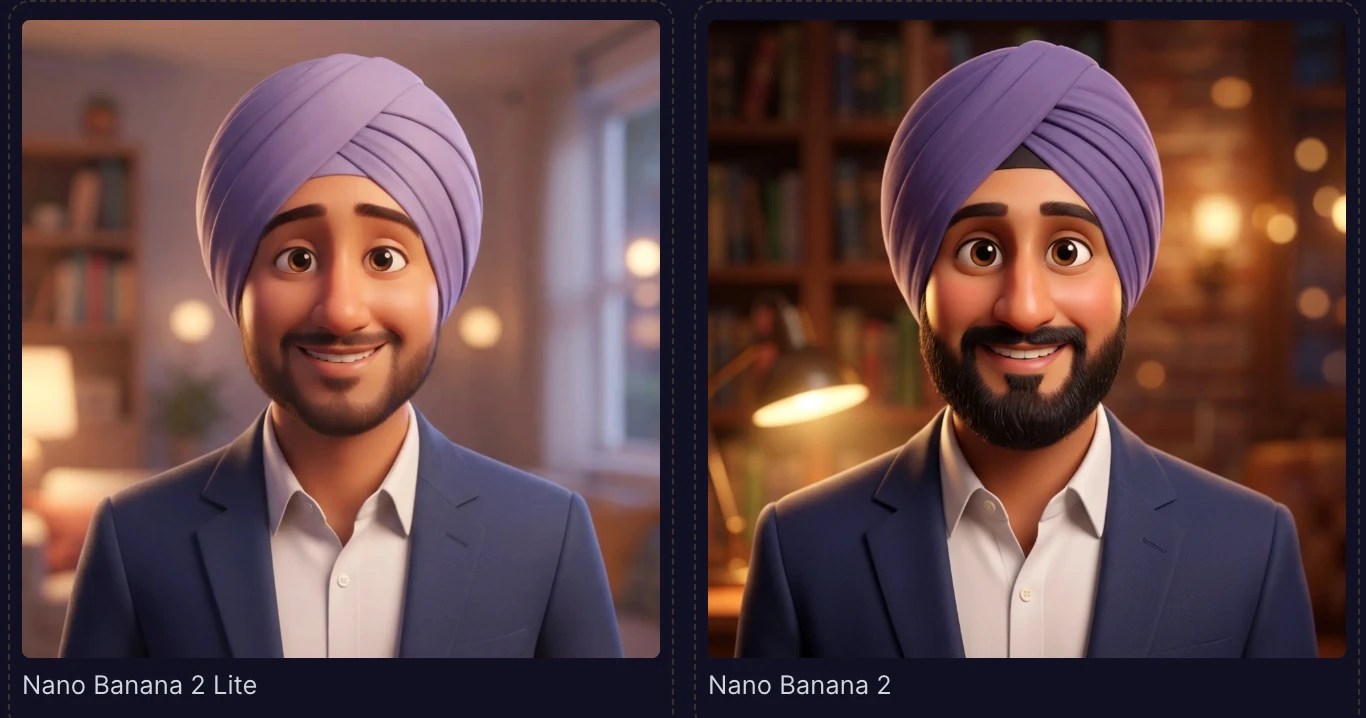
D. YouTube Thumbnail (Using Your Photo)
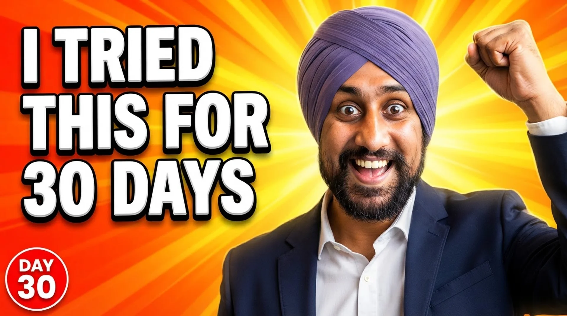
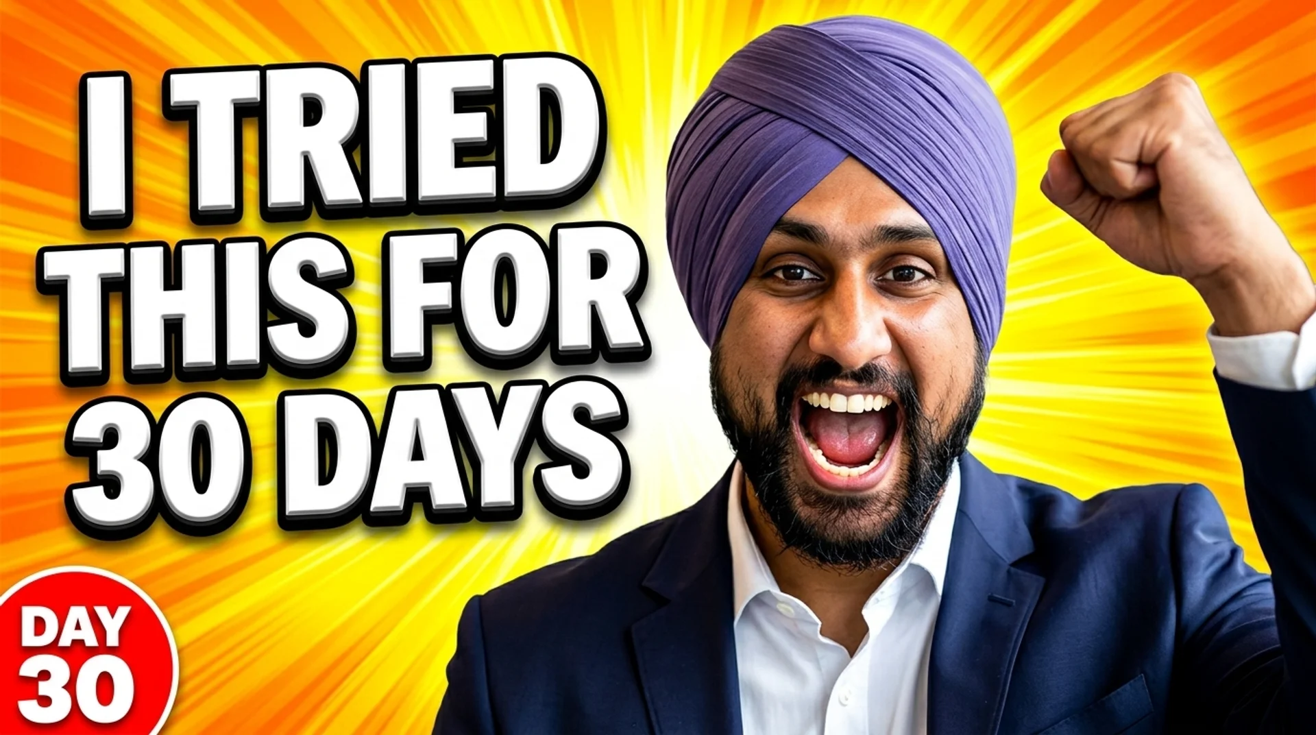
Using the attached photo as the exact likeness of the subject, keep the same face, skin tone, and hair completely unchanged, and composite them into a high-energy YouTube thumbnail in a 16:9 aspect ratio. Position the subject on the right two-thirds of the frame with a wide-eyed, excited expression and one arm raised in a triumphant fist-pump. The background is a radial burst of bright yellow-and-orange light rays exploding outward from behind the subject's head. In the left third of the frame, render the headline 'I TRIED THIS FOR 30 DAYS' stacked across three lines in a thick, chunky, 3D-extruded white font with a heavy black outline and a subtle drop shadow for readability at small sizes. Add a small red circular badge in the bottom-left corner reading 'DAY 30' in bold white lettering. Punchy oversaturated colors, high contrast, sharp studio-style lighting on the subject's face, composition optimized to stay readable even scaled down to a 120-pixel-wide preview.
E. Practical Photo-Editing Use Cases


Using the attached photo, keep the subject's face, exact facial features, hairstyle, and body pose completely unchanged, and edit only the surroundings and outfit. Replace the background with a bright, minimalist modern office featuring a floor-to-ceiling window, a softly blurred skyline outside, and neutral gray walls. Dress the subject in a well-tailored navy blazer over a plain white shirt. Light the scene with soft, even three-point studio lighting matched naturally across the subject's face and the new background so the edit looks seamless, with a shallow depth of field (f/2.8-equivalent) gently blurring the background. Frame it as a professional LinkedIn-style headshot, medium close-up, centered composition, square 1:1 aspect ratio, natural color grading, no added text, logos, or watermarks anywhere in the frame.
F. Real-World Data Image
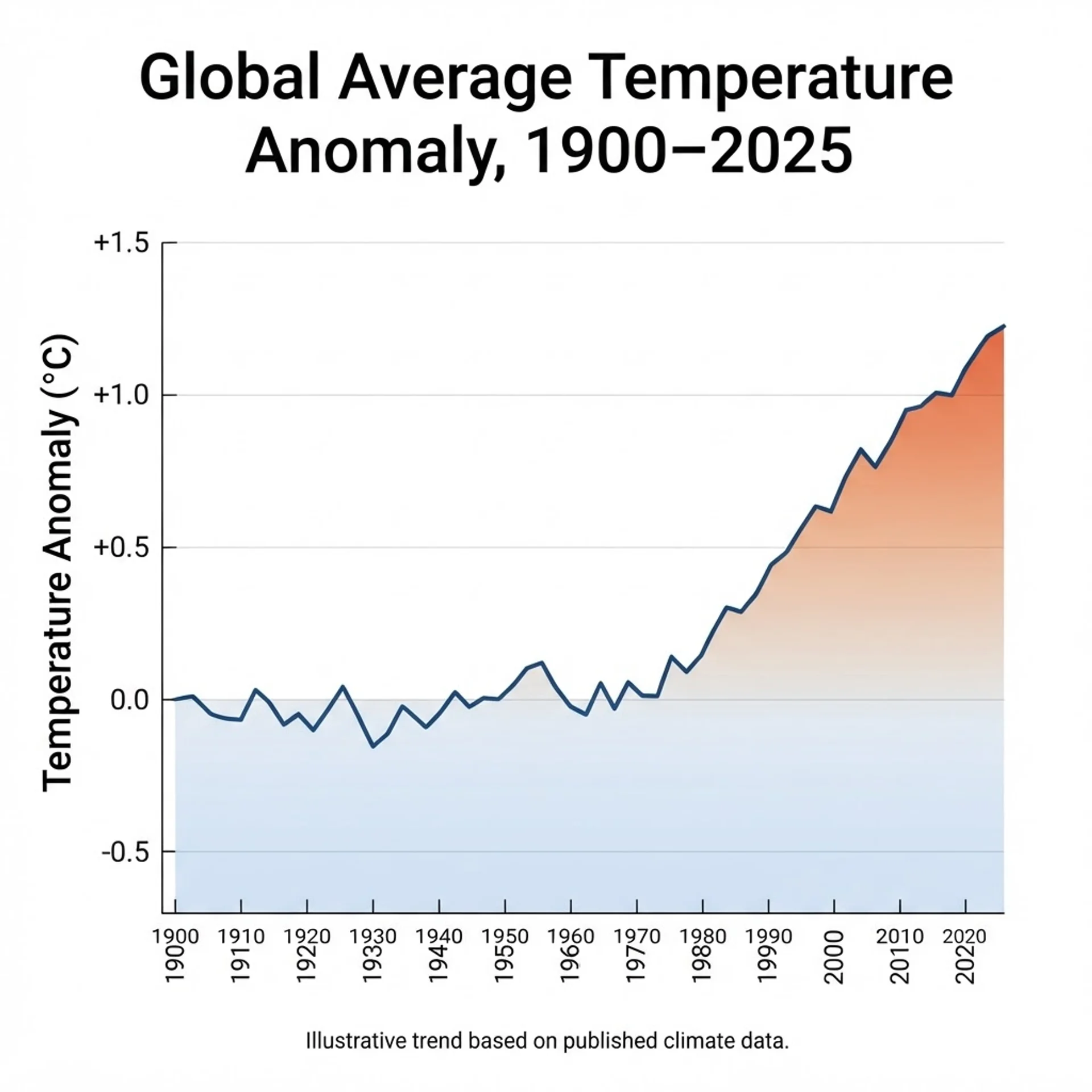
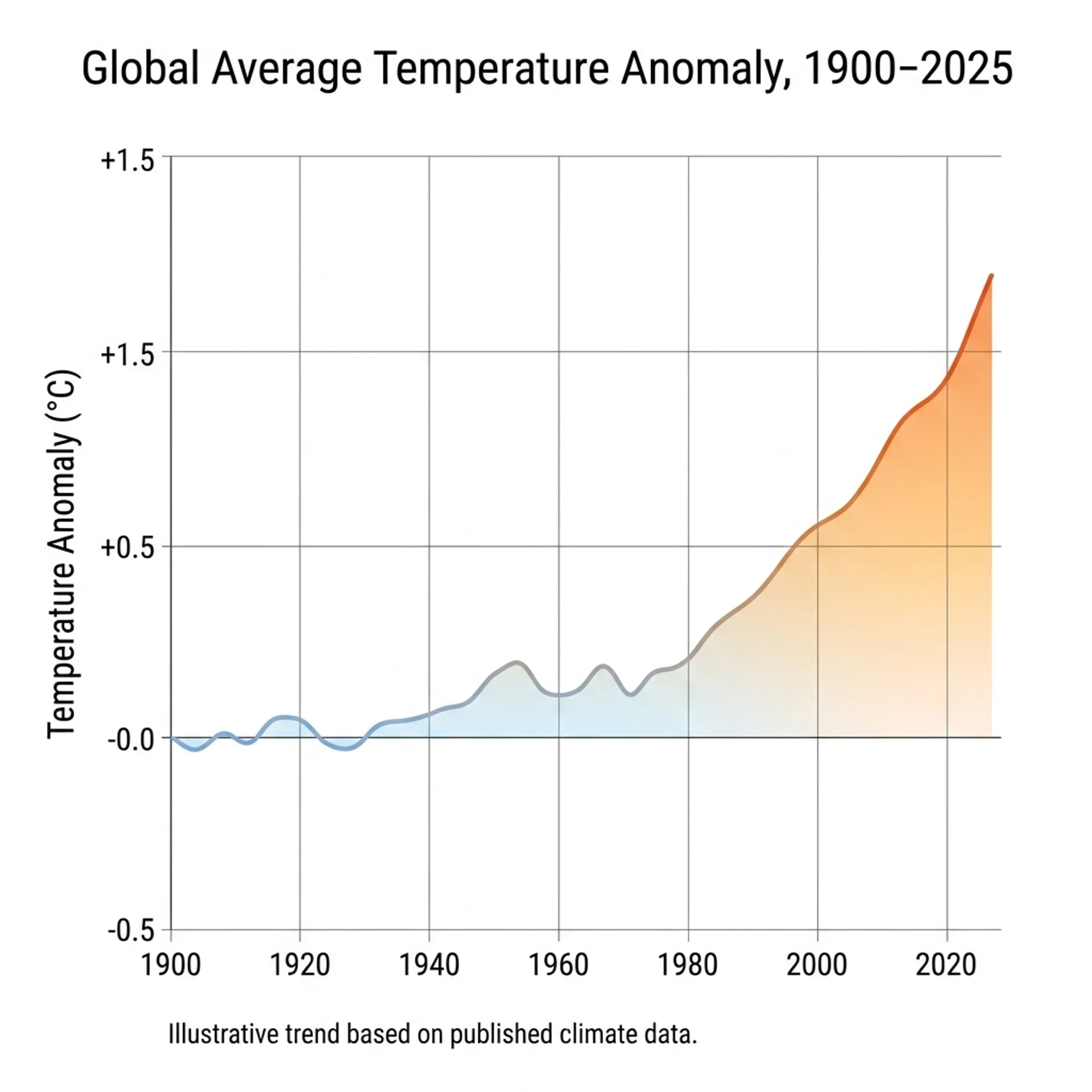
An educational data-visualization poster titled 'Global Average Temperature Anomaly, 1900-2025,' rendered as a clean line chart in a 4:3 aspect ratio on a white background. The X-axis shows decade markers from '1900' to '2020' in a small, legible sans-serif font; the Y-axis is labeled 'Temperature Anomaly (degrees C)' ranging from '-0.5' to '+1.5.' Plot one smooth line that starts near zero in 1900, stays relatively flat with minor fluctuation through the mid-20th century, then rises steadily after 1980 to roughly +1.2 degrees C by 2025, shaded beneath the line with a gradient from pale blue to warm orange as it climbs. Include gridlines at each major axis interval and a small caption at the bottom reading 'Illustrative trend based on published climate data.' Minimalist scientific-report style, precise and uncluttered, every label spelled correctly and easy to rea
G. Public Figure / Celebrity-Style
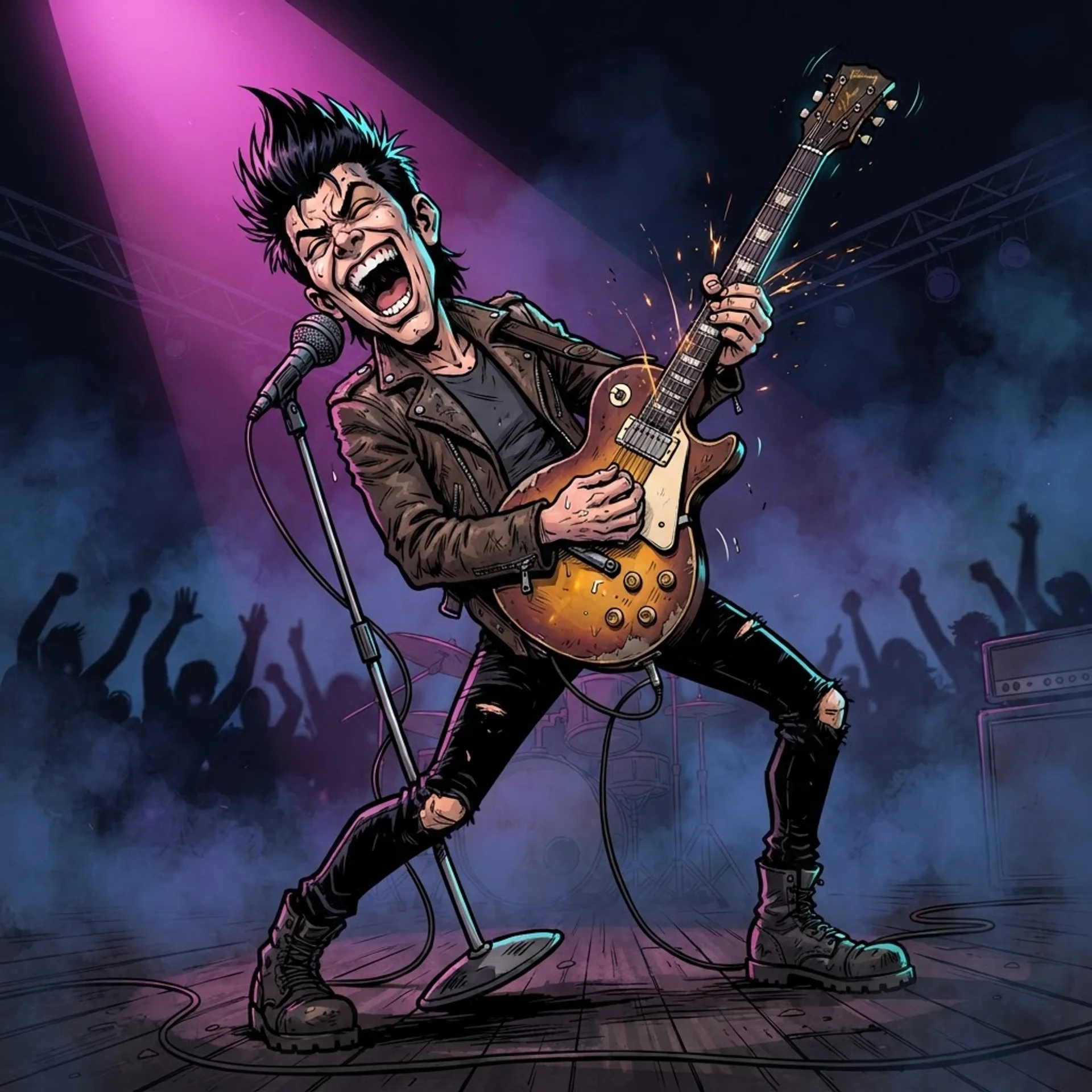
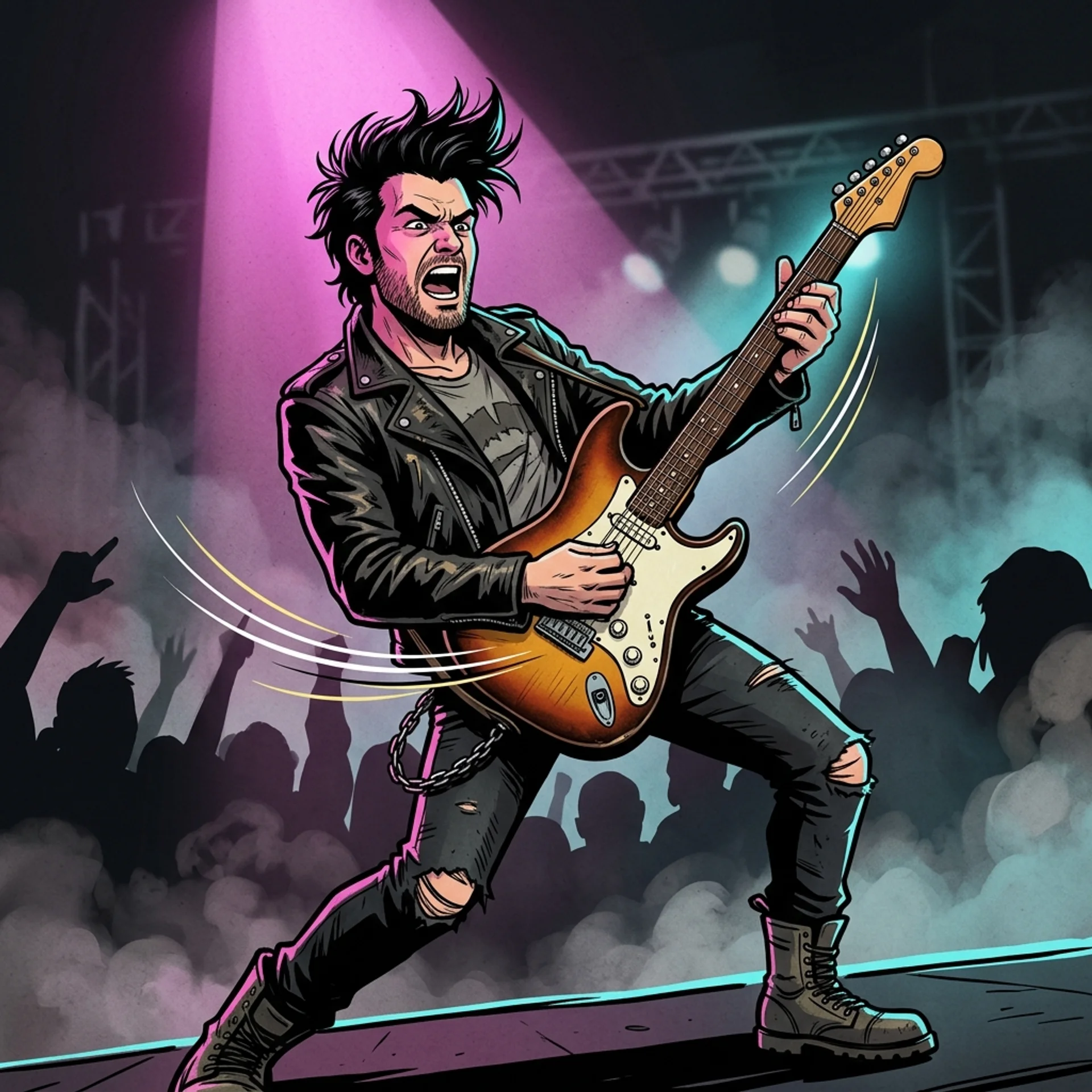
A stylized caricature illustration of a fictional, generic rock-and-roll frontman archetype -- not based on any real, identifiable person -- performing mid-song on a concert stage. He has spiked black hair, wears a worn leather jacket over a plain band t-shirt, and grips a vintage sunburst electric guitar tilted upward as he leans back dramatically. Exaggerated comic-caricature proportions with an oversized expressive face, bold black ink outlines filled with flat cel-shaded color, a single magenta spotlight from above-left and a cyan rim light from behind, smoke and crowd silhouettes suggested in the darkened background. Dynamic low-angle composition looking up at the performer, motion lines trailing from the guitar, no text or logos anywhere in the frame.
H. Cartoon / Stylized Conversion
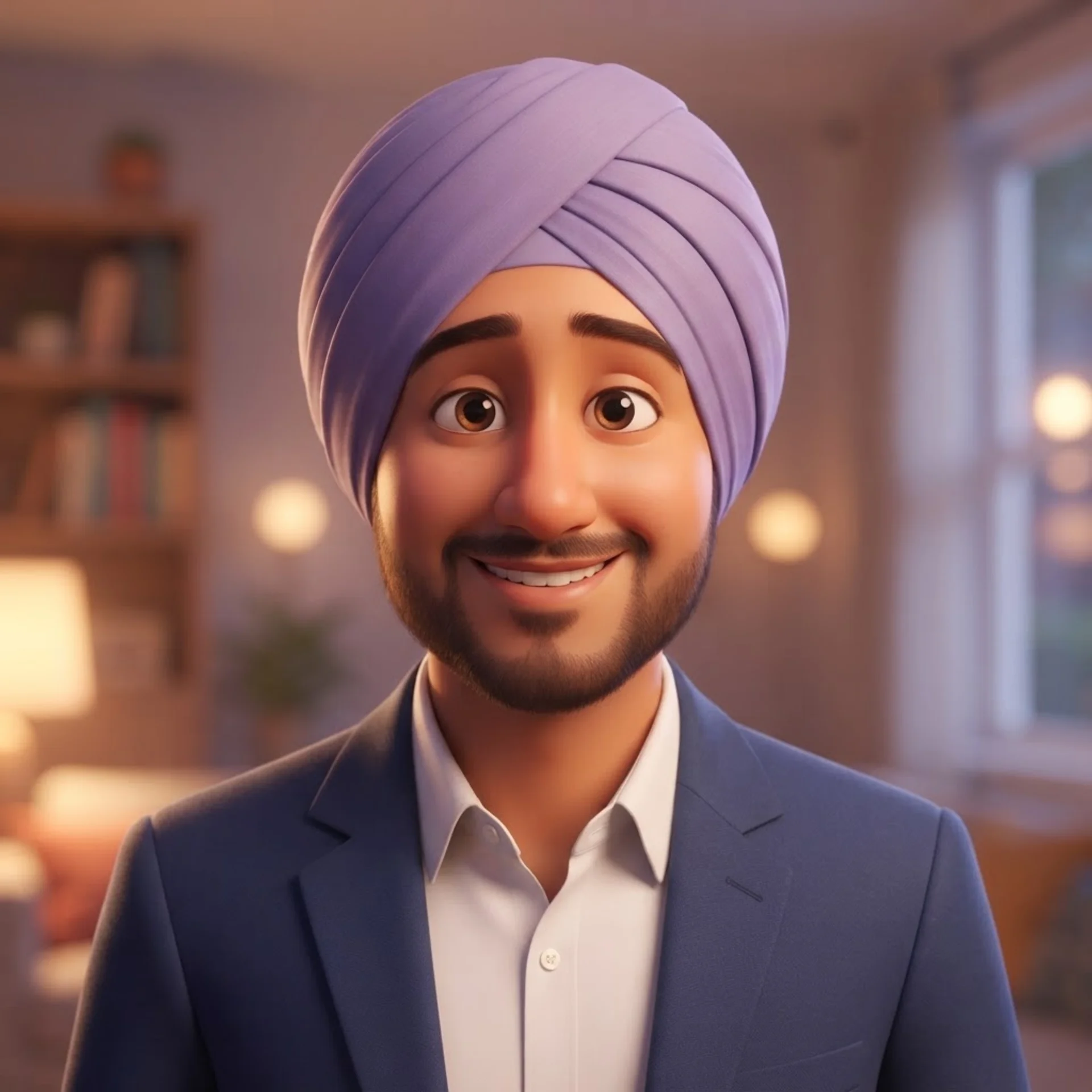

Using the attached photo, keep the same hairstyle, hair color, and clothing color palette as the reference, and transform the subject into a warm, Pixar-style 3D animated character. Slightly enlarge and soften the eyes for a friendly, expressive look while keeping them clearly recognizable as the same person, round out the facial proportions gently, add smooth stylized skin shading with soft highlights, and give the character a warm, gentle smile. Place the character in a softly lit, cozy indoor setting with warm bounce lighting from the lower-left and a softly blurred bokeh background. Medium shot, centered composition, vibrant but natural color grading typical of modern 3D animated films, smooth glossy rendering with visible ambient occlusion in the clothing creases, square 1:1 aspect ratio.
I. Anime / Manga, Multi-Pose Consistency
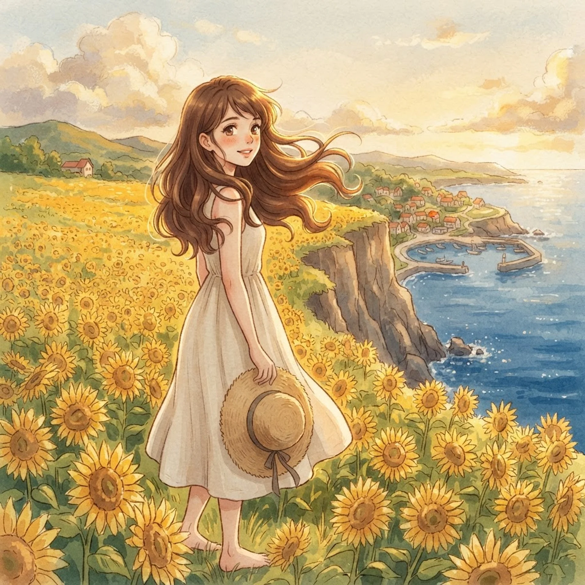
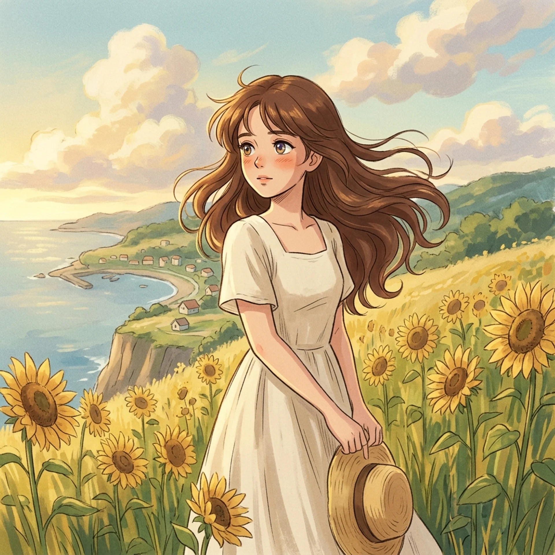
A Studio-Ghibli-inspired anime portrait of a young woman standing waist-deep in a golden field of sunflowers at the edge of a cliff overlooking a distant coastal village, her long chestnut hair caught mid-motion by a warm breeze, wearing a simple cream-colored linen dress and holding a straw hat loosely in one hand. Soft, painterly hand-drawn background with visible brush texture in the clouds and distant hills, warm late-afternoon backlighting creating a gentle golden rim light around her hair and shoulders, large expressive anime eyes rendered with soft multi-tone highlights, delicate line work on the face contrasted with looser, more impressionistic linework in the background foliage. Medium-wide shot with the subject positioned slightly left of center, 3:2 aspect ratio, warm nostalgic color grading with gentle film grain, no text anywhere in the frame.
J. Multilingual Text Rendering
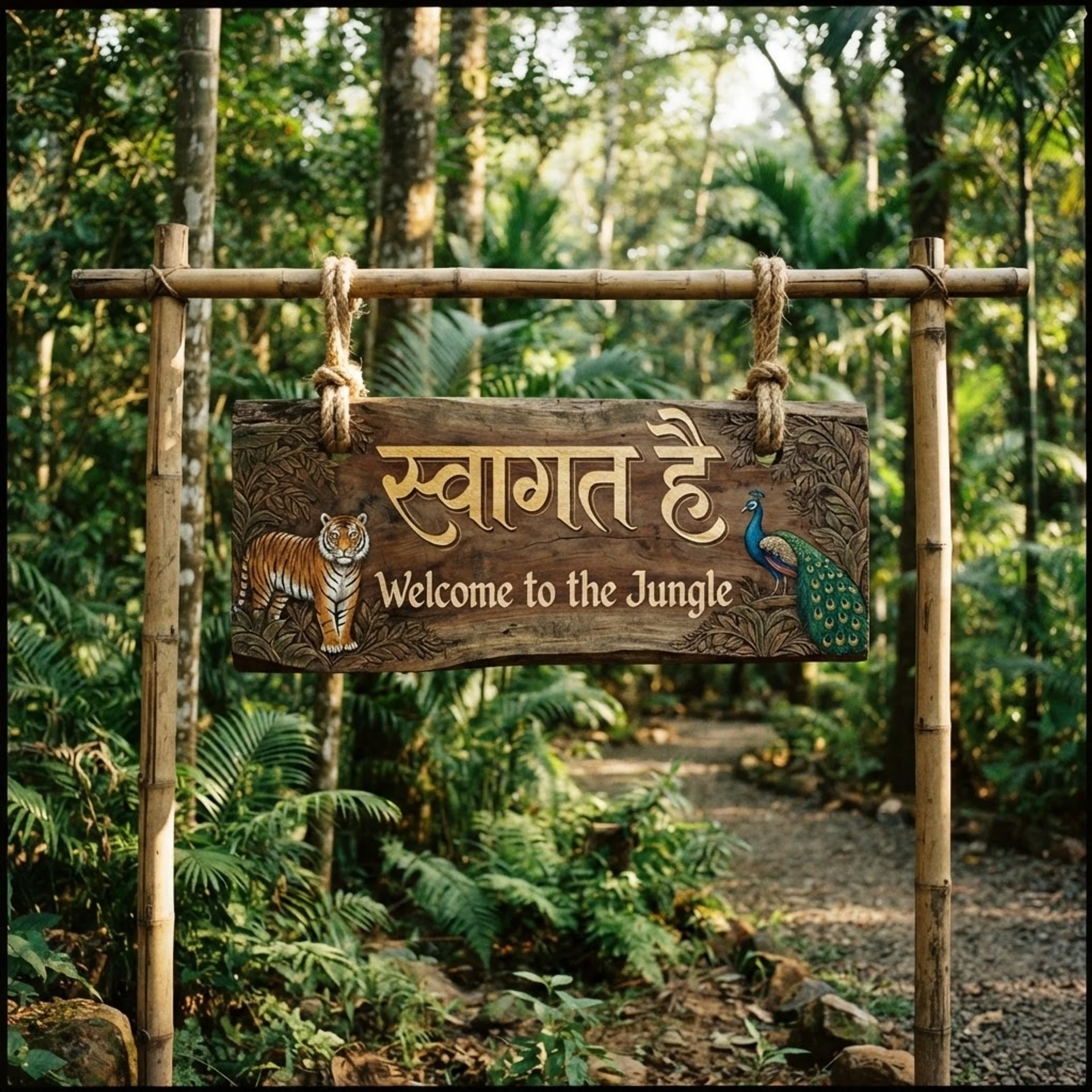
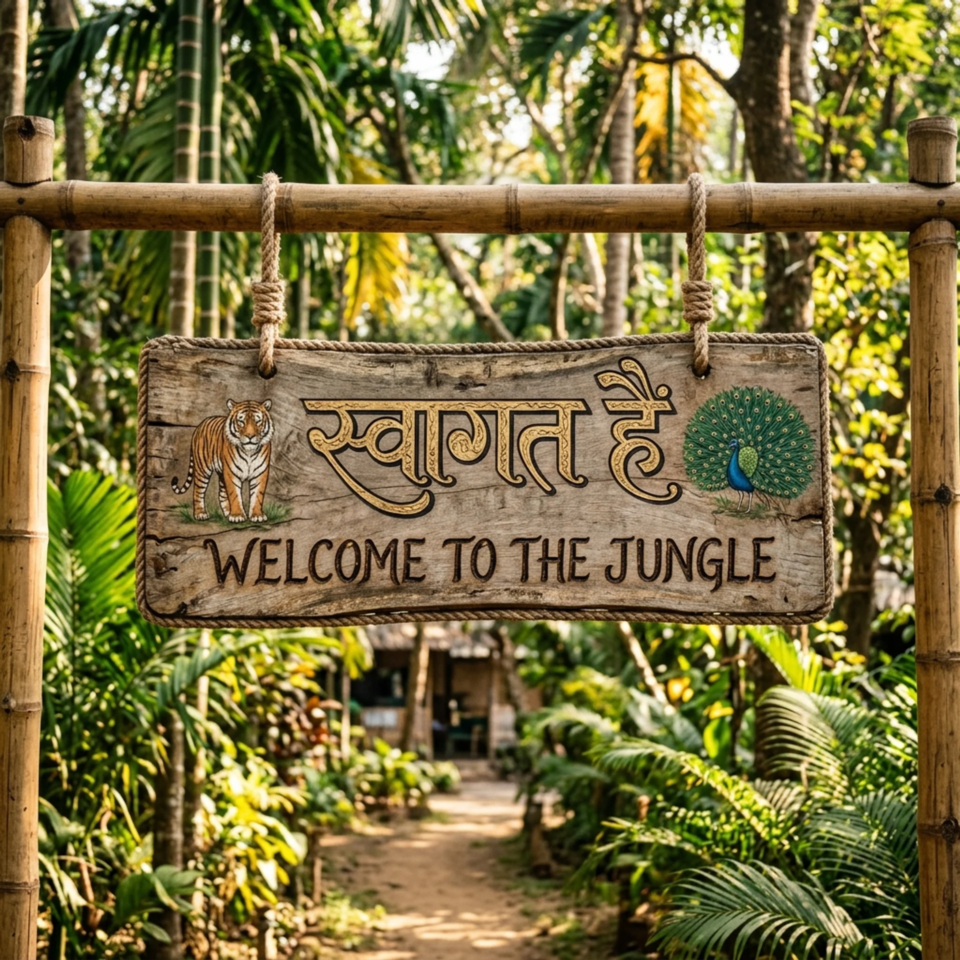
A rustic wooden welcome sign mounted at the entrance of a lush jungle eco-lodge, photographed in a realistic outdoor setting with dappled afternoon sunlight filtering through tall tropical trees. Carve and paint the sign with the Hindi phrase 'स्वागत है' ('Welcome') at the top in elegant, hand-painted Devanagari calligraphy with gold-leaf detailing, and beneath it render the English translation 'Welcome to the Jungle' in a smaller, rustic hand-lettered serif font burned into the wood. The sign hangs from two thick rope loops on a carved bamboo frame, with small painted illustrations of a tiger and a peacock flanking the text on either side. Natural warm lighting, slightly weathered wood grain texture, medium shot centered on the sign with a softly blurred green jungle background, 4:3 aspect ratio, both the Devanagari and English text rendered with perfectly accurate spelling and clean, legible strokes.K. Instruction-Following Stress Test
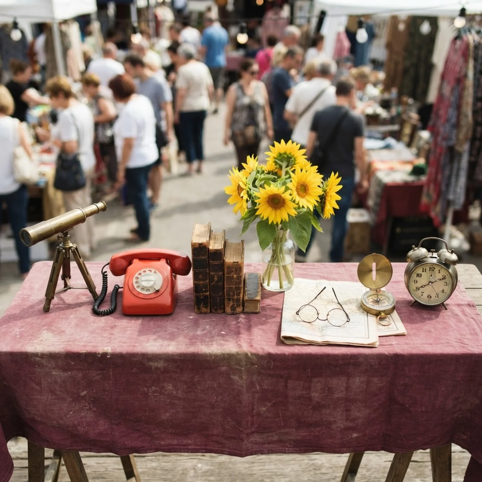
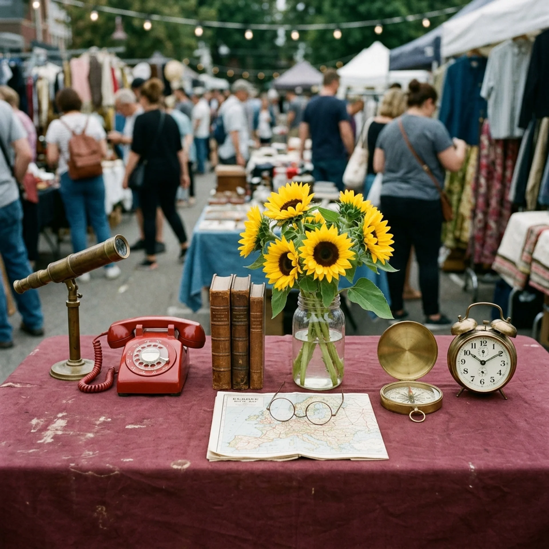
A flat-lay overhead photograph of a flea-market vendor's table covered in a faded burgundy cloth, shot from directly above in a top-down composition. Arrange exactly seven distinct objects in this precise left-to-right order across the table: first, a brass telescope on a small tripod stand; second, a vintage red rotary telephone; third, a stack of exactly three hardcover books with worn leather spines; fourth, a clear glass vase holding a bunch of yellow sunflowers; fifth, a pair of round wire-frame glasses resting on an open folded map; sixth, a brass compass with its lid open; and seventh, a classic twin-bell alarm clock. Behind the table, keep a softly blurred, busy background of a crowded outdoor flea market with shoppers browsing other stalls and string lights overhead, midday natural light casting soft, even shadows. Documentary-style photography, natural color grading, every one of the seven objects clearly visible, correctly counted, and in the exact order specified, with no additional or substituted objects added to the table.
Where Lite Wins, Where Standard Wins
The Two Prompt Tools I Use for Both Models
Neither model fixes a vague prompt. I use two free tools to get from a rough idea to a full Creative-Director-style brief before I touch either model.
Frequently Asked Questions (FAQs)
Is Nano Banana 2 Lite better than Nano Banana 2?
Not on quality. Documented testing shows Nano Banana 2 following complex, multi-object prompts more precisely. Lite wins on price and matches Standard's speed closely enough that speed alone isn't a reason to pick either one.
Is Nano Banana 2 Lite free?
Not as a standalone API call — it costs $0.034 per image through the Gemini API. It's included at no extra cost inside the Gemini app, NotebookLM, and Google Photos, and Google AI Studio offers a free tier for testing.
Can Nano Banana 2 Lite do 4K images?
No. Its pricing and documentation list only a 1K output tier. For 2K or 4K, I use Standard Nano Banana 2 or Nano Banana Pro.
What's the difference between Nano Banana 2 and Nano Banana Pro?
Nano Banana 2 runs on Gemini 3.1 Flash for speed and cost-efficiency. Nano Banana Pro runs on Gemini 3 Pro for maximum reasoning depth. Nano Banana 2 reaches about 95% of Pro's quality in most scenarios at meaningfully less cost per image.
Which one should I use for virtual try-on or product mockups?
Either works. AIReiter's reference-image test showed both models keeping garment color and shape consistent with the source photo. I use Lite when I'm running many variants before picking a final one.
When should I turn Thinking Mode on?
I keep it off by default on both models for speed. I only turn it on for confusing output, dense infographics, or spatial-reasoning tasks like a labeled map with multiple cities placed correctly.
Final Thoughts
Lite and Standard aren't rivals to me — they're a pipeline. I draft variants in Lite at half the cost, pick my winner, then re-run that exact prompt through Standard Nano Banana 2 (or Pro, if identity accuracy is critical) for my final 2K or 4K asset.
Before I run either model, I put my idea through one of the two prompt tools above. A full Creative-Director-style brief beats a rushed one-liner every time, and it costs me nothing to try.