 Chrome Extension

I took the exact five prompts from my solo Opus 5.5 review and ran them again on GPT-6 Astra, side by side, so the comparison would actually be fair. One model costs 2.5 times less than the other per token.
I wanted to know if the expensive one earns that gap.
Here is everything I found, round by round, including the one test where Astra genuinely won the room.
Key Takeaways
xhigh reasoning effort and Opus 5.5 at high, so this is not a lopsided-effort comparison in Astra's favor.What's Actually Being Compared
Before the five rounds, let me lay out the numbers I was testing against, because the price gap is the whole reason this comparison matters.
| Claude Opus 5.5 | GPT-6 Astra | |
|---|---|---|
| Input tokens | $4 / MTok | $10 / MTok |
| Output tokens | $20 / MTok | $50 / MTok |
| Cached input | $0.20 / MTok | $1.00 / MTok |
| Effort levels | low, medium, high, xhigh, max | low, medium, high, xhigh, max |
| Effort I used | high | xhigh |
I want to flag that effort setting directly, because it means this test is not skewed to make the cheaper model look better. I gave Astra the higher effort tier of the two and it still cost 2.5 times more per token to run.
On independent, third-party numbers rather than my own hands-on tests, Artificial Analysis scores it the same direction I did:
"For intelligence, Claude Opus 5.5 scores highest: Claude Opus 5.5 (Adaptive Reasoning, Max Effort, Default Fallback) at 58, against GPT-6 Astra (max) at 53... For output speed, Claude Opus 5.5 is fastest: 92 t/s, against GPT-6 Astra (max) at 52 t/s... For cost per task, Claude Opus 5.5 is cheapest: $0.55, against GPT-6 Astra (low) at $0.82."
That is intelligence, speed, and cost all landing in the same direction on an independent benchmark. Worth knowing going into my own five tests.
If you are choosing between these two models for your own agentic coding or app-building workflow, the effort level you pick matters as much as the model itself. Both support the same five-tier naming, low through max, so if you see someone claim one model "feels smarter," check what effort tier they actually ran before you trust the comparison. I made sure to disclose mine above for exactly this reason.
Watch whole comparison;
Round 1: Pigment AI, A Brand Design System SaaS
Same prompt, same brand-tool concept: an AI SaaS that generates a full design system, color palette, and branding kit for a website with none. I ran it on both models.
Build "Pigment" — a SaaS that generates and manages complete brand identity systems.
Describe a brand (or upload a logo), and Pigment produces a full design system: colour
palette with accessible pairings, type scale, spacing system, component previews, and
exportable tokens for CSS, Tailwind, and design tools.

Include a ONE-PAGE LANDING (single scrolling page, not a multi-page marketing site), full
AUTH with SAMPLE LOGINS, and the complete app.

STACK: Node 18+, Express 4.x, EJS, PostgreSQL 16 (pg), bcryptjs, express-session,
  connect-pg-simple, multer (logo upload), sharp (image processing + colour extraction),
  Lucide icons, vanilla CSS. All colour maths written by hand — no colour library.
AI: Anthropic API, model claude-opus-5-5, x-api-key, anthropic-version: 2023-06-01.
  Effort: high for generation, medium for refinement. Vision for logo analysis.
  ⚠️ tool_choice "any"/"tool" → 400 on this model. Use {"type":"auto"} with strict tool use.
  ⚠️ thinking cannot be disabled — omit the field or use {"type":"adaptive"}.

WHY THIS MODEL: Opus 5.5 ships sharper vision for charts, diagrams and screenshots — reading
a logo and deriving a coherent system from it is exactly that capability, and the output is
immediately, visually checkable on camera.

SCHEMA:
  users (id, email, password, name, company, plan[free|studio|agency], created_at)
  brands (id, user_id, name, description, industry, personality JSONB, logo_path,
    is_archived, created_at, updated_at)
  palettes (id, brand_id, name, colors JSONB, is_active, generated_at)
    -- colors: [{ role:"primary|secondary|accent|neutral|success|warning|danger",
    --            hex, name, shades:{50..950}, on_color_hex, contrast_ratio }]
  typography (id, brand_id, display_font, body_font, mono_font, scale_ratio,
    base_size, weights JSONB, pairings_rationale)
  tokens (id, brand_id, format[css|tailwind|json|scss], content TEXT, generated_at)
  components (id, brand_id, component_type, config JSONB)  -- live preview configs
  revisions (id, brand_id, note, snapshot JSONB, created_at)  -- version history

SAMPLE LOGINS (seed; password for all: pigment2026) — ONE-CLICK tiles AND listed visibly:
  demo@pigment.app   / pigment2026  — "Demo Studio" (agency), 4 brands
  sarah@pigment.app  / pigment2026  — "Sarah Chen" (studio), 2 brands mid-revision
  free@pigment.app   / pigment2026  — "Free User", 1 brand

DEMO DATA (must look alive on first load — this app is judged on how it LOOKS):
  4 fully-built brands with genuinely different, genuinely good identities:
    - "Meridian Capital" — a financial firm: deep navy, restrained, serif display, tight scale
    - "Fernbank" — an organic grocer: warm greens and clay, friendly rounded sans, generous scale
    - "Voltage" — a developer tool: near-black with electric lime, geometric sans + mono
    - "Lumen Clinic" — healthcare: soft teal and warm neutrals, humanist sans, high contrast
  Each with a complete palette (every role, all shade ramps, computed contrast ratios), a type
  system, generated tokens in all four formats, component configs, and 3-4 revisions of
  history. These must be designed well enough that a designer would nod at them.

ONE-PAGE LANDING (/) — a single scrolling page, and it must be beautiful:
  Sticky minimal nav; hero ("A complete brand system in ninety seconds" + CTA + a live
  animated demo where a palette generates itself on loop); the problem in one line; how it
  works (3 steps, horizontal); a LIVE INTERACTIVE DEMO STRIP — visitors type a brand
  description right on the landing page and see a palette generate (rate-limited, no login,
  this is the conversion moment); features grid; a before/after (a plain page vs the same
  page themed by a generated system); pricing (Free 1 brand / Studio $29 / Agency $99,
  monthly-annual toggle); testimonials; FAQ accordion; footer. Scroll-reveal animations
  throughout, fully responsive.

THE APP:
  BRAND CREATION — two entry paths:
    (a) DESCRIBE: name, industry, and a description, plus personality sliders (traditional↔
        modern, serious↔playful, minimal↔expressive, warm↔cool, approachable↔premium)
    (b) UPLOAD A LOGO: extract the dominant colours locally with sharp, then send the image
        to Opus 5.5 to read the logo's character, suggest what the brand appears to be, and
        build a system around it

  GENERATION (the core AI call, strict JSON):
    { "palette": [ { "role": "primary", "hex": "#...", "name": "a real colour name",
                     "rationale": "why this colour for this brand" }, ... ],
      "typography": { "display_font": "a real Google Font", "body_font": "...",
                      "mono_font": "...", "scale_ratio": 1.25, "base_size": 16,
                      "pairings_rationale": "why these fonts together" },
      "personality_read": "2-3 sentences on the identity being expressed",
      "usage_notes": ["where to use each colour role"] }
    Constrain fonts to REAL Google Fonts — validate every returned font name against a
    bundled list and substitute the nearest valid match if the model invents one. That
    validation step matters and is worth showing on camera.

  COLOUR ENGINE (write this yourself — no library):
    - Generate a 50→950 shade ramp for every role by interpolating in a perceptually
      reasonable space (convert to OKLCH or at minimum HSL with lightness curves tuned so
      the ramp doesn't go muddy in the middle)
    - Compute WCAG contrast ratios for every foreground/background pairing
    - Auto-select the correct on-colour (black or white) per shade, and flag any pairing
      that fails AA
    - An accessibility panel showing the full contrast matrix as a colour-coded grid

  LIVE COMPONENT PREVIEW (the screen that sells the product):
    Render real components themed by the active system, updating instantly as the user
    adjusts anything: buttons (all variants and states), form inputs, cards, alerts, a nav
    bar, a pricing table, a data table, badges, and a full sample landing page. Toggle
    light/dark. This is the proof that the system works, so make it genuinely good.

  REFINEMENT: adjust any colour with a picker and the whole ramp regenerates; lock roles you
    like and ask for a regeneration of the rest; "make it warmer / more premium / more
    playful" natural-language nudges sent back to the model with the current system as context.

  EXPORT: CSS custom properties, Tailwind config, JSON tokens, SCSS variables — each in a
    copyable code block with a download. Plus a one-page PDF brand sheet.

  VERSION HISTORY: every generation snapshots; browse and restore revisions with a visual diff
    of what changed between them.

DESIGN: the app itself must be impeccably designed — it's a design tool, so the UI is the
  credential. Light-mode-first with a dark option. Neutral chrome so the user's brand colours
  are the only saturated thing on screen. Inter + JetBrains Mono. Generous spacing.

README: what it does, the 3 sample logins in a table, setup (createdb → migrate → seed →
  ANTHROPIC_API_KEY → npm run dev), how generation and the colour engine work, deploy notes.

Output all files completely, no truncation. The colour ramp engine with correct contrast
computation, the live component preview, and the font-name validation are the critical pieces.
Both landing pages looked clean. I will say it directly: Astra's landing page was genuinely crisp, and for pure front-end polish I found myself preferring GPT-6's UI on this one. The interface felt tighter, the controls looked "perfect," in my own words at the time.
But functionality told a different story. Opus 5.5's version had four working feature areas: color palettes, spacing, a live studio to preview components, and a full branding export. When I uploaded a logo to auto-extract brand colors, Opus 5.5 instantly recognized the colors from the image. Astra's version did not extract any color from the logo at all. That is the one thing that flatly did not work.
Astra's studio preview also had no live controls, so I could look at components but not adjust them. Opus 5.5's studio let me change colors directly.
My verdict: Opus 5.5 wins on function. But I have to give Astra credit on visual design. Both things are true at once.
Round 2: The Watchmaker 3D Site
This is the same Three.js watchmaker site from my Opus 5.5 solo review, run again on Astra with the identical prompt, including an explicit instruction to reuse the same 3D model across a second page.
Build "Escapement" — the website for an independent mechanical watchmaker. A complete
MULTI-PAGE site: 6 interlinked pages sharing one design system, one nav, and smooth page
transitions. This is a luxury horology brand — the site must feel precise, patient, and
expensive. Restraint is the design.

STACK — pin this exact setup:
<script type="importmap">
{ "imports": {
  "three": "https://cdn.jsdelivr.net/npm/three@0.170.0/build/three.module.js",
  "three/addons/": "https://cdn.jsdelivr.net/npm/three@0.170.0/examples/jsm/"
}}
</script>
Plus GSAP 3.12 + ScrollTrigger, Lenis smooth scroll, Lucide icons, Google Fonts.
Modern API only — SRGBColorSpace, ACESFilmicToneMapping, BufferGeometry, no deprecated calls.
ALL imagery procedural — no external image files.

FILES:
  shared.css · shared.js
  index.html · calibre.html · collection.html · atelier.html · heritage.html · enquire.html
  js/home.js · js/calibre.js · js/collection.js · js/atelier.js · js/heritage.js · js/enquire.js

DESIGN DIRECTION — "patient precision":
  Light-first (luxury horology is photographed bright), with a full dark theme for the
  movement pages. Palette: warm bone-white, deep graphite ink, and ONE metal accent —
  a restrained rose-gold — plus a cool steel blue for technical annotation. Fonts: a fine
  high-contrast serif for display (the kind on a watch dial), a clean grotesk for body, and
  a mono for specifications and reference numbers. Enormous whitespace. Slow easings
  (0.9–1.4s). Nothing bounces. Nothing flashes. The pacing IS the brand.

THE 3D HERO (real Three.js WebGL — the centerpiece, and the hardest thing on the site):
  A mechanical watch MOVEMENT built from primitives — mainspring barrel, gear train (four
  meshing wheels), escape wheel, pallet fork, and a balance wheel. And it must actually RUN:
  the gears rotate at correct RELATIVE ratios (each wheel's angular velocity inversely
  proportional to its tooth count), the escape wheel ticks in discrete steps rather than
  sweeping, and the balance wheel oscillates back and forth at a steady beat. The pallet fork
  rocks in time with the escapement. Get the mechanical relationship right — that's the whole
  point of the object.
  Materials: polished steel, brushed rose-gold plates, blued screws, jewel bearings as tiny
  translucent red cylinders. Env-map reflections, soft key light, and a shallow depth-of-field
  feel. Mouse parallax tilts the movement gently. Dispose on page transition; static gradient
  fallback if WebGL is unavailable.

CUSTOM CURSOR (fresh — must differ from every other cursor style):
  A fine crosshair with a slowly sweeping second-hand tick around it — a thin line that
  advances one discrete step per second, like a watch's seconds hand. On hover over
  interactive elements the crosshair contracts and a hairline circle closes around it.
  Hidden on touch devices.

PAGE 1 — index.html (11 sections):
  1. Hero: the running 3D movement + brand name + a single line of positioning + two
     restrained CTAs. No urgency, no banners.
  2. A quiet credibility strip (founded year, pieces per year, patents, awards) in mono
  3. Three pillars (in-house calibre, hand finishing, limited production) — tilt cards
  4. THE PINNED SCROLL INTERLUDE (400vh) — "the movement, assembled": the signature moment.
     The watch movement DISASSEMBLES into its component parts, which drift apart and hold in
     an exploded view with hairline annotation lines naming each part and its function — then
     reassembles as the user continues scrolling. Each component labels itself as it separates.
     This must be one continuous choreographed sequence driven by scroll scrub, not a slideshow.
  5. The current collection preview (3 pieces, hover reveals the caseback) → collection.html
  6. Hand-finishing detail: a macro comparison slider (machine-finished vs hand-finished
     bevel), drawn procedurally as SVG
  7. Numbers band (animated counters: components per movement, hours of finishing, power
     reserve, beats per hour)
  8. Owner testimonials — set as short, quiet pull quotes, not a carousel of faces
  9. The atelier teaser (a wide procedural workshop illustration) → atelier.html
  10. FAQ accordion (delivery times, servicing, waitlist, water resistance)
  11. Final enquiry CTA + rich footer

PAGE 2 — calibre.html: the in-house movement. A sticky scroll-spy side nav through the
  movement's systems (power, gear train, escapement, regulation, finishing); an interactive
  exploded diagram where hovering a component highlights it and shows its specification;
  a technical spec table (jewels, frequency, power reserve, dimensions, tolerance); a
  finishing-techniques section (Côtes de Genève, perlage, anglage) each illustrated
  procedurally; a patents list; CTA.

PAGE 3 — collection.html: the watches. A collection grid where each piece has a front view,
  a caseback view showing the movement, and a strap selector that recolors live; a filter by
  case material, dial colour, and complication; a piece detail view with full specification,
  edition size, and price on application; a size-on-wrist visualizer (a simple scale
  comparison); waitlist CTA.

PAGE 4 — atelier.html: how they are made. A production-stages walkthrough where an SVG line
  draws between stations as you scroll; the watchmakers (cards with hover reveal); tooling
  and machinery; the quality-control protocol; annual production philosophy and why the
  numbers are small; a workshop gallery; CTA.

PAGE 5 — heritage.html: the house. Founding story; a timeline whose SVG line draws on scroll
  with milestone pieces attached to it; historic calibres; the founder's philosophy as a full-
  bleed statement; press and awards; museum and exhibition appearances; footer.

PAGE 6 — enquire.html: acquisition. A considered enquiry form (piece of interest, strap size,
  preferred contact, message) — validated, calm, no marketing language; boutique and
  authorized-dealer locations; the servicing programme; the waitlist explanation; response-time
  commitment; a closing macro shot of the movement. Footer.

SHARED SYSTEMS (shared.js):
  - Lenis smooth scroll + a hairline scroll-progress bar
  - The watch-tick cursor described above
  - Theme toggle persisted in localStorage, slow crossfade
  - [data-reveal] entrance system (up/left/right/scale, batched with stagger, slow easings)
  - Magnetic buttons (very subtle — this is a luxury brand, not a tech startup)
  - Tilt cards with a faint metal-sheen gradient following the cursor
  - PAGE TRANSITION VEIL: intercept internal links → veil in → navigate → veil out on load

REQUIREMENTS: 6 distinct background patterns (guilloché, perlage dots, hairline grid, warm
  paper grain, radial polish, fine diagonal); active nav link indicated; frosted nav after
  scroll; mobile overlay menu; fully responsive; reduced-motion fully respected (the movement
  slows and the explode becomes static); accessible (semantic HTML, visible focus, aria
  labels, aria-hidden on decorative SVG); 60fps; cap pixel ratio at 2. Every specification
  figure must be consistent across all six pages.

DELIVERY: output shared.css and shared.js complete FIRST, then each page with its JS. No
truncation, no "rest is similar" shortcuts. End with a validation checklist.
Astra's 3D model did disassemble on scroll, but the result looked odd and did not show the specific mechanical detail I asked for. Opus 5.5's version was, in my own words, very detailed, and it surfaced the distinct watch feature I wanted called out explicitly.
The bigger gap showed up on the second page. My prompt explicitly instructed both models to reuse the same 3D model rather than regenerating it. Opus 5.5 followed that instruction. Astra did not, and generated something different instead, despite the same explicit instruction sitting in the same prompt.
My verdict: Opus 5.5 wins clearly. With 3D capability specifically, I called this one "way better," and I keep coming back to the fact that this performance costs 2.5 times less per token than the model that lost.
Round 3: Tumble, The Marble-Run Game
This is the physics puzzle game I originally built for my daughter, marbles, ramps, loops, and dispensers you snap together. Same prompt on both.
Build "Tumble" — a playful 3D marble run builder. Drag pieces into a scene, drop marbles in
the top, and watch them clatter down through ramps, loops, funnels, spinners and bells. Pure
toy — satisfying, colourful, and physically believable.

DELIVER: ONE self-contained tumble.html. All procedural — no external assets. Same three.js
importmap setup pinned above (three@0.170.0, modern API only).
Write the physics yourself — no physics engine. That's the test.

═══════════ THE PHYSICS ═══════════
  Fixed timestep (180Hz) decoupled from render, with interpolated positions for smooth display.
  Marbles are spheres with position, velocity, ANGULAR velocity, mass, radius, restitution and
  friction.
  - Gravity, plus linear and angular damping
  - SPHERE↔TRIANGLE collision against the run geometry: find the closest point on each nearby
    triangle, resolve penetration along the normal, reflect velocity with restitution, and
    apply tangential friction. Use a spatial hash so this stays fast with 100+ marbles.
  - ROLLING: friction at the contact point must convert linear motion into spin and vice
    versa, so a marble genuinely rolls down a ramp rather than sliding. Visible spin on a
    textured marble is what sells the whole thing — get this right.
  - SPHERE↔SPHERE collisions so marbles queue up, nudge each other, and jam in funnels
  - CONTINUOUS COLLISION for fast marbles — sweep the path between steps so nothing tunnels
    through a thin ramp at speed. This is the bug that ruins marble runs; handle it explicitly.
  - Marbles have mass variation (glass, steel, wood) that changes how they behave and how they
    knock each other around

═══════════ THE PIECES (all built from primitives, all functional) ═══════════
  STRAIGHT RAMP (adjustable length and slope) · CURVED RAMP (90° and 180°) · SPIRAL (a helix
  the marble winds down) · FUNNEL (marbles orbit inward and drop through the throat) ·
  LOOP-THE-LOOP (requires enough entry speed, and a slow marble will fall off — that failure
  is part of the fun) · SEESAW (tips under marble weight, then rights itself) · SPINNER (a
  paddle wheel the marbles turn as they pass) · CATAPULT (accumulates and flings) · BELL and
  XYLOPHONE BARS (chime on impact, tuned to a pentatonic scale so any run sounds pleasant) ·
  SPLITTER (alternates marbles left/right) · ELEVATOR (a powered screw lift that carries
  marbles back to the top, so a run can loop forever) · TUNNEL · JUMP GAP · COLLECTOR BASIN.

  Each piece: snaps to a 3D grid, rotates in 90° increments (and free-rotates with a modifier),
  connects at defined entry/exit ports, and visually indicates when its port is correctly
  aligned with an adjacent piece's port. Colour-code connected vs dangling ports — the build
  UX lives or dies on that feedback.

═══════════ BUILD INTERACTION ═══════════
  - A piece palette with hotkeys; click or drag to place; ghost preview shows validity
  - Free orbit/zoom/pan camera; a build plane you can raise and lower to work at height
  - R to rotate, Delete to remove, drag to reposition, copy/paste a selection
  - Undo/redo, at least 30 steps
  - PLAY / PAUSE / STEP, and a speed control (0.25× slow-motion is essential — watching a
    marble take a loop in slow motion is the best thing in the toy)
  - Marble dispenser at the top: choose marble type, set a release rate, or drop one at a time
  - "Stress test" button: release 100 marbles at once
  - Free-camera "ride the marble" view that follows a single marble through the whole run

═══════════ THE FEEL (this is a toy — the polish IS the product) ═══════════
  - Bright, tactile, slightly toy-like materials: glossy marbles with env-map highlights,
    painted wooden ramps, brass bells, plastic funnels. Soft shadows, warm lighting, a clean
    backdrop. It should look like a well-photographed desk toy.
  - Marbles leave a subtle motion trail at speed
  - Impact particles and a small squash on hard hits
  - Every collision makes a sound, pitched by impact speed and material — glass marble on
    wood, on metal, on another marble. Bells and xylophone bars ring true notes. A busy run
    should sound genuinely musical rather than noisy.
  - Camera shake on the heaviest impacts, very subtle
  - A "marbles completed" counter and a run timer; a satisfying chime when one reaches the basin

═══════════ CONTENT ═══════════
  - 6 prebuilt demo runs that load instantly (including one absurd Rube Goldberg showpiece that
    loops forever using the elevator) — the first thing a user sees should be a run already
    working
  - 8 challenge puzzles: "get a marble from A to B using only these pieces", "make a run that
    takes exactly 10 seconds", "sort steel marbles from glass ones into separate basins"
  - Free sandbox with unlimited pieces
  - Save/load runs to localStorage; export a run as JSON; import a shared one

═══════════ STRUCTURE (single file, clearly sectioned) ═══════════
  Marble, Piece (base) + each piece subclass with its own collision geometry and behaviour,
  PhysicsWorld (fixed step, spatial hash, sphere↔triangle, sphere↔sphere, CCD), Grid + Snapping,
  PortSystem (connection validation), Builder (placement, rotation, undo stack), Dispenser,
  AudioEngine (material-aware impact sounds + tuned bells), Renderer, ParticleSystem,
  CameraRig (orbit + marble-follow), ChallengeManager, Storage, UI.

═══════════ VERIFY ═══════════
  □ Marbles visibly ROLL with correct spin, not slide
  □ Nothing tunnels through geometry, even at maximum speed — test the steepest possible drop
  □ 100 marbles at once stays above 50fps and they interact with each other believably
  □ A loop-the-loop works with enough entry speed and fails gracefully without it
  □ The seesaw tips under weight and rights itself; the spinner is turned BY the marbles
  □ The elevator successfully returns marbles to the top for an infinite run
  □ Port connection feedback is unambiguous — you always know if a piece is connected
  □ Undo/redo restores exact state; save/load round-trips a complex run
  □ Bells and bars play in tune; a busy run sounds musical
  □ All 6 demo runs work on load and all 8 challenges are solvable

Output the complete single HTML file, no truncation. The sphere↔triangle collision with
rolling friction and continuous collision detection is the critical system — a marble run
where marbles slide instead of roll, or fall through ramps, fails no matter how good it looks.
Astra's version looked cool on the surface, but it stayed locked to a single platform type rather than feeling playful the way Opus 5.5's version did. The platform also had a visual flashing issue I could not explain. In the sandbox mode, I could not find any controls at all to build a new empty layout on Astra.
In the challenge mode, I tried to attach a straight ramp piece from a specific point. On Opus 5.5, that was, in my words, "as easy as that." On Astra, I simply could not do it. The control scheme was not user-friendly enough to complete the same action.
My verdict: I'm going to prefer Opus 5.5 on this one, definitely.
Round 4: The Flight Simulator
Same high-fidelity flight simulator prompt, both models, full test flight on each.
Build "Pigment" — a SaaS that generates and manages complete brand identity systems.
Describe a brand (or upload a logo), and Pigment produces a full design system: colour
palette with accessible pairings, type scale, spacing system, component previews, and
exportable tokens for CSS, Tailwind, and design tools.

Include a ONE-PAGE LANDING (single scrolling page, not a multi-page marketing site), full
AUTH with SAMPLE LOGINS, and the complete app.

STACK: Node 18+, Express 4.x, EJS, PostgreSQL 16 (pg), bcryptjs, express-session,
  connect-pg-simple, multer (logo upload), sharp (image processing + colour extraction),
  Lucide icons, vanilla CSS. All colour maths written by hand — no colour library.
AI: Anthropic API, model claude-opus-5-5, x-api-key, anthropic-version: 2023-06-01.
  Effort: high for generation, medium for refinement. Vision for logo analysis.
  ⚠️ tool_choice "any"/"tool" → 400 on this model. Use {"type":"auto"} with strict tool use.
  ⚠️ thinking cannot be disabled — omit the field or use {"type":"adaptive"}.

WHY THIS MODEL: Opus 5.5 ships sharper vision for charts, diagrams and screenshots — reading
a logo and deriving a coherent system from it is exactly that capability, and the output is
immediately, visually checkable on camera.

SCHEMA:
  users (id, email, password, name, company, plan[free|studio|agency], created_at)
  brands (id, user_id, name, description, industry, personality JSONB, logo_path,
    is_archived, created_at, updated_at)
  palettes (id, brand_id, name, colors JSONB, is_active, generated_at)
    -- colors: [{ role:"primary|secondary|accent|neutral|success|warning|danger",
    --            hex, name, shades:{50..950}, on_color_hex, contrast_ratio }]
  typography (id, brand_id, display_font, body_font, mono_font, scale_ratio,
    base_size, weights JSONB, pairings_rationale)
  tokens (id, brand_id, format[css|tailwind|json|scss], content TEXT, generated_at)
  components (id, brand_id, component_type, config JSONB)  -- live preview configs
  revisions (id, brand_id, note, snapshot JSONB, created_at)  -- version history

SAMPLE LOGINS (seed; password for all: pigment2026) — ONE-CLICK tiles AND listed visibly:
  demo@pigment.app   / pigment2026  — "Demo Studio" (agency), 4 brands
  sarah@pigment.app  / pigment2026  — "Sarah Chen" (studio), 2 brands mid-revision
  free@pigment.app   / pigment2026  — "Free User", 1 brand

DEMO DATA (must look alive on first load — this app is judged on how it LOOKS):
  4 fully-built brands with genuinely different, genuinely good identities:
    - "Meridian Capital" — a financial firm: deep navy, restrained, serif display, tight scale
    - "Fernbank" — an organic grocer: warm greens and clay, friendly rounded sans, generous scale
    - "Voltage" — a developer tool: near-black with electric lime, geometric sans + mono
    - "Lumen Clinic" — healthcare: soft teal and warm neutrals, humanist sans, high contrast
  Each with a complete palette (every role, all shade ramps, computed contrast ratios), a type
  system, generated tokens in all four formats, component configs, and 3-4 revisions of
  history. These must be designed well enough that a designer would nod at them.

ONE-PAGE LANDING (/) — a single scrolling page, and it must be beautiful:
  Sticky minimal nav; hero ("A complete brand system in ninety seconds" + CTA + a live
  animated demo where a palette generates itself on loop); the problem in one line; how it
  works (3 steps, horizontal); a LIVE INTERACTIVE DEMO STRIP — visitors type a brand
  description right on the landing page and see a palette generate (rate-limited, no login,
  this is the conversion moment); features grid; a before/after (a plain page vs the same
  page themed by a generated system); pricing (Free 1 brand / Studio $29 / Agency $99,
  monthly-annual toggle); testimonials; FAQ accordion; footer. Scroll-reveal animations
  throughout, fully responsive.

THE APP:
  BRAND CREATION — two entry paths:
    (a) DESCRIBE: name, industry, and a description, plus personality sliders (traditional↔
        modern, serious↔playful, minimal↔expressive, warm↔cool, approachable↔premium)
    (b) UPLOAD A LOGO: extract the dominant colours locally with sharp, then send the image
        to Opus 5.5 to read the logo's character, suggest what the brand appears to be, and
        build a system around it

  GENERATION (the core AI call, strict JSON):
    { "palette": [ { "role": "primary", "hex": "#...", "name": "a real colour name",
                     "rationale": "why this colour for this brand" }, ... ],
      "typography": { "display_font": "a real Google Font", "body_font": "...",
                      "mono_font": "...", "scale_ratio": 1.25, "base_size": 16,
                      "pairings_rationale": "why these fonts together" },
      "personality_read": "2-3 sentences on the identity being expressed",
      "usage_notes": ["where to use each colour role"] }
    Constrain fonts to REAL Google Fonts — validate every returned font name against a
    bundled list and substitute the nearest valid match if the model invents one. That
    validation step matters and is worth showing on camera.

  COLOUR ENGINE (write this yourself — no library):
    - Generate a 50→950 shade ramp for every role by interpolating in a perceptually
      reasonable space (convert to OKLCH or at minimum HSL with lightness curves tuned so
      the ramp doesn't go muddy in the middle)
    - Compute WCAG contrast ratios for every foreground/background pairing
    - Auto-select the correct on-colour (black or white) per shade, and flag any pairing
      that fails AA
    - An accessibility panel showing the full contrast matrix as a colour-coded grid

  LIVE COMPONENT PREVIEW (the screen that sells the product):
    Render real components themed by the active system, updating instantly as the user
    adjusts anything: buttons (all variants and states), form inputs, cards, alerts, a nav
    bar, a pricing table, a data table, badges, and a full sample landing page. Toggle
    light/dark. This is the proof that the system works, so make it genuinely good.

  REFINEMENT: adjust any colour with a picker and the whole ramp regenerates; lock roles you
    like and ask for a regeneration of the rest; "make it warmer / more premium / more
    playful" natural-language nudges sent back to the model with the current system as context.

  EXPORT: CSS custom properties, Tailwind config, JSON tokens, SCSS variables — each in a
    copyable code block with a download. Plus a one-page PDF brand sheet.

  VERSION HISTORY: every generation snapshots; browse and restore revisions with a visual diff
    of what changed between them.

DESIGN: the app itself must be impeccably designed — it's a design tool, so the UI is the
  credential. Light-mode-first with a dark option. Neutral chrome so the user's brand colours
  are the only saturated thing on screen. Inter + JetBrains Mono. Generous spacing.

README: what it does, the 3 sample logins in a table, setup (createdb → migrate → seed →
  ANTHROPIC_API_KEY → npm run dev), how generation and the colour engine work, deploy notes.

Output all files completely, no truncation. The colour ramp engine with correct contrast
computation, the live component preview, and the font-name validation are the critical pieces.
This round was the closest of the five. Comparing cockpit views side by side, one model gave me visible steering controls in the cabin while the other gave me a clearer view of the outer screens instead, a genuine camera-setup tradeoff rather than one being flatly better.
Flying Opus 5.5's build: releasing the brake and applying thrust looked properly synchronized on the steering readout, and shifting the camera around the aircraft held up well.
Flying Astra's build was rougher. The propeller was missing from the aircraft model entirely, and the controls were hard to manage. That said, once I got past the controls and looked at the surrounding environment, the cabin detailing and environment art on Astra's side were genuinely top-notch, arguably the best pure environment art of the whole comparison.
My verdict: Even here, I prefer 5.5 better than Astra 6, mainly because a flight simulator with missing controls and no propeller undercuts the polish, no matter how good the scenery looks.
Round 5: An Obsidian Clone
The most feature-dense test: a note-taking app clone with folders, checklists, a graph view showing note links, and a time-lapse of how notes connect over time. Same prompt, both models.
Build "Loom" — a local-first note-taking desktop app. Plain markdown files on disk, wiki-style
[[links]], and a LIVING KNOWLEDGE MAP that grows and rearranges as you write. The graph isn't a
static picture of your notes — it's the primary way you navigate and think.

STACK: Electron 31, better-sqlite3 (index + FTS5 — the markdown files remain the source of
  truth on disk), chokidar (file watching), electron-store (settings), Lucide icons (CDN),
  vanilla JS/HTML/CSS. Markdown parsing and the graph layout written by hand — no markdown
  library, no graph library. That's the test.
AI: Anthropic API, model claude-opus-5-5, x-api-key, anthropic-version: 2023-06-01.
  Effort: medium for analysis, low for quick suggestions.
  ⚠️ thinking cannot be disabled — omit the field or use {"type":"adaptive"}.
  ⚠️ tool_choice "any"/"tool" → 400. Use {"type":"auto"} with strict tool use.

LOCAL-FIRST, LIKE OBSIDIAN — this is a design principle, not a feature:
  - A "vault" is just a folder of .md files. Loom never owns the data.
  - Every note is plain markdown, readable and editable in any other editor
  - Links are [[wiki-style]] and resolve by filename
  - The SQLite database is a disposable INDEX — deleting it and re-scanning must fully rebuild
    everything. Nothing lives only in the database.
  - chokidar watches the vault; external edits appear live in the app
  - Nothing is uploaded anywhere unless the user explicitly invokes an AI action

WINDOW: 1400×900, frameless, vibrancy, custom title bar.
  LEFT (240px): vault file tree, tags, starred, recent
  CENTER: the editor, or the graph in full-screen mode
  RIGHT (320px): backlinks, outgoing links, local graph, and the AI panel
  A command palette (Cmd+K) for everything.

═══════════ THE EDITOR ═══════════
  - A live-preview markdown editor: formatting renders in place as you type (bold shows bold),
    with the raw syntax revealed on the line the cursor is in. Write the parser and renderer
    yourself — incremental, so a long note doesn't re-parse entirely on every keystroke.
  - Support: headings, bold/italic/strikethrough, lists (nested, with checkboxes), code blocks
    with syntax highlighting, blockquotes, tables, horizontal rules, images from the vault,
    and [[wikilinks]] with autocomplete on `[[`
  - Frontmatter (YAML) parsed into properties shown in a collapsible header
  - #tags inline, autocompleted, clickable
  - Autosave to disk, debounced
  - Split panes; open a linked note side by side
  - Outline sidebar generated from headings

═══════════ LINKING ═══════════
  - [[wikilinks]] with autocomplete; create-on-click if the note doesn't exist yet
  - BACKLINKS panel: every note that links here, with the surrounding sentence as context
  - UNLINKED MENTIONS: notes that mention this note's title as plain text but don't link —
    with a one-click "link this" action. This is what makes a vault densify over time.
  - Aliases in frontmatter so a note can be linked by several names
  - Embed a note inside another with ![[note]]

═══════════ 🕸️ THE LIVING MAP (the centerpiece — this is what makes it Loom, not a clone) ═══════════
  A force-directed graph of the whole vault, written from scratch:
  - LAYOUT: a proper force simulation — repulsion between all nodes (Barnes–Hut quadtree
    approximation so it stays fast past 1,000 notes), spring attraction along links, and mild
    centering gravity, with velocity damping so it settles instead of jittering forever
  - NODE SIZE by link count; NODE COLOUR by folder or tag
  - LINK THICKNESS by how many times one note references another
  - ALIVE, not static — this is the differentiator:
      * When you create a note, its node appears and the graph gently reorganizes around it
      * When you add a link while typing, the edge animates into existence and the two nodes
        visibly pull together
      * The note you're currently editing pulses softly and stays highlighted
      * Recently edited notes glow warm and cool down over days, so the graph shows where your
        attention has been
      * Orphan notes (no links either way) drift at the edges, visibly adrift
  - CLUSTERS: run community detection (label propagation is simple and fast enough) to find
    groups of densely-linked notes, tint each cluster, and draw a soft hull around it
  - INTERACTION: hover a node for a preview card; click to open; drag to reposition (and it
    stays pinned until released); scroll to zoom; a search box that dims everything except
    matches and their neighbours
  - LOCAL GRAPH: a small graph in the right panel showing just the current note and its
    neighbourhood to a settable depth (1–3 hops)
  - FILTERS: by tag, folder, date range, orphans only, or a minimum link count
  - TIME-LAPSE: scrub a timeline and watch the vault grow from its first note to now, with
    nodes and edges appearing in the order they were created. This is the single most
    compelling thing in the app — build it properly.

═══════════ SEARCH ═══════════
  FTS5 across titles, body, and tags. Instant filter-as-you-type with match highlighting.
  Operators: tag:, folder:, linked-to:, created:, modified:. Saved searches.

═══════════ 🤖 THE AI LAYER (Opus 5.5) ═══════════
  All optional, all invoked explicitly, and all clear about what leaves the machine:

  1. LINK SUGGESTIONS — the most valuable one. Send the current note plus the titles and
     first lines of other notes, and ask which existing notes it should probably link to and
     why. Strict JSON:
       { "suggestions": [ { "note_title": "...", "reason": "one line on the connection",
                            "confidence": 0.0-1.0,
                            "suggested_anchor": "the phrase in this note to link from" } ] }
     Validate every returned title against notes that actually exist — drop any invention.
     Show suggestions as inline ghost links the user accepts or dismisses.

  2. CLUSTER NAMING — send each detected cluster's note titles and get back a short label and
     a one-line description. Those labels render on the graph hulls, which turns an abstract
     blob diagram into a readable map of what you actually think about.

  3. ORPHAN RESCUE — for notes with no links, suggest where they belong and what to connect
     them to.

  4. DAILY SYNTHESIS — given the notes touched today, write a short recap of what was worked
     on and what threads are left open.

  5. ASK YOUR VAULT — a question box that retrieves relevant notes by FTS + link proximity,
     then answers grounded in them with citations back to specific notes.

  KEY HANDLING: prompted in settings, stored via electron-store, never hardcoded.
  WITHOUT A KEY: everything else — editor, links, backlinks, unlinked mentions, search, the
  full living graph, clustering, time-lapse — works completely. Only the five AI actions are
  disabled, with a clear note. The app must be genuinely excellent with no API key at all.

═══════════ ALSO ═══════════
  - Daily notes with a template
  - Templates folder; insert a template into a new note
  - Export: a single note or the whole vault to HTML or PDF; the graph to PNG or SVG
  - Themes: dark and light, plus an accent colour; the graph respects the theme
  - A first-run experience that creates a small sample vault (~25 interlinked notes on a
    coherent topic) so the graph has something real to show immediately — an empty graph is
    a terrible first impression

═══════════ STRUCTURE ═══════════
  loom/
  ├── main.js            # windows, vault selection, file watching, IPC
  ├── preload.js
  ├── vault/
  │   ├── files.js       # read/write/watch markdown, frontmatter parsing
  │   ├── parser.js      # the markdown parser + incremental live-preview renderer
  │   └── links.js       # wikilink extraction, backlinks, unlinked mentions, aliases
  ├── db/ (schema.js, queries.js — the index + FTS5, fully rebuildable from disk)
  ├── graph/
  │   ├── layout.js      # force simulation + Barnes–Hut quadtree
  │   ├── clusters.js    # community detection + hulls
  │   └── render.js      # canvas rendering, interaction, animation, time-lapse
  ├── services/ai.js     # the five Opus 5.5 actions + JSON validation
  ├── renderer/ (index.html, styles.css, app.js, editor.js, palette.js)
  ├── settings/
  └── package.json

═══════════ VERIFY ═══════════
  □ Deleting the SQLite index and restarting fully rebuilds everything from the .md files
  □ Editing a file outside the app updates the UI live
  □ Live-preview editing is smooth in a 5,000-word note (the parser must be incremental)
  □ [[link]] autocomplete works; clicking a link to a non-existent note creates it
  □ Backlinks and unlinked mentions are both correct
  □ The force simulation settles into a readable layout and stays smooth at 1,000+ nodes
  □ Creating a note and adding a link animate into the graph live, without a full re-layout
  □ Clusters are detected sensibly and hulls render cleanly
  □ Time-lapse replays vault growth in true creation order
  □ AI link suggestions never reference notes that don't exist
  □ The whole app is fully usable with no API key
  □ The sample vault makes the graph look alive on first launch

Output all files completely, no truncation. The incremental markdown parser, the Barnes–Hut
force layout, and the live graph animation are the three critical systems — a knowledge map
that lags or has to re-layout from scratch on every edit isn't "living," it's just a picture.
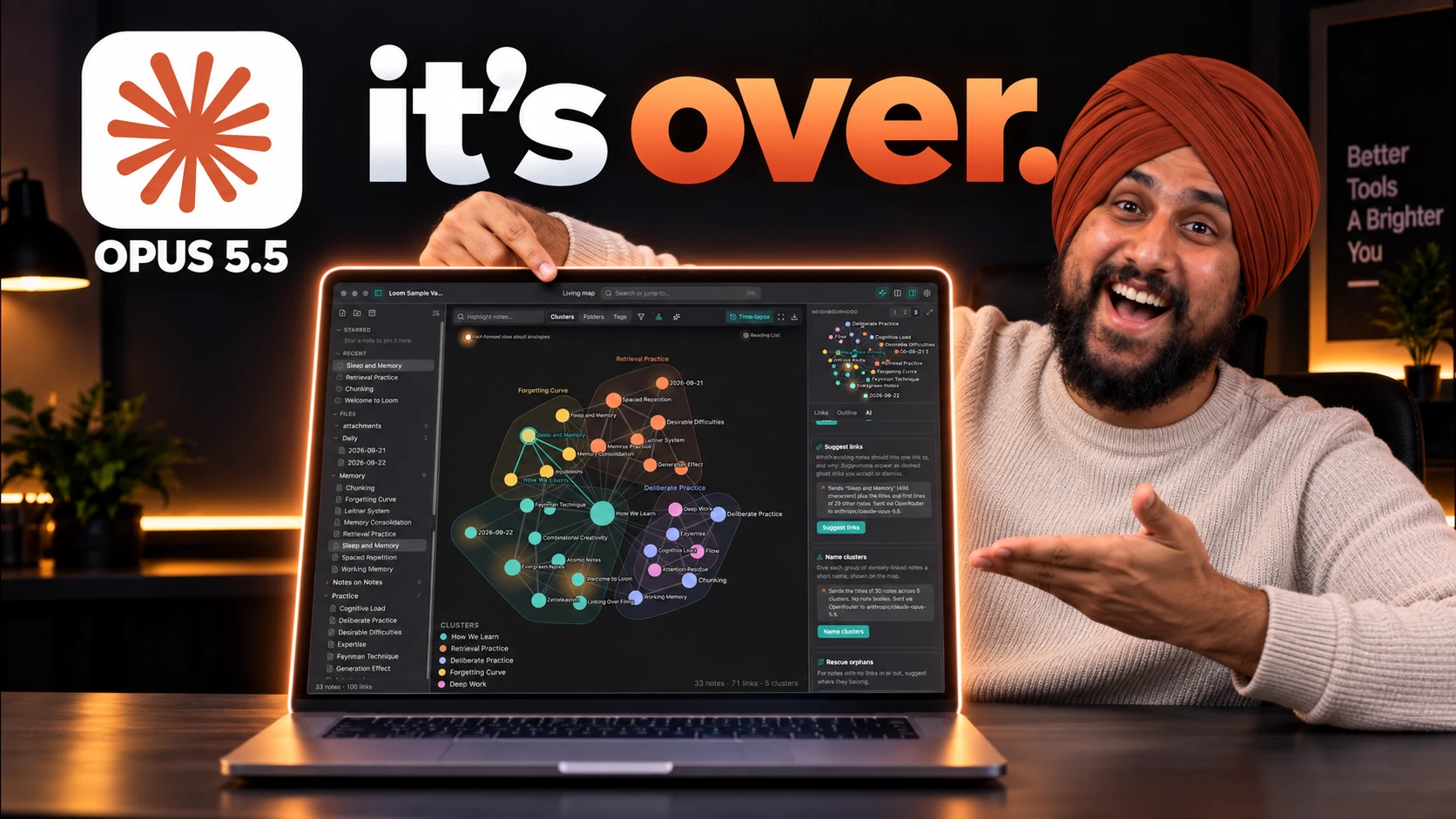
I will give Astra genuine credit here first: I liked its font choice, and its interface looked, in the moment, better than Opus 5.5's on pure visual polish. But the experience underneath did not hold up. The property panel sat in the wrong place on the screen entirely. There was no graph view at all, even though the prompt asked for one. The knowledge map existed but I could not browse it. The time-lapse feature I specifically asked for in the prompt never appeared.
Opus 5.5's version worked the way Obsidian actually works. Clicking the knowledge map navigated between pages correctly. The graph view rendered and was browsable. The time-lapse played exactly as requested, precisely matching what I asked for in the prompt.
My verdict: Opus 5.5 wins clearly, because roughly 40% of the features I asked for were never built by Astra, while Opus 5.5 delivered all of them in one prompt.
The Scorecard
| Round | Winner | Why |
|---|---|---|
| Pigment AI SaaS | Opus 5.5 (function) / Astra (visual polish) | Astra's logo color extraction failed entirely; Opus 5.5's studio had working live controls |
| Watchmaker 3D site | Opus 5.5 | Astra ignored the explicit instruction to reuse the 3D model |
| Tumble marble-run game | Opus 5.5 | No sandbox controls and no ramp-attachment on Astra |
| Flight simulator | Opus 5.5 | Missing propeller and hard-to-manage controls on Astra, despite strong environment art |
| Obsidian clone | Opus 5.5 | Roughly 40% of requested features never built on Astra: no graph view, no time-lapse |
Four outright wins for Opus 5.5, one split decision where Astra earned real credit on visual design. Zero outright wins for Astra on functionality across five identical prompts.
What People Are Building And Arguing About
I checked X to see if my own results matched what other people are finding this week.
A direct cost comparison that matches what I found on pricing, running Opus 5.5 at medium effort against Astra at high on real workloads:
https://x.com/Maplaipz/status/2103109412055363917
A useful counterpoint I don't want to bury, because I do not want this article to read as a one-sided win. One builder gave both models the exact same hard 3D task, an homage to the legendary 96kb game kkrieger, and reported both models struggled and burned tokens without nailing it:
https://x.com/Bad_AI_/status/2103109762569195722
A token-usage complaint specific to Astra, echoing my own cost findings from a different angle:
https://x.com/songadaymann/status/2103109465574617156
That kkrieger post matters. It is a reminder that neither model is universally dominant, and my five rounds happened to land in areas where Opus 5.5 held up better. Your own results will vary by task.
My Honest Take
I went into this expecting Astra to win on visual polish and lose on price, and that is roughly half true. Astra's UI did look crisper in two of my five tests, and its flight simulator environment art was genuinely the best single visual moment in this whole comparison. If you are optimizing purely for how something looks in a screenshot, Astra earned real points here.
But polish is not the same as working software. Across five identical prompts at comparable-to-higher effort on Astra's side, I hit a broken logo color extractor, an ignored explicit instruction, a sandbox with no controls, a missing propeller, and a note app missing 40% of its requested features. Opus 5.5 did not have a single outright failure across the same five prompts, and it cost 2.5 times less per token to get there.
If I had to pick one model to build with today, on function, on cost, and on instruction-following, it is Opus 5.5. If I needed the single best-looking landing page or the richest environment art in one shot, I would not rule Astra out.
Here is the practical way I would put it to you if you are deciding between the two right now. If your workflow involves multi-step app generation where the output actually has to run, start with Opus 5.5 and only reach for Astra on the specific visual tasks where you have already seen it win. Do not assume either model's reputation carries over task to task, because my own results this week say it does not.
Frequently Asked Questions (FAQs)
Is Claude Opus 5.5 better than GPT-6 Astra?
In my five identical side-by-side tests, Opus 5.5 won 4 outright and split the fifth on visual design versus function. Independent benchmarking from Artificial Analysis also scores Opus 5.5 higher on intelligence, faster on output speed, and cheaper per task.
How much cheaper is Opus 5.5 than GPT-6 Astra?
Opus 5.5 costs $4 per million input tokens versus Astra's $10, a 2.5x difference on the same workload. Output pricing follows the same ratio: $20 versus $50 per million tokens.
Does GPT-6 Astra have an effort or reasoning setting like Opus 5.5?
Yes. Astra supports low, medium, high, xhigh, and max reasoning effort levels, the same naming convention Opus 5.5 uses. I ran Astra at xhigh and Opus 5.5 at high for this comparison.
Does GPT-6 Astra ever win against Opus 5.5?
Yes, on pure visual polish in some of my tests, particularly front-end crispness on a SaaS landing page and environment art in the flight simulator. Other builders have also reported both models struggling equally on genuinely hard 3D generation tasks, so results are not universal in either direction.
What was the biggest functional gap I found in GPT-6 Astra?
In the Obsidian clone test, Astra never built the graph view or time-lapse feature I explicitly requested in the prompt, roughly 40% of what was asked for. Opus 5.5 delivered every requested feature in the same single prompt.
Final Thoughts
Running the identical five prompts side by side is a more honest test than reading two separate marketing pages, and the gap I found was bigger than I expected going in. Opus 5.5 is not just cheaper, it followed instructions more consistently and shipped fewer broken states across the same workload.
That said, I do not think this settles it permanently. The kkrieger example on X is proof neither model is bulletproof, and Astra's visual design instincts genuinely impressed me twice in this comparison. Test your own specific use case before committing a workflow to either one.
I am putting all five prompts from both runs on promptslove.com along with everything else I use.