
 Chrome Extension
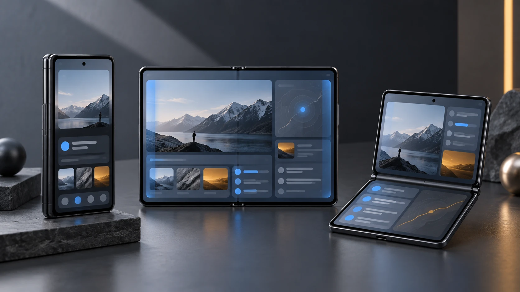
You are designing one iPhone app whose available space, control edge, height, safe area, and folding region can change while a person stays in the same task.
In this guide, I turn every meaningful scene into a design choice, a build move, and a test you can run. I also give you the prompt and reusable skill I would use to repeat the same audit on your own app.
Key Takeaways
What is official, and what is still early
Apple styles the product name as iPhone Duo. It is Apple’s first foldable iPhone, with an outer display, a folding inner display, a hinge, vertical controls, reserved regions, and Split View multitasking. The supplied YouTube video is an Apple Developer session, and Apple hosts the same session in its own Tech Talks library.
The design direction is official. The timing of the newest implementation APIs needs care. As of 12 September 2026, Apple’s developer hub still says the Xcode 27.1 beta and Device Hub support are coming later this month. Xcode 27 RC and iOS 27.0 RC are available, while iPhone Duo is scheduled to ship on 23 October with iOS 27.1.
For layout, Apple describes compact width as the outer-display foundation. Its engineering session says the inner display is regular in both dimensions. Read those traits at runtime because Split View, resizing, and other system changes can alter the space your app receives.
My publishing rule: I describe the design behavior as current Apple guidance. I label new 27.1 symbols as announced or upcoming until I can compile them in the released toolchain.
Do not turn hardware numbers into layout breakpoints Apple publishes panel specifications and separate App Store screenshot delivery sizes. Those numbers serve different jobs. Your app should read live scene and container geometry instead of calculating a Duo layout from inches, pixels, model names, or a guessed fold angle.
Think in changing usable regions, not device poses
The fastest way to make this harder than it needs to be is to draw a separate app for closed, open, book-like, seated, standing, portrait, landscape, Split View, and Picture in Picture. Apple’s video makes the opposite case. You should let one information hierarchy respond to compact or regular width, current height, safe-area insets, and any active reserved region.
I use pose names in a test matrix because they help a team reproduce physical conditions. I do not use them as a navigation model. A fold can change where you place a button, but it should not decide whether the button exists.
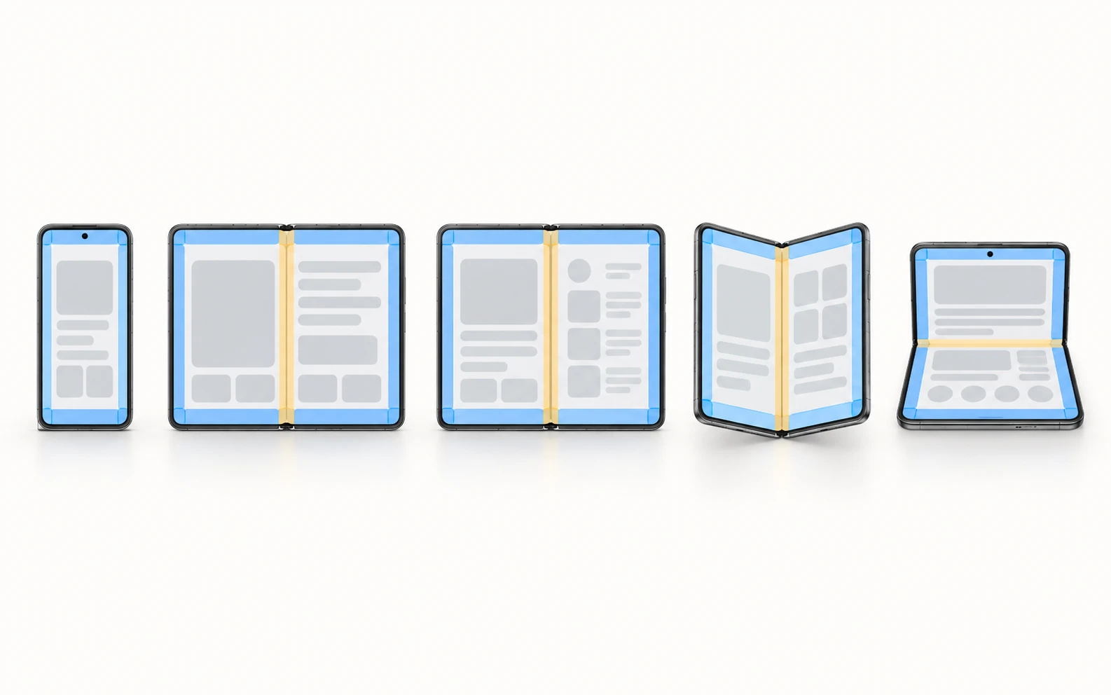
Original posture diagram created for this guide. Blue marks safe foreground zones. Amber marks a fold or reserved region that can affect interaction. These shapes explain the rule; they are not measured Apple templates.
If a person opens the phone halfway through composing a message, your layout may change. Their draft, focus, selection, navigation path, and available actions should remain.
Use four inputs in this order
From the Apple session
The five rules I pulled from the video
1. Closed and open are two scales of the same task
The first comparison shows a familiar compact experience on the outer display and a richer wide composition inside. The useful inner layout exposes context, such as list and detail together. It should not feel like a different product that happens to share an icon.
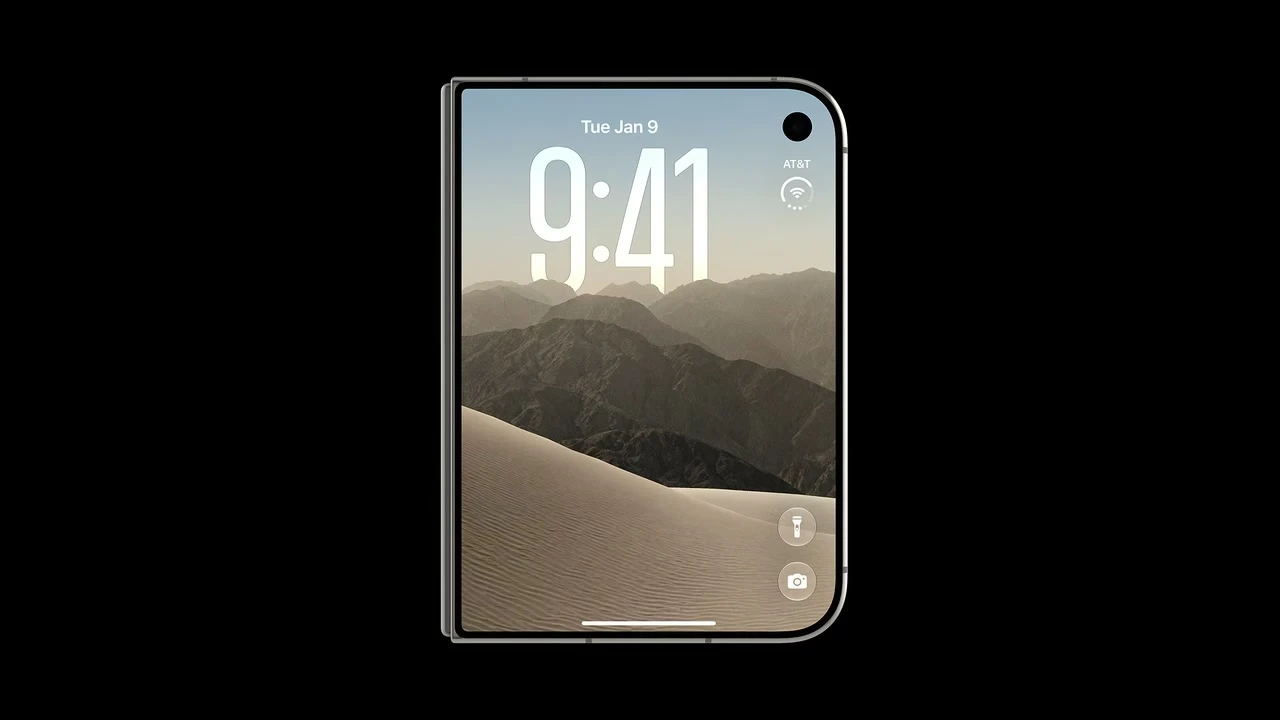
00:30. Start with a compact, complete task. Source: Apple Developer video.
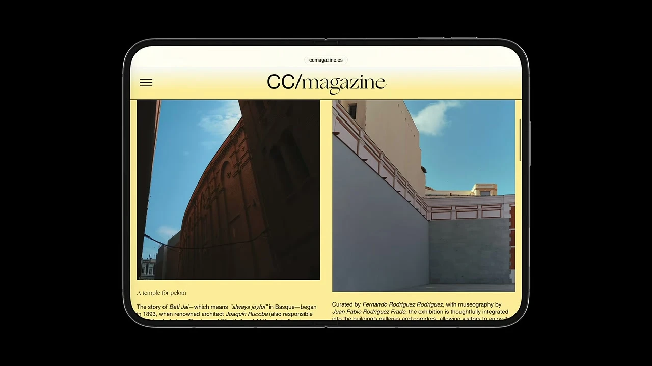
00:40. Let regular width reveal useful context. Source: Apple Developer video.
2. Free resizing is the real target
Two size classes provide a durable starting point, but the app also loses or gains height and width through Split View, pinned video, the keyboard, system activity, rotation, and folding transitions. I would review a continuous range of sizes instead of approving only two polished artboards.
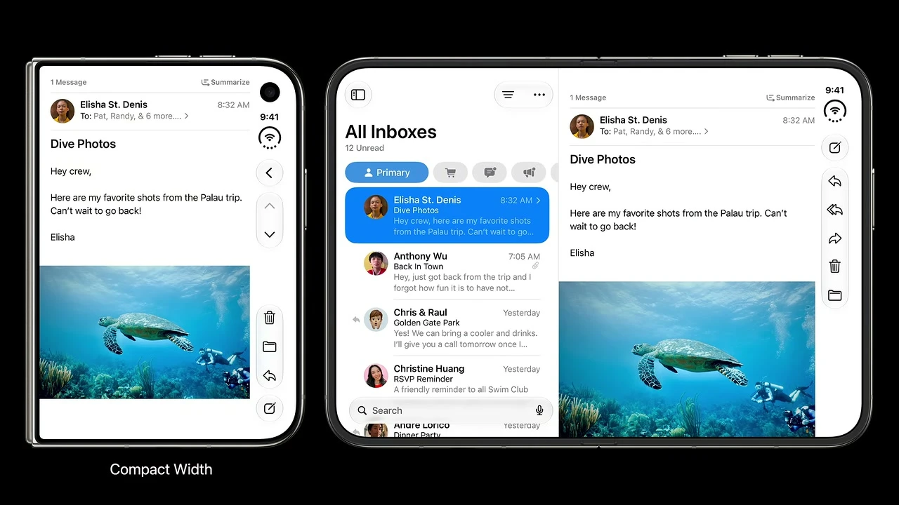
04:06. Use compact and regular width as structural decisions.
04:34. The strongest test is smooth behavior between named states.
3. Controls move to protect vertical content
On the outer display and inner landscape, standard navigation, toolbar, tab, status, and Dynamic Island content can share a vertical side region. Inner portrait is the key exception and keeps horizontal bars. If you own a custom bar, you do not inherit all of this behavior for free.
4. Safe areas protect interaction, not every pixel of art
Ordinary text and controls belong inside the safe area. A background, header illustration, or suitable non-scrolling visual can extend farther if it stays visually sound and leaves interaction clear. This layer-by-layer decision gives you a better result than calling ignoresSafeArea() on the whole screen.
5. Fold avoidance should be small and purposeful
Apple’s system components move alerts, sheets, menus, navigation, and priority UI around active obstacles. For custom layouts, protect the element that must remain whole, such as a slider thumb, a face, or a short label. Do not shove every item far from the center, and do not displace a continuous feed merely because it scrolls across the fold.
Build an environment matrix
I make this matrix before opening Figma because it stops pose screenshots from becoming isolated deliverables. Choose the rows that matter to your product, then connect every row to a real task and a transition test.
| Configuration | Adaptive input | Content structure | Control placement | Stress test |
|---|---|---|---|---|
| Outer display, closed | Compact width | Single-pane compact hierarchy | Vertical bar on the right hardware edge | Primary flow, large text, expanded Dynamic Island, one-hand reach |
| Inner display, fully open landscape | Regular width | Split, two-column, or intentionally wide composition | Vertical bar on outer hardware edge | Open mid-task, rotate, activate camera, compare state and action order |
| Inner display, portrait | Regular width | Tall single or multi-column composition | Standard horizontal bars | Rotate while editing or playing media; verify no reset and no stray vertical rail |
| Partially folded, book-like | Size class plus active division region | Two usable regions divided by the curve | Controls toward outer edges | Fold slowly and rapidly; check text, focal images, controls, focus, and VoiceOver order |
| Partially folded, tabletop | Container geometry plus active division region | Viewed content above, interaction on stable lower half when helpful | Pose-appropriate system bars | Tap every control, show keyboard, open/close without moving or losing the task |
| Standing on edges | Actual container size | Freely resizable composition | System-selected placement | Exercise primary flow at each supported orientation and reach zone |
| 50/50 Split View, app on left | Often compact width; verify actual traits | Independent compact pane | Vertical bar on left outer hardware edge | Test RTL separately; hardware rail stays left while content direction localizes |
| 50/50 Split View, app on right | Often compact width; verify actual traits | Independent compact pane | Vertical bar on right outer hardware edge | Resize and swap sides; selection, navigation, and overflow remain stable |
| Top-pinned Picture in Picture | Variable height and width | App occupies remaining region below video | Adapts to available rail space | Vary PiP height, keyboard, and fold state; no overlap or playback reset |
| Keyboard or expanded system activity | Current available space | Compresses content and bars | System overflow may increase | Type at large text size while Live Activity is active; inspect overflow and dismissal |
You do not need every row for every screen. A reading app may care deeply about book-like folding and continuous scroll. A camera app may care more about the active inner camera, scene accessories, and a stable lower interaction zone. Keep the matrix connected to actual user work.
Compact width
Design the outer display as a complete app
The outer display is not a preview panel. A person should be able to finish the primary task there. Your compact design may show one pane at a time, but it must keep every essential destination, action, status, and route to secondary content.
Start with content inside asymmetric safe areas
The vertical control region changes the usable center of ordinary content. In Split View, the app may sit on either side of the inner display and the hardware edge can change. Treat top, leading, bottom, and trailing insets separately. Never subtract one guessed rail width or assume both sides match.
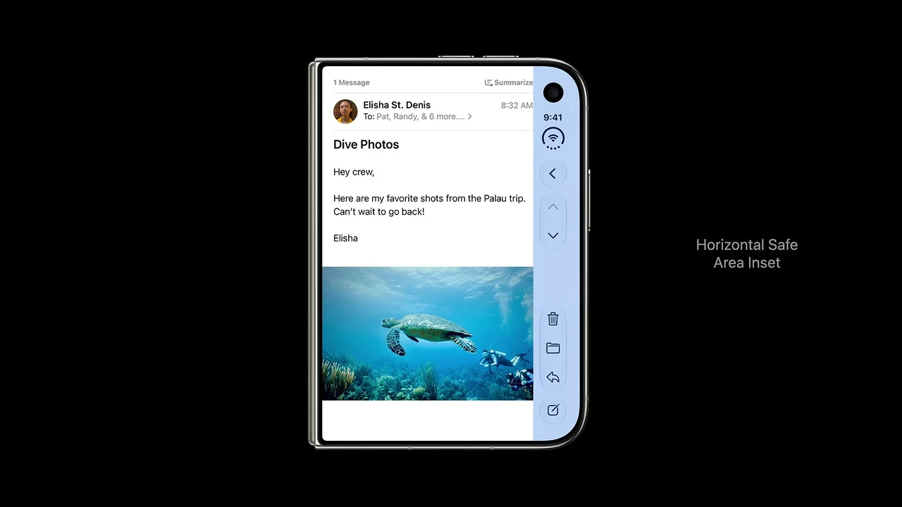
07:00. The system inset shifts normal foreground content away from the shared side region.
Separate the background from the foreground
I split each screen into three layers during review: background art, readable content, and interaction. Background art may fill view bounds. Readable and interactive layers usually stay inside the safe area. A non-scrolling immersive instrument can use the full display only if status, camera, and control regions cannot obscure meaning or input.
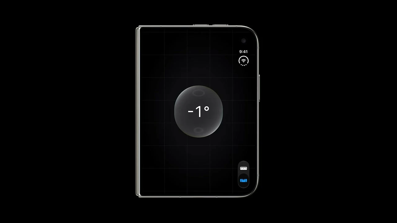
07:13. A focused visual tool can use the whole display after a clearance check.

07:25. Full-width art and safe foreground content can coexist in one screen.
Compact does not mean stripped down
If a secondary panel becomes visible beside the primary panel at regular width, give compact width a push, sheet, or explicit control that reaches the same content. The inner display may reveal more at once. It should not own a feature that disappears when the phone closes.
Regular width
Let the inner display expose useful structure
A stretched compact screen wastes the main advantage of the inner display. Ask what context helps a person make the current decision. In Mail, list and detail belong together. In Health, two related summaries can sit in columns. In a destination-heavy product, a sidebar can keep navigation visible.
NavigationSplitView or UISplitViewController. Collapse to one pane at compact width without losing selection.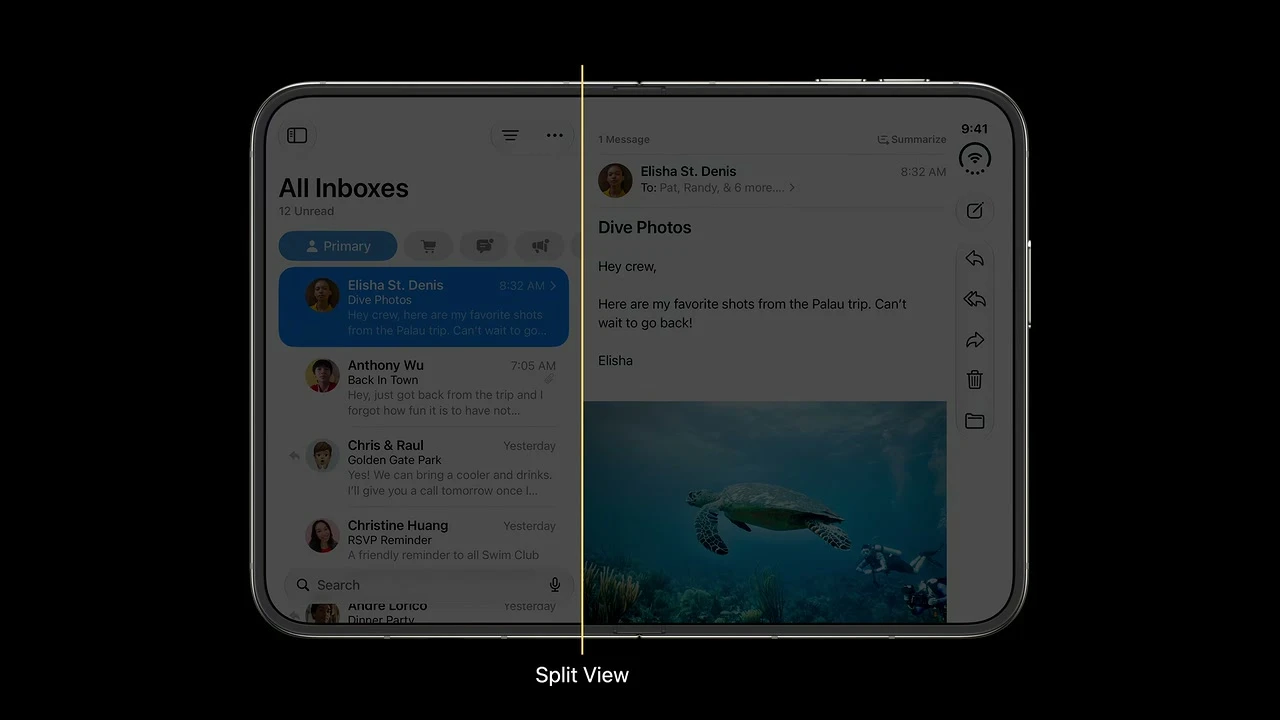
07:48. Expose another hierarchy level when it helps the current task.
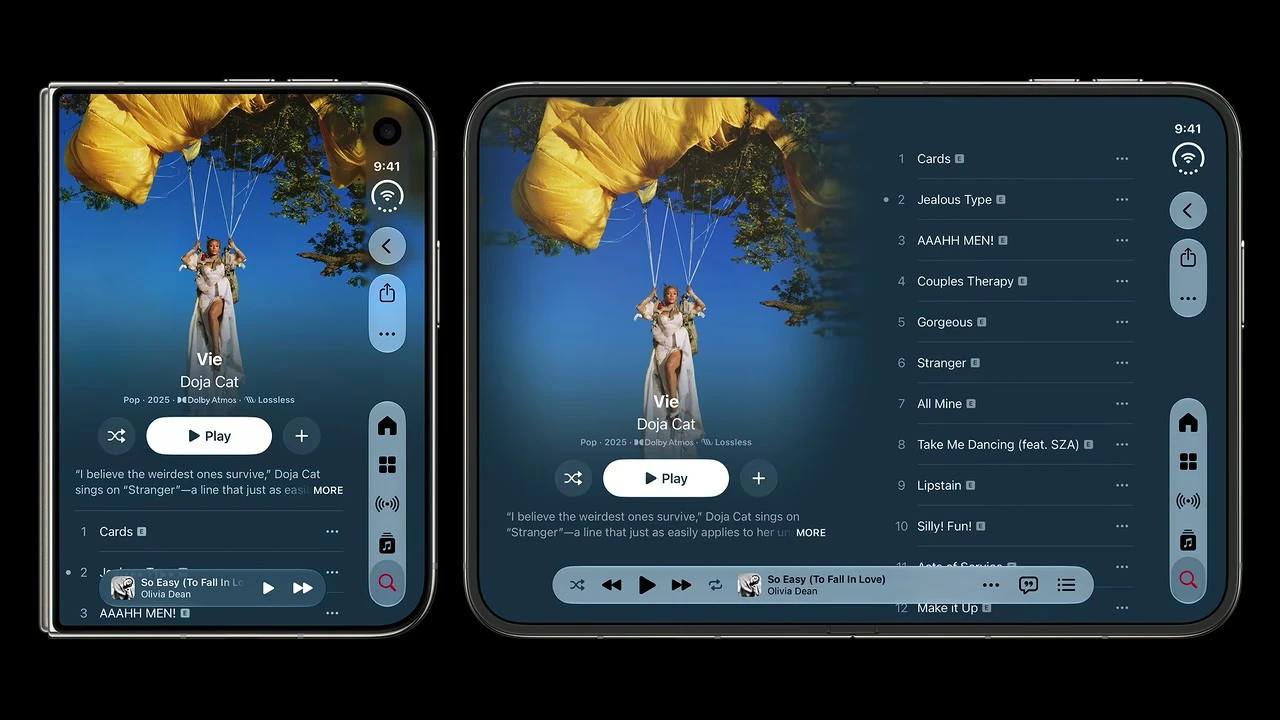
08:13. Reflow related material instead of magnifying a phone column.
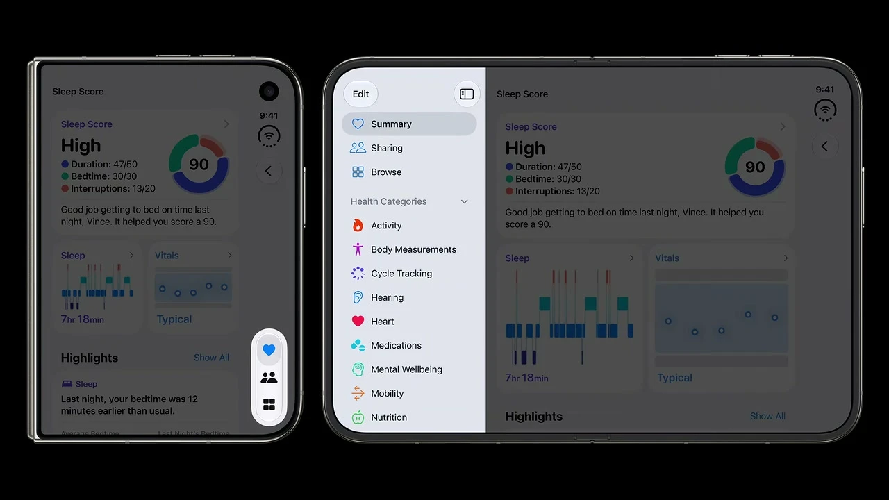
08:30. A sidebar is a product decision based on navigation density, not a required Duo decoration.
Navigation and actions
Make vertical controls predictable under pressure
The shared side region has a fixed width and changing height. Dynamic Island, Live Activities, status, navigation, toolbars, and tabs can compete for space. Your job is to give the system clean semantics and a real priority order.
Classify every item before you move it
Map top groups near the top and bottom groups near the bottom. Keep related actions together. Favor symbols where the meaning stays clear, and always provide a title because the system can use it in overflow, expanded forms, and accessibility.
In an in-app split hierarchy, the detail column joins the shared vertical bar. An inspector does not receive a separate rail of its own. This is another reason to express navigation and accessory relationships through the system containers instead of drawing one custom strip per column.
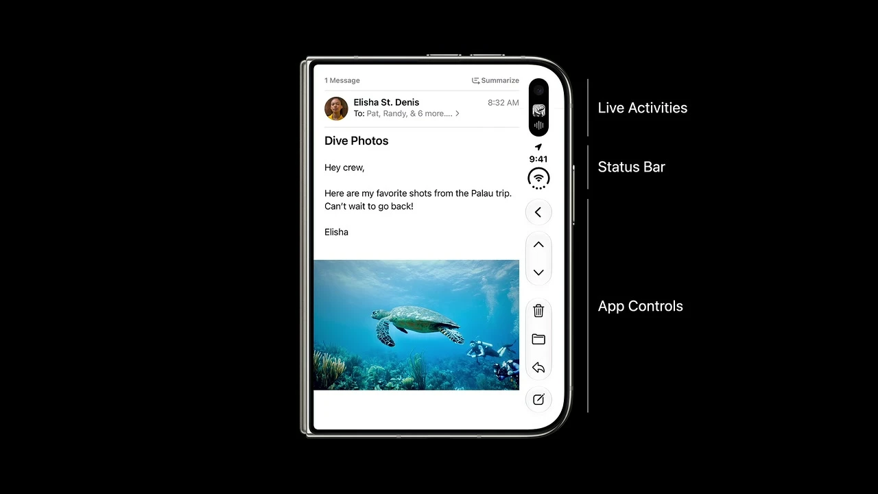
05:45. App buttons share height with system content.
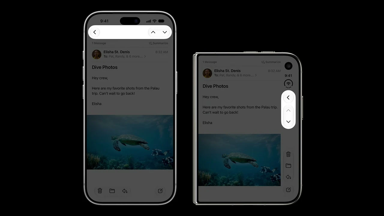
06:08. Preserve familiar grouping while the axis changes.
Keep wide controls horizontal
A text button, segmented control, search field, or element that carries information by width may belong in a horizontal bar. Forcing it into a narrow vertical strip can hurt localization, target quality, and comprehension. Let form follow meaning.
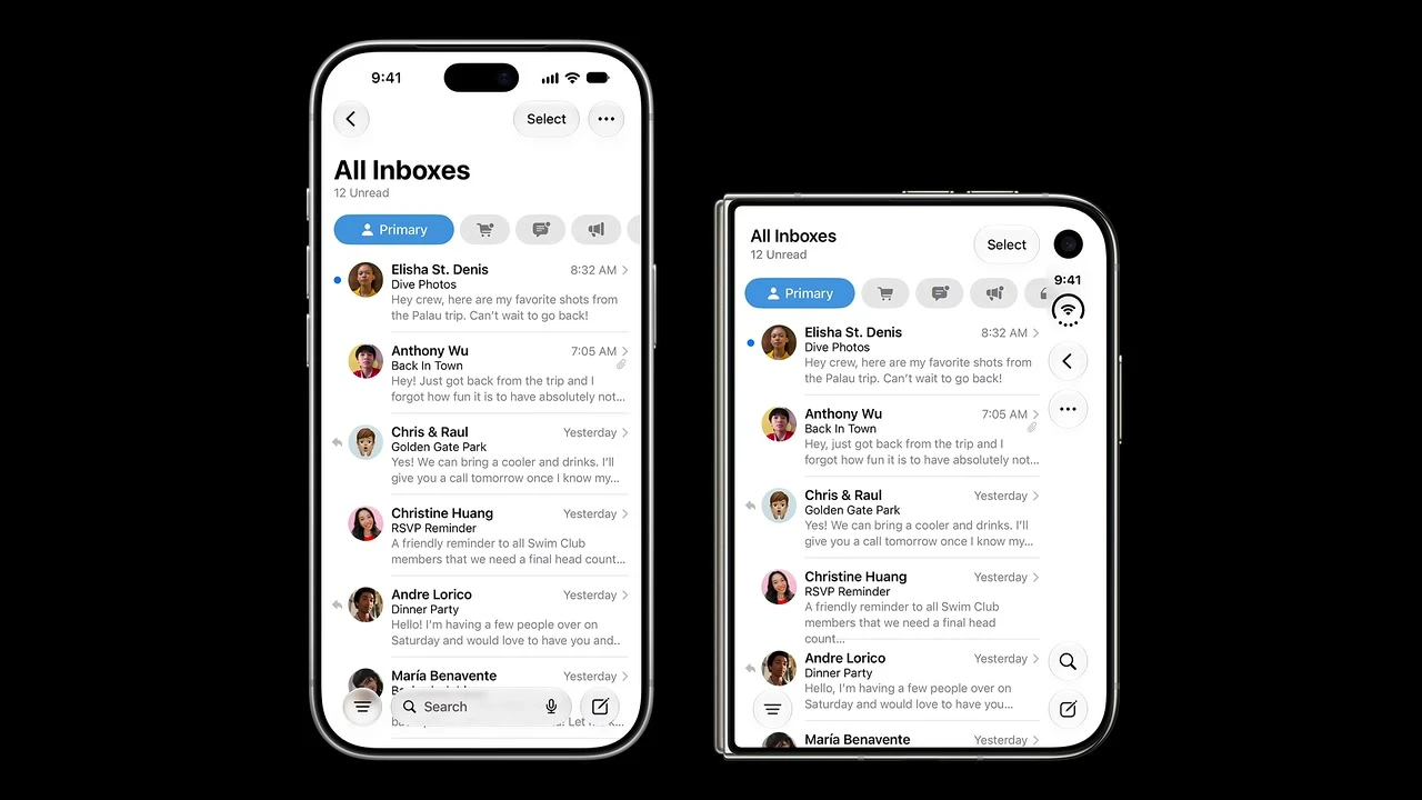
06:26. A wide or text-heavy action can stay horizontal instead of squeezing into the rail.
Two edge rules people often miss In two-app Split View, each app’s vertical controls sit at its outer hardware edge. A left-side app gets a left-side rail. The rail is hardware-aligned, so it does not mirror just because the language changes to right-to-left. Localize the content direction and test the hardware edge as separate concerns.
Reserved regions
Treat the folding region as live geometry
The fold is a division region when it is active and effectively has zero width when the phone is flat. Cameras produce occlusion regions. This difference matters because you should not draw a permanent seam into a flat layout or reserve empty space on every screen.
What should move
What can stay continuous

02:20. Group meaningful content on either side and keep interaction away from the curve.
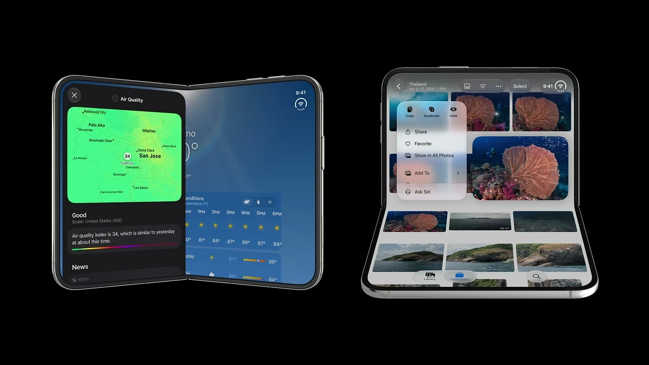
09:38. Standard components handle much of the displacement automatically.
Use the lower region for stable tabletop interaction
When a person props the phone on a surface, viewed-at-a-distance content can sit above and controls can sit on the stable lower region. This is useful for media, calls, capture, monitoring, and guided tasks. It remains an optional arrangement of existing content, not a new feature mode.
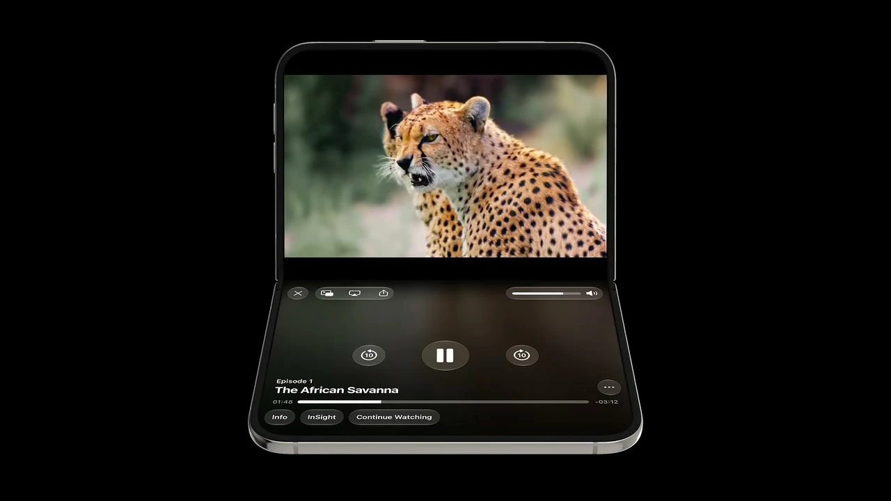
02:36. Put interaction on the stable lower region when the use case benefits from hands-free viewing.
Width and height can change live
Design for Split View and pinned video
Apple uses Split View in two different ways, and your team should name which one it means. System Split View places two apps side by side. An in-app split view exposes two levels of your own hierarchy. The new arrangement APIs describe the relationship between two pieces of content, not navigation.
For system Split View, test your app on the left and right. Read the traits and bounds you actually receive. Do not assume half the inner display always maps to one class or one fixed number.
iPhone Duo also brings multiple UI instances to iPhone. A new window can be created on the inner display, while a request from the outer display can fail. Handle that result and keep each scene’s navigation and editing state independent.
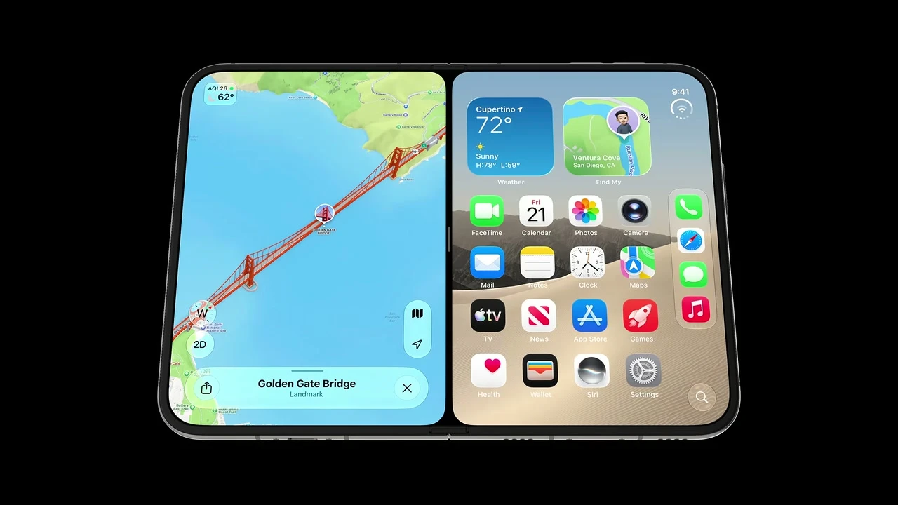
02:56. A second app changes your container without changing the user’s intent.
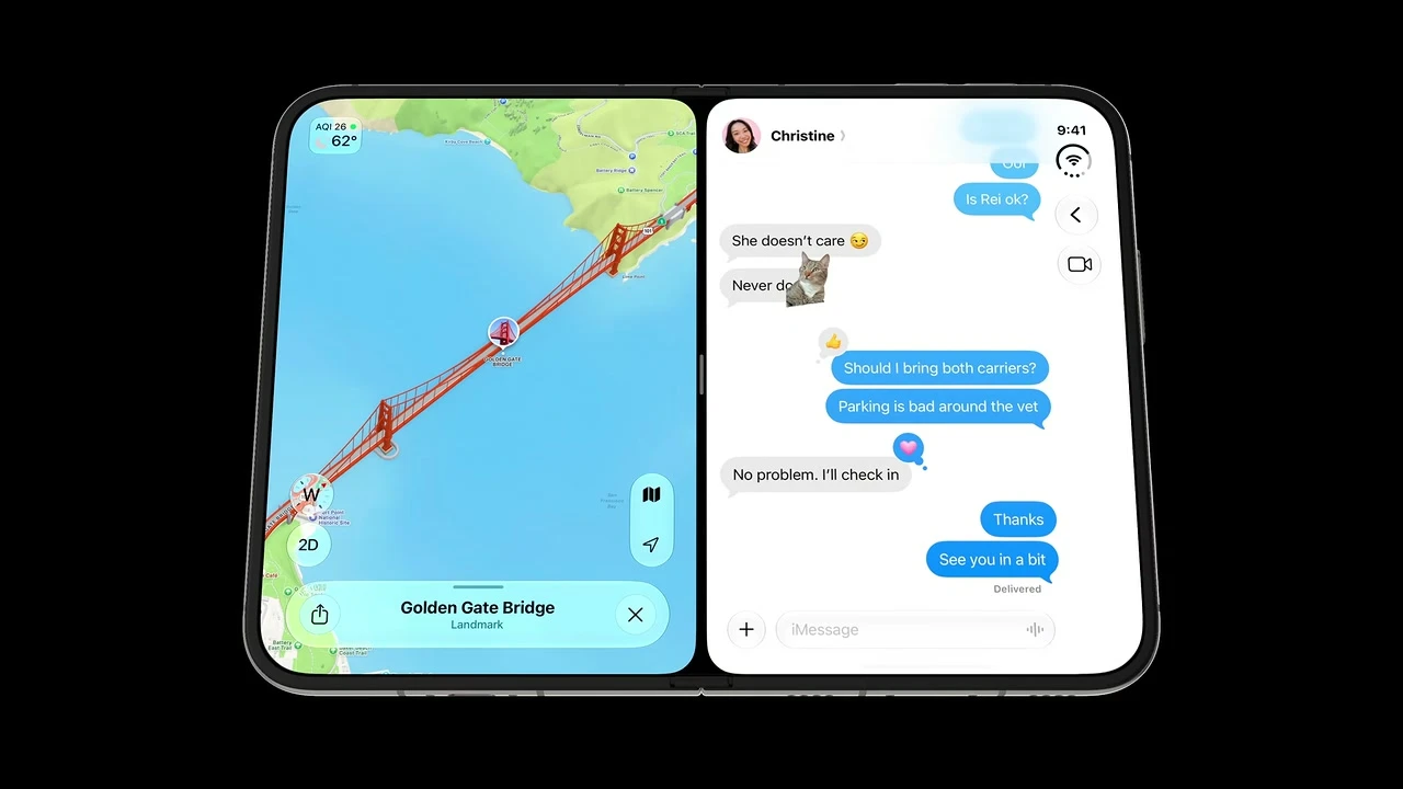
03:04. Each half must remain complete, and each rail stays on an outer edge.
Pinned Picture in Picture can reduce height instead of floating over the app. The message composer, media controls, keyboard, and scroll position must survive that change. Test the transition, not just the final screenshot.
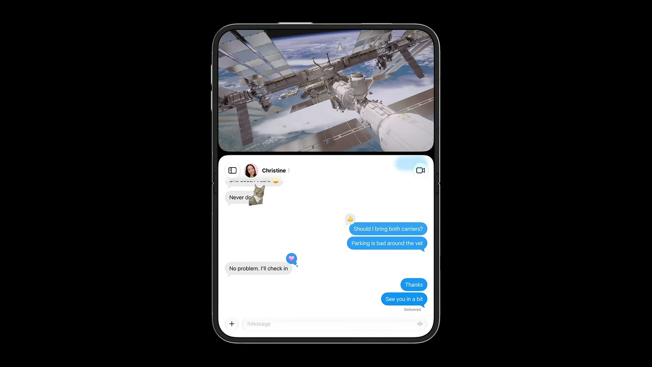
03:28. The app resizes below a pinned video.
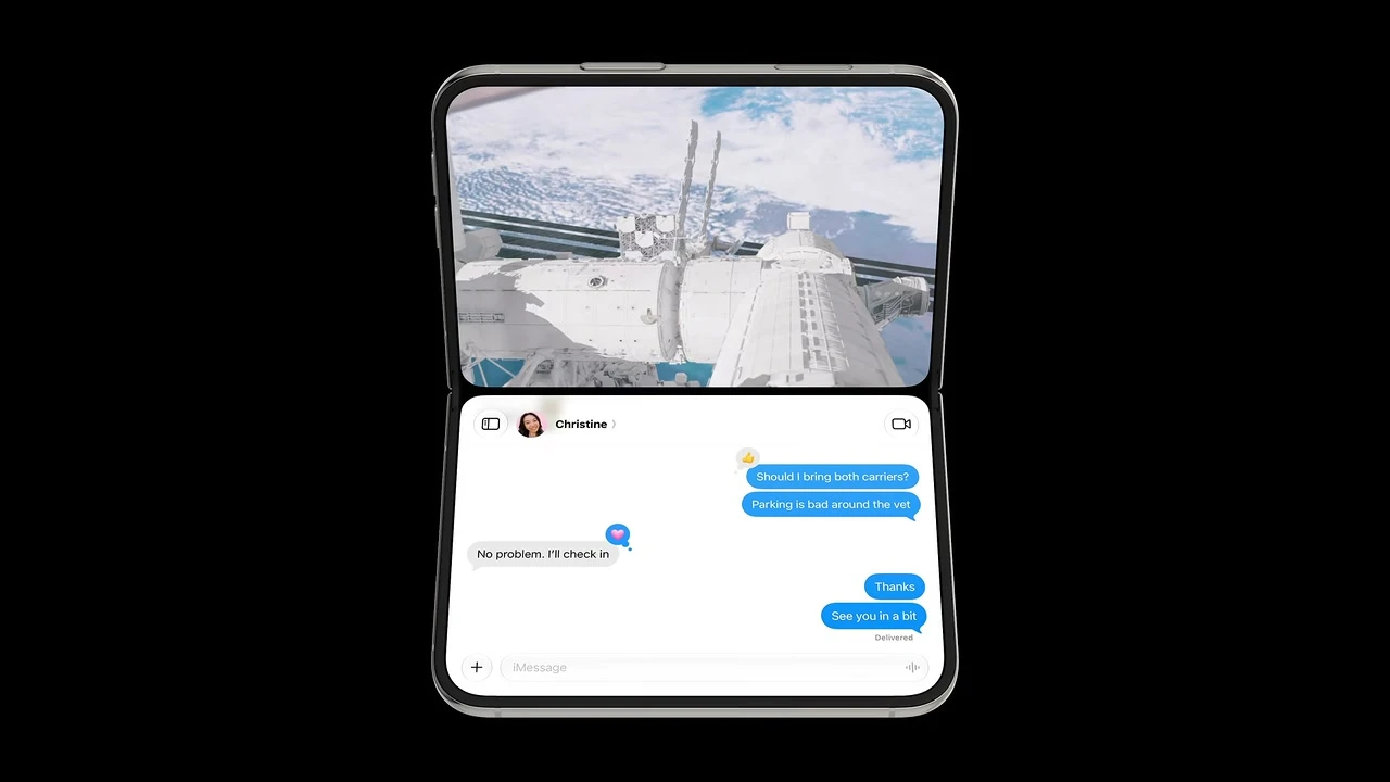
03:36. Folding can turn the same pair into two stable regions without resetting either task.
Transient interface
Audit every sheet, menu, alert, and popover
System presentations earn their keep on Duo. Outer-display sheets normally use vertical controls. Inner-display sheets use horizontal bars. In a partial fold, a standard sheet can move away from the folding region. A custom lookalike does not gain that behavior by appearance alone.
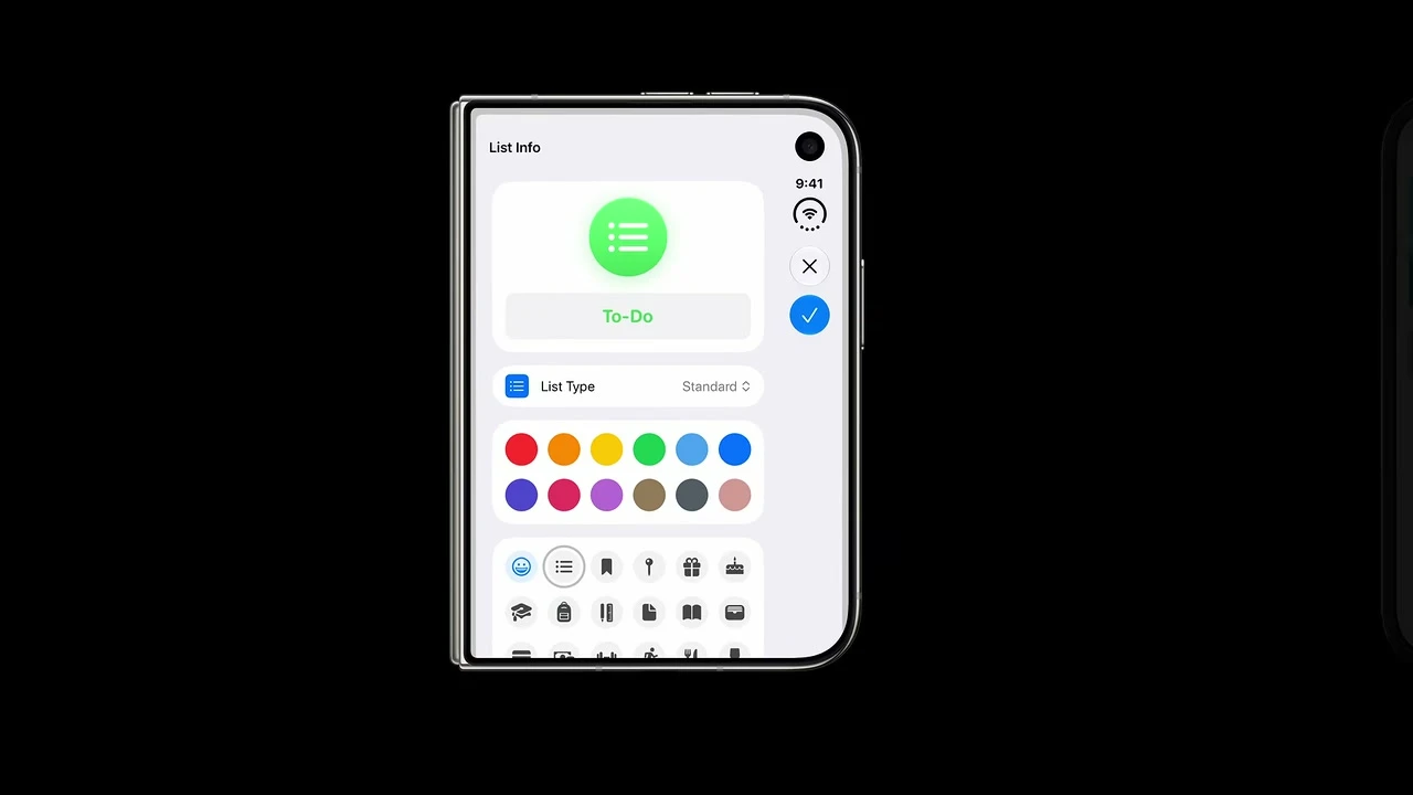
08:46. Outer sheet with the default vertical control treatment.
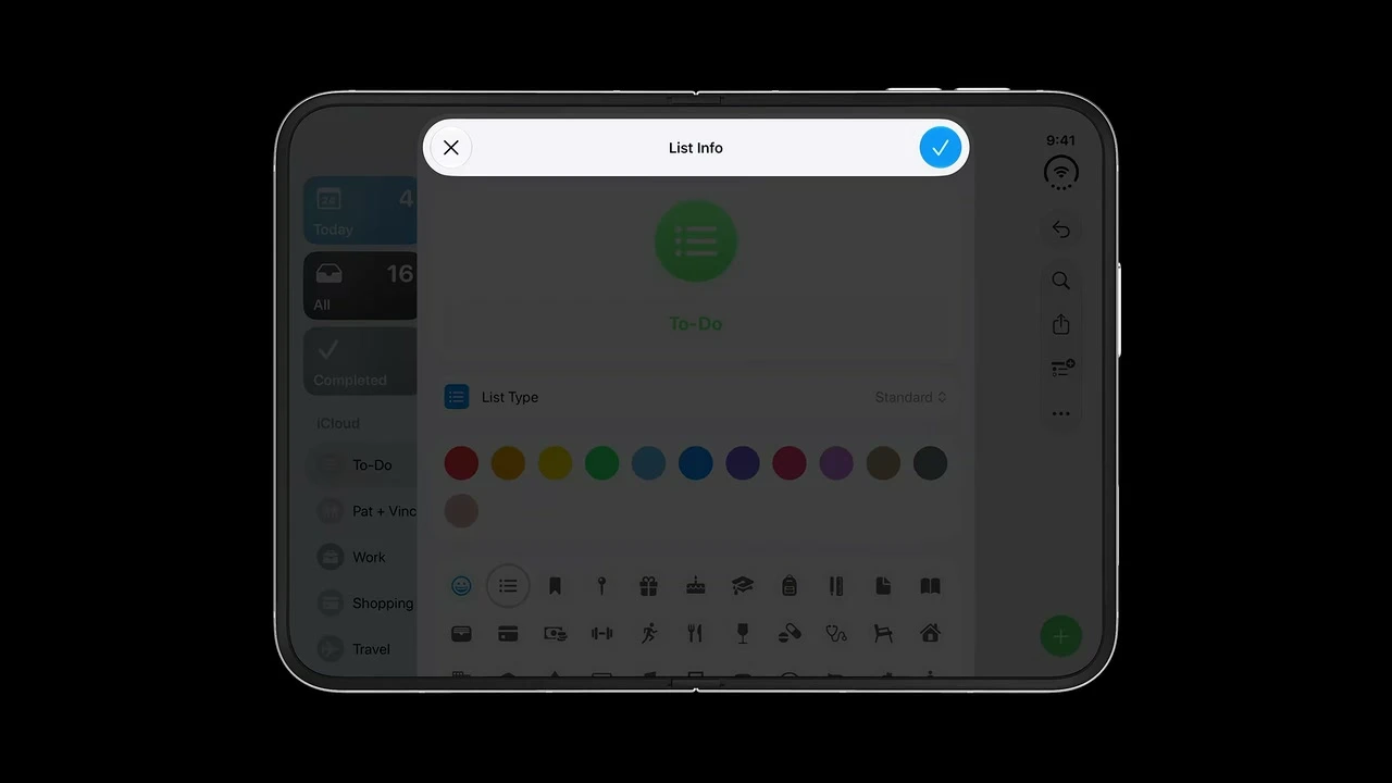
09:16. Inner sheet with familiar horizontal bars.
A one-action sheet can justify disabling the vertical behavior, but treat that as an exception with a written reason. For each presentation, test detents, keyboard entry, dismissal, rotation, open and close transitions, and the identity of the edited item.
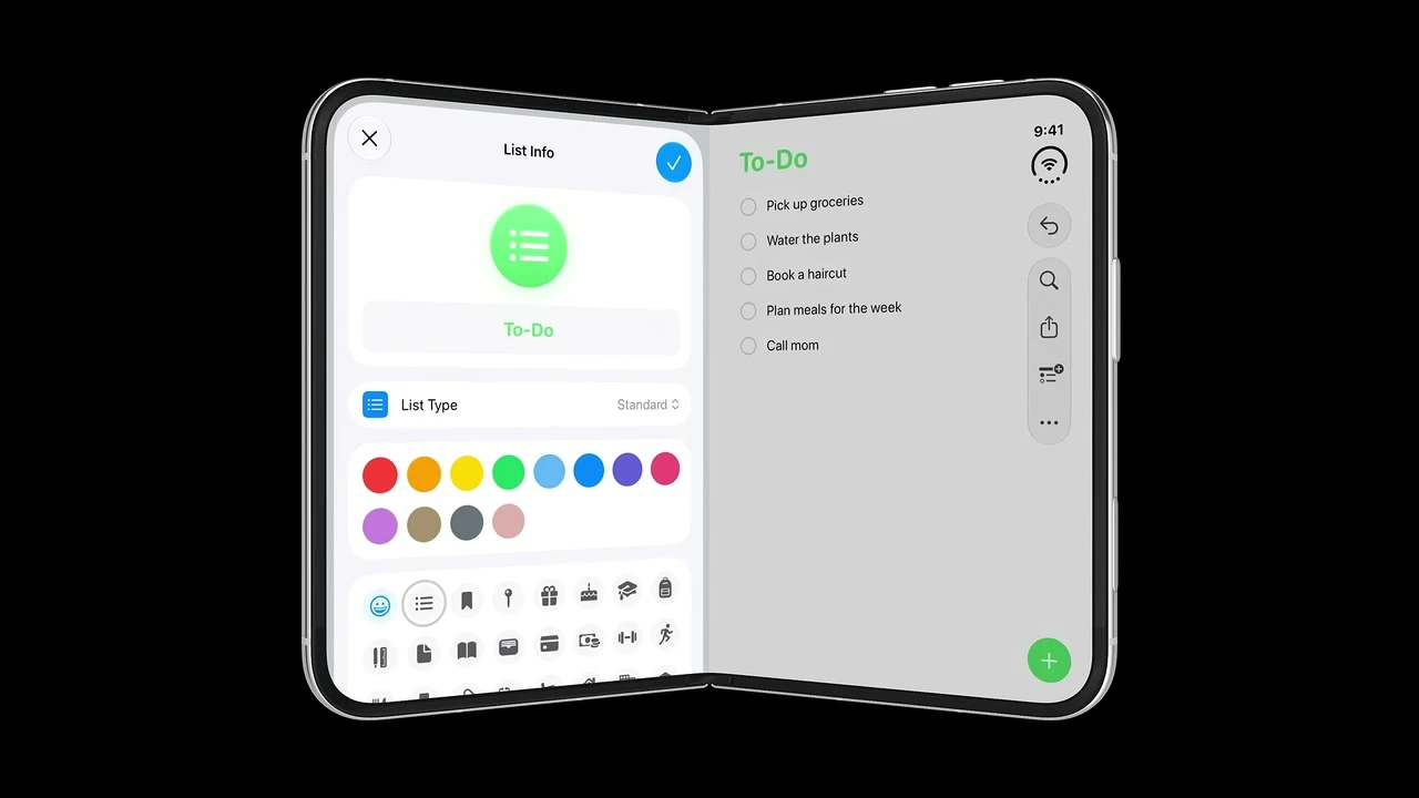
09:24. The standard sheet shifts away from the active curve.
The hidden architecture work
Keep state above adaptive layout branches
A Duo redesign can look correct and still feel broken if a fold resets the task. I treat continuity as a product requirement and an ownership problem. The view that changes shape should not own the only copy of important state.
What keeps me honest is a simple transition test: start a real task, change the physical or multitasking condition, and continue without retracing a step. A static snapshot cannot prove this.
SwiftUI and UIKit
Develop in two tracks
You can remove brittle layout assumptions now. You can also prepare the architecture that lets new Duo behavior slot in later. Keep announced 27.1 API work in a separate track until the symbols compile in the installed SDK.
Track 1: work you can start now
UIScreen.main .SwiftUI structure
struct AdaptiveLibrary: View {
    @Environment(.horizontalSizeClass) private var widthClass
    @State private var selection: Book.ID?
    @State private var path = NavigationPath()

    var body: some View {
        Group {
            if widthClass == .regular {
                NavigationSplitView {
                    BookList(selection: $selection)
                } detail: {
                    BookDetail(selection: selection)
                }
            } else {
                NavigationStack(path: $path) {
                    BookList(selection: $selection)
                }
            }
        }
        // The state lives above the adaptive representation.
    }
}
Safe foreground over a full-bleed background
ZStack {
    ArtworkBackground()
        .ignoresSafeArea()

    ScrollView {
        ReadableForegroundContent()
    }
    // This foreground follows the safe area by default.
}
UIKit geometry
override func viewDidLayoutSubviews() {
    super.viewDidLayoutSubviews()

    backgroundView.frame = view.bounds
    foregroundView.frame = view.bounds.inset(by: view.safeAreaInsets)
}

let widthClass = traitCollection.horizontalSizeClass
let activeScreen = view.window?.windowScene?.screen
Track 2: announced iOS and Xcode 27.1 work
Apple’s sessions discuss reserved-region queries, arrangement views, hinge interaction, vertical-bar control, overflow priority, and a Duo simulator in Device Hub. These are the right ideas to plan around. The exact spelling, availability, and runtime behavior must be checked in the toolchain you actually install.
// Conceptual review pattern based on Apple's announced API direction.
// Compile-check names and availability in the released 27.1 SDK.

GeometryReader { proxy in
    let divisions = proxy.reservedRegions(kind: .division)
    let occlusions = proxy.reservedRegions(kind: .occlusion)

    CustomCanvas(
        divisionRegions: divisions,
        occlusionRegions: occlusions
    )
}
Do not drive layout from hinge angle Apple exposes hinge information for interactions and effects. Use size, arrangement, safe-area, and reserved-region behavior for layout. Always handle the absence of hinge data.
My step-by-step iPhone Duo workflow
Acceptance tests your team can sign off
I would attach one screenshot for static geometry and one short recording for each stateful transition. The pass condition should name what must remain true, not merely say that the screen looks good.
| Review item | Track | Pass condition |
|---|---|---|
| Discovery: Find brittle layout assumptions | Now | Each finding names its container and affected configuration |
| Discovery: Define continuity state | Now | Opening, closing, resizing, or folding does not recreate state |
| Layout: Build environment matrix | Now | Every critical flow has a static and transition test |
| Layout: Design compact outer structure | Now | Primary task completes with all actions and no clipping |
| Layout: Design regular inner structure | Now | Regular width adds context without changing features or hierarchy |
| Layout: Apply margins and safe areas per edge | Now | Full screen and both Split View sides have no obscured foreground |
| Layout: Stress variable height and width | Now | No overlap, stranded control, or task reset across the continuum |
| Controls: Supply clear labels and symbols | Now | VoiceOver and overflow show useful names for every action |
| Controls: Test left/right hardware edge | 27.1 gated | Left app rail stays left, right app rail stays right, RTL content still localizes |
| Fold: Adopt reserved-region handling | 27.1 gated | No fixed hinge gutter or hinge-angle layout breakpoint remains |
| Presentations: Validate outer, inner, and folded sheet bars | 27.1 gated | Outer default vertical, inner horizontal, folded placement clear of curve |
| Accessibility: Run accessibility and localization pass | Now | 44 pt preferred targets, logical focus order, long strings, usable contrast |
| QA: Run the Duo Device Hub matrix | 27.1 gated | Every relevant pose and both Split View sides pass in one build |
| Release: Compile-gate new APIs and test fallbacks | 27.1 gated | No unverified beta snippet is labeled production-ready |
| Release: Run physical-device regression | After hardware ships | Physical-device evidence replaces simulator-only assumptions |
Common mistakes I would flag
Treat the closed device as the compact, familiar handheld configuration
This is the baseline small canvas; the app cannot assume traditional iPhone proportions or the inner display's width.
Build move: Remove device-locked root sizing. Build the closed experience as a compact-width layout inside the actual container and safe area.
Pass condition: Complete the primary task on the closed display at compact width with no clipping, hidden action, or state loss.
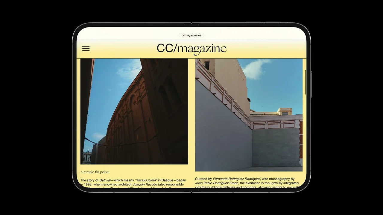
Use the open device as an immersive regular-width canvas.
The inner display should reveal a richer composition rather than merely enlarge a phone layout.
Build move: Add a regular-width composition that reveals useful hierarchy or columns without creating different features or state.
Pass condition: Open the device mid-task: regular width adds useful context, preserves selection/state, and avoids stretched text or empty space.
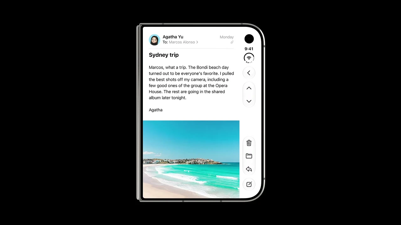
Move controls from the top and bottom to the side so the shorter display preserves vertical room for content.
The rail creates an uninterrupted content column and keeps common actions in thumb reach.
Build move: Use supported navigation containers and toolbar APIs so the system can form the vertical control region; keep foreground content in the safe area.
Pass condition: With Dynamic Island or a Live Activity present, content stays clear and all actions are reachable through the rail or overflow.
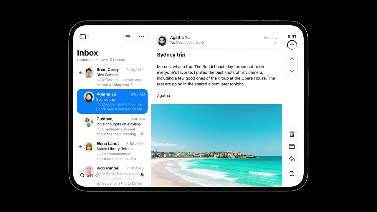
Use the side rail on the inner display in landscape as well.
It preserves vertical content space and keeps actions reachable without sacrificing the multi-column hierarchy.
Build move: Use a regular-width split or multi-column container. Keep detail actions associated with the detail region and the hardware outer edge.
Pass condition: Open, close, and resize Mail-like hierarchy: both panes remain legible and the current detail never resets.

Shift text, images, and interactive elements away from the curved center region.
The fold becomes a natural layout divider while content stays readable and controls remain easy to target.
Build move: Prefer system containers. For remaining custom controls, query active division regions and displace the smallest coherent group.
Pass condition: Partially fold in book pose: no essential word, image focal point, or target sits in the active center curve.
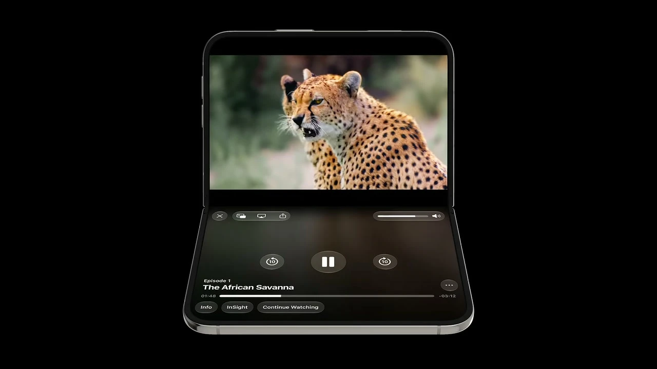
In the portrait tabletop pose, place interactive controls on the stable bottom half.
Lower-half controls are easier to reach and do not destabilize the device during taps.
Build move: Treat tabletop as an optional composition. Keep the same actions and shared state while moving viewed content above and interaction below.
Pass condition: In tabletop pose, tap every action without moving the device; the same actions remain reachable after fully opening or closing.
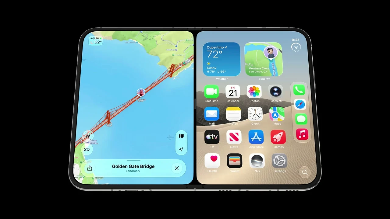
Support the familiar home-gesture flow that creates split view by dragging an app to the side.
A predictable system interaction lets people add a second app without learning a new layout model.
Build move: Make every scene freely resizable and participate in system Split View. Do not add a second app-launch model or a Duo-only gesture.
Pass condition: Enter and leave 50/50 Split View through the system gesture; the app remains functional with no custom transition conflict.
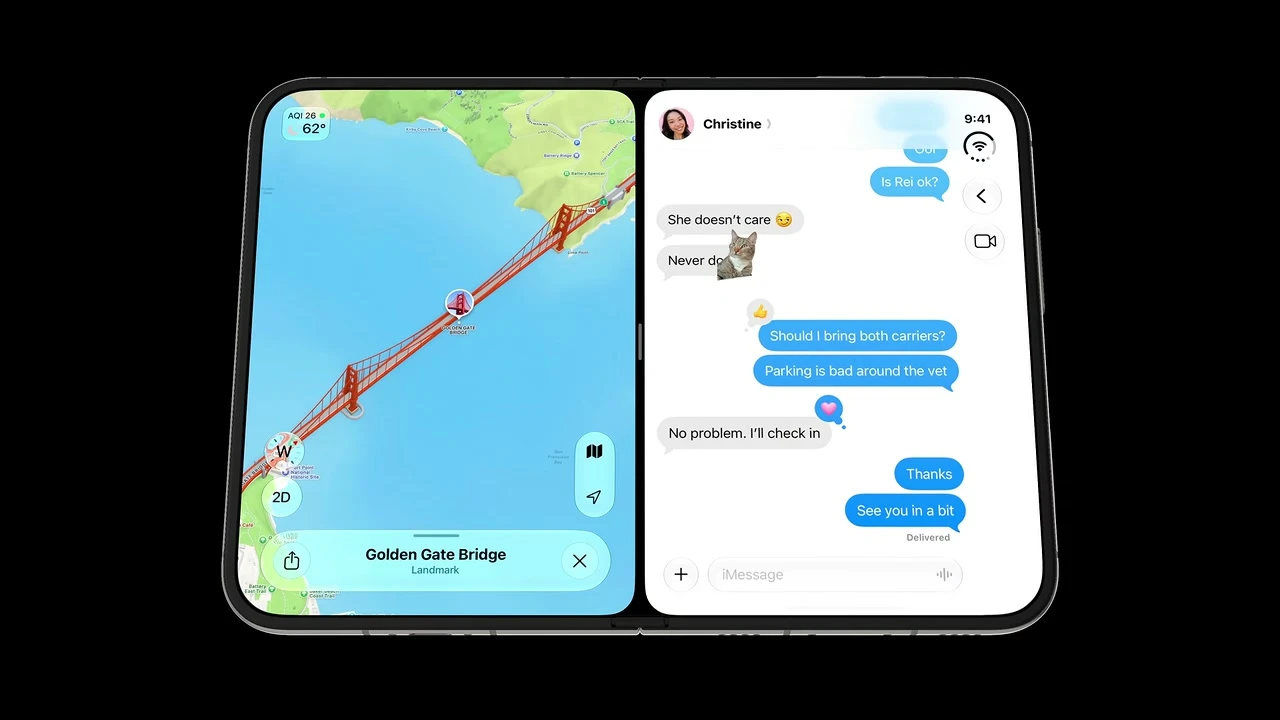
Each half should remain functional on its own and put its controls away from the fold.
This preserves thumb reach and keeps the center curve free of small targets.
Build move: Test compact behavior independently on both halves. Keep bars on each app's physical outer edge and all core actions available.
Pass condition: Run the app on left and right halves, including RTL. Controls stay on the correct physical outer edge and content localizes normally.
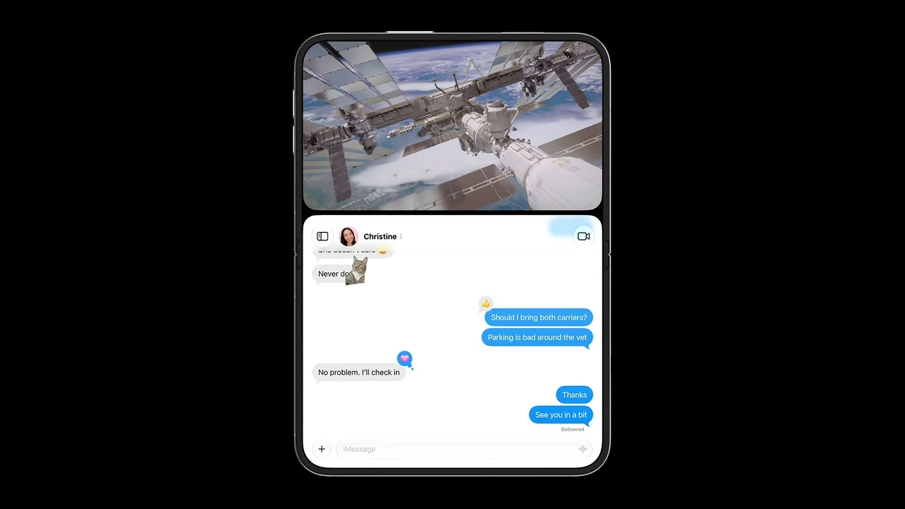
Let the active app resize vertically around a top-pinned picture-in-picture video.
Content remains usable while media stays visible, instead of being covered by a floating window.
Build move: Replace fixed heights with container-driven layout. Keep app state alive while Picture in Picture changes the available height.
Pass condition: Pin video at several heights and show the keyboard; content reflows continuously with no overlap or unreachable control.
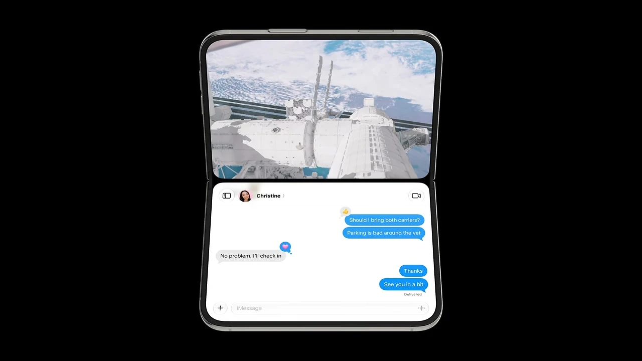
When the device folds, expand pinned video to one half and resize the app into the remaining half in real time.
The fold supplies a stable media/content boundary and avoids awkward floating geometry.
Build move: Bind playback, selection, scroll, and navigation to long-lived state above adaptive branches so folding doesn't reset the task.
Pass condition: Fold and unfold during playback: time, rate, PiP, active cue, transcript scroll mode, selection, and sheet identity persist.
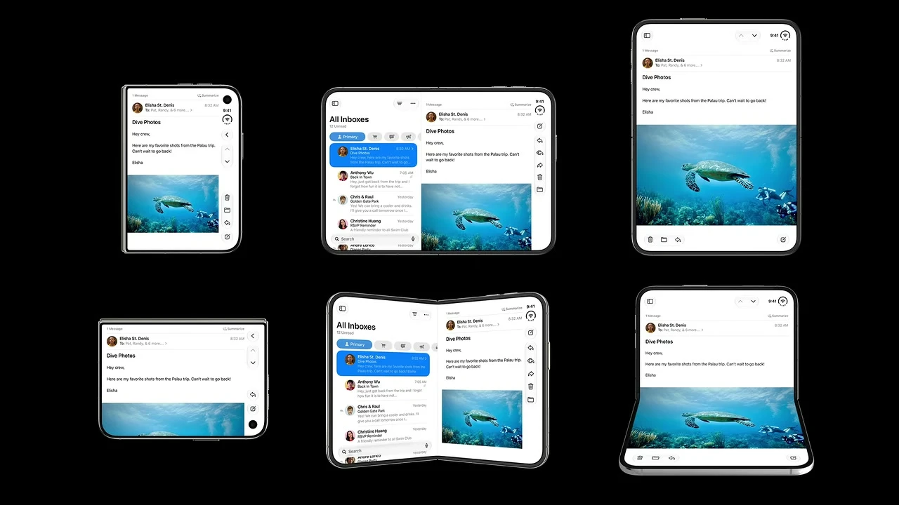
Plan for continuous adaptation across poses rather than building a custom layout for every posture.
The same information architecture must survive rotation, folding, opening, closing, and resizing.
Build move: Use one compact/regular architecture plus reserved-region adaptation. Maintain a transition test matrix instead of pose-specific screens.
Pass condition: Transition through every relevant pose in one session; features, labels, hierarchy, and navigation path remain consistent.
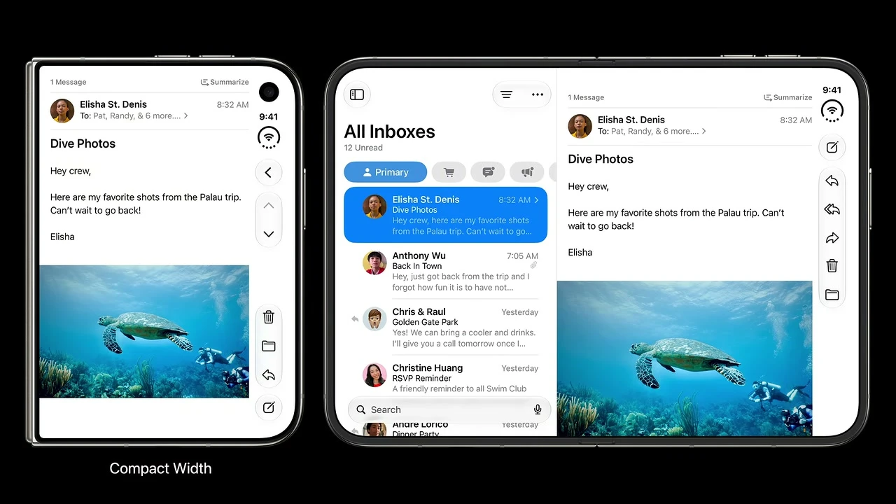
Design around compact width for the outer display and regular width for the inner display.
Two size classes are a more durable decision boundary than pose-specific breakpoints or hard-coded screen dimensions.
Build move: Read horizontal and vertical size classes. Avoid device-name, inch-size, fixed-pixel, or orientation-only routing.
Pass condition: Resize across compact and regular classes: structure changes only at documented adaptive inputs, not a device-specific breakpoint.
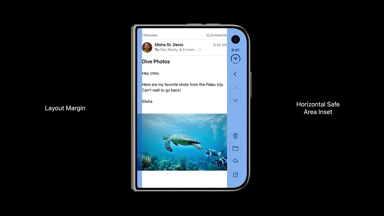
Build layouts from layout margins and horizontal safe-area insets.
System-provided geometry automatically accounts for the side rail and changing usable width.
Build move: Use layout margins and each safe-area edge independently. Never calculate one side from the opposite inset.
Pass condition: Inspect leading and trailing insets separately in full screen and both Split View sides; no foreground content enters a reserved region.
Make free resizing the central implementation test.
A layout that responds to available space is more likely to work across all Duo poses and split configurations.
Build move: Remove device-locked root frames while retaining flexible local constraints such as media aspect ratio and readable text width.
Pass condition: Test narrow, wide, and tall containers: root fills available space while media ratio and readable line length stay intentional.
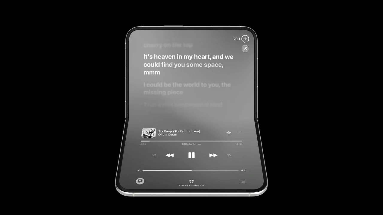
An optional hands-free layout may put media above and tappable controls below, but must preserve the same actions and hierarchy as other poses.
Pose optimization should improve ergonomics without making capabilities pose-exclusive.
Build move: Only add a hands-free layout where it materially helps. Implement it with system arrangements or documented geometry, not guessed hinge angles.
Pass condition: Compare ordinary and tabletop layouts: the same controls and hierarchy exist, and no task depends on physical pose detection.
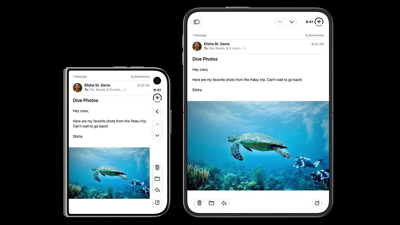
Use side controls broadly; retain horizontal bars only for the tall inner display in portrait.
The exception is driven by available vertical space, not by app-specific styling.
Build move: Allow current system bars to choose vertical or horizontal presentation. Do not hard-code a permanent right rail.
Pass condition: Verify outer/inner landscape vertical bars and inner portrait horizontal bars using the current supported SDK and simulator.
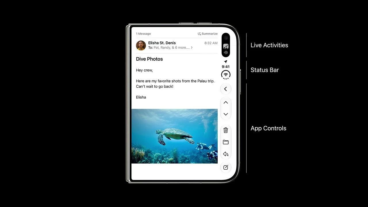
Assume app controls share the rail with dynamic system content and may collapse into overflow when space is constrained.
Designers must prioritize actions and avoid treating the full rail height as permanently available to the app.
Build move: Inventory symbols, titles, groups, frequency, and status importance. Assign visibility priority and consolidate custom overflow.
Pass condition: Force overflow with keyboard and system activity: frequent/status-bearing items remain visible longest and every action is discoverable.
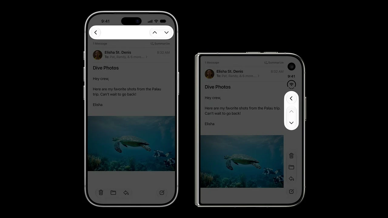
Map top toolbar actions to the rail top; map bottom toolbar actions and tab bars to the rail bottom.
Existing control hierarchy can transfer predictably instead of being redesigned from scratch.
Build move: Preserve existing action groups: navigation/prominent actions near the top; bottom actions and tab destinations near the bottom.
Pass condition: Compare control order before and after adaptation; semantic groups and relative priority remain recognizable.
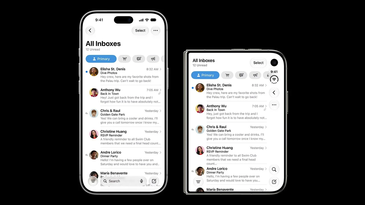
Keep controls that are too wide for the rail, including text buttons and segmented controls, in the navigation bar.
Forcing wide labels into the rail would reduce clarity, hit-target quality, and localization resilience.
Build move: Keep text-only, segmented, and other wide controls horizontal unless a verified vertical representation remains clear and accessible.
Pass condition: Test long localized text and largest Dynamic Type: wide items remain legible and do not shrink targets below platform guidance.
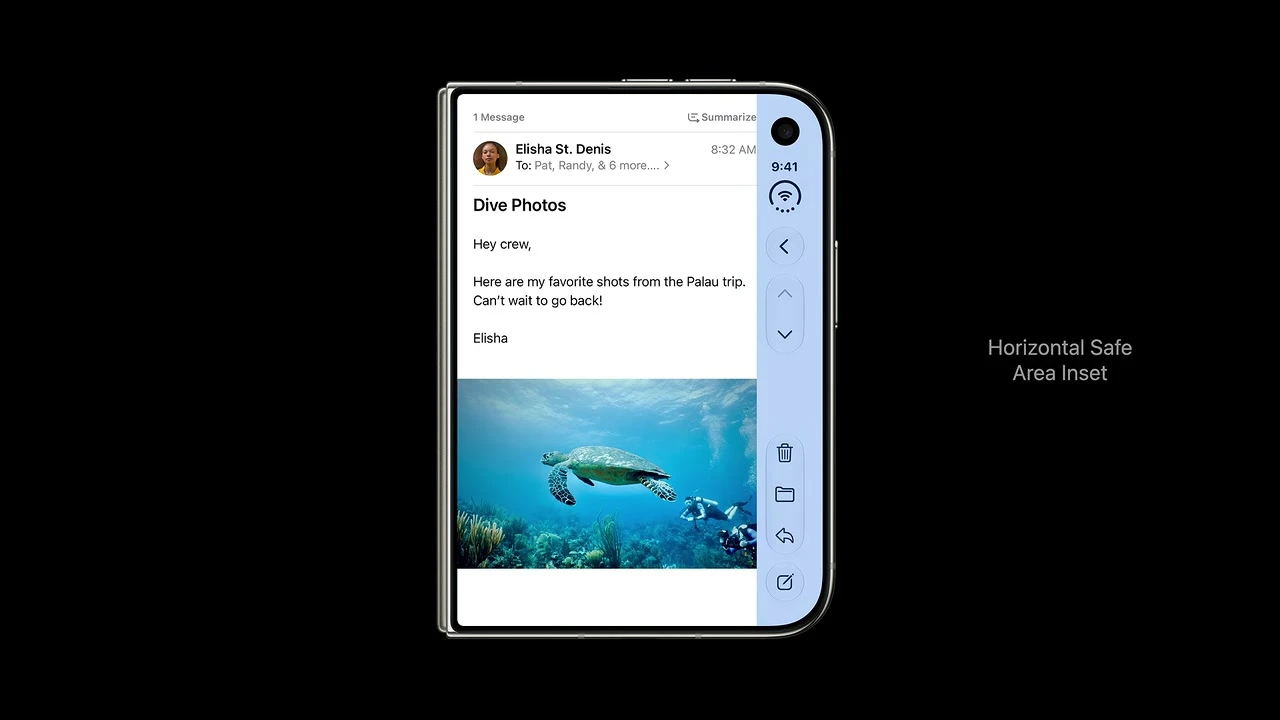
Center ordinary content inside the horizontal safe area rather than across the physical display.
The automatic offset prevents text, images, and interactive content from hiding behind the rail.
Build move: Align scrolling and interactive foreground content to the horizontal safe area; center within usable content, not raw screen bounds.
Pass condition: Overlay safe-area diagnostics: every scrolling or interactive element remains inside the usable region in each configuration.
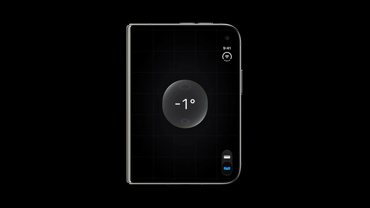
A highly visual, non-scrolling interface may center on the full display when its interactive elements cannot be obstructed.
Not every composition needs the safe-area offset; intentional full-bleed centering can improve visual balance.
Build move: Use full-display centering only for non-scrolling visual layouts whose targets cannot collide with system regions.
Pass condition: Enable system regions and hit-test all controls; full-width content remains visually centered without blocked interaction.

Mix full-bleed backgrounds or headers with foreground content constrained to the safe area.
This preserves immersive artwork while guaranteeing that every actionable element remains unobscured.
Build move: Separate layers: extend decorative background or header to view bounds while constraining readable and interactive foreground content.
Pass condition: Scroll the mixed layout end to end: artwork spans cleanly while every link, button, and field stays inset and operable.
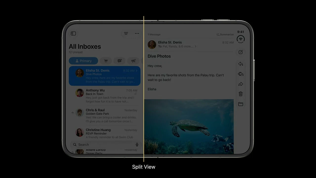
Use split views to reveal multiple levels of the existing hierarchy on the wider inner display.
The layout becomes more capable without changing the hierarchy or restricting functions to one pose.
Build move: Use NavigationSplitView or UISplitViewController for primary/detail structure. Add a compact route to any secondary content.
Pass condition: Collapse to compact width: secondary hierarchy stays reachable through an explicit route and returns to the same detail when expanded.
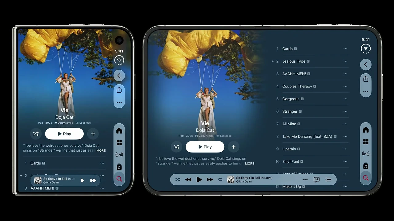
Rearrange stacked content into columns when regular width provides meaningful horizontal room.
Reflow uses the inner display productively and avoids the look of a stretched phone screen.
Build move: Recompose stacks into flexible columns when regular width helps. Cap readable line length instead of stretching content indefinitely.
Pass condition: At regular width, columns improve scan/readability; at compact width, content returns to a clear single-column order.
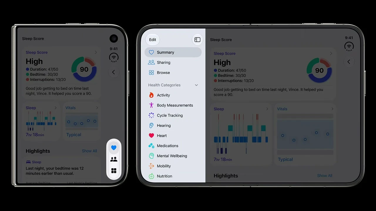
Information-dense tab-based apps may present the tab bar as a sidebar at regular width.
A sidebar exposes destinations and content simultaneously, but should be reserved for hierarchies dense enough to benefit.
Build move: For information-dense navigation, test a sidebar-adaptable TabView or UIKit sidebar placement and retain a compact tab fallback.
Pass condition: Verify destination order and state in compact tabs and inner sidebar; no destination is added, removed, or renamed.
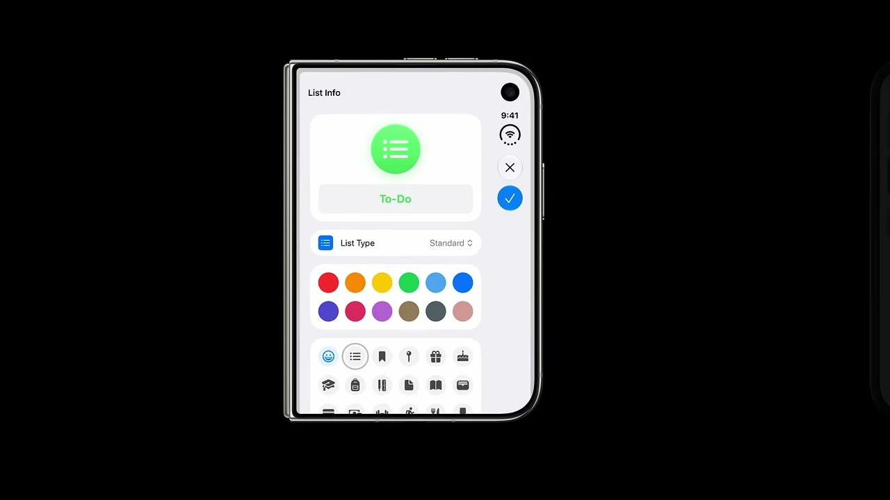
By default, sheet controls on the outer display move into the side rail.
The default behavior preserves sheet height and stays consistent with the rest of the outer-display control model.
Build move: Use a system sheet with stable presentation state so current SDK behavior can adapt its controls and safe regions.
Pass condition: Present, resize, fold, use the keyboard, and dismiss the sheet; detent, navigation, edited values, and identity remain stable.
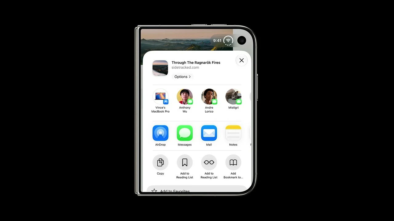
For a sheet with a single toolbar action, optionally disable the vertical bar and let the status area reposition above the sheet.
The opt-out avoids spending a full rail on one action while preserving camera and status-bar clearance.
Build move: Opt out of the vertical sheet bar only for a justified low-control case; version-gate the API and test camera/status clearance.
Pass condition: On the outer display, the one-action sheet remains clear of camera/status regions and the action remains reachable at large text sizes.
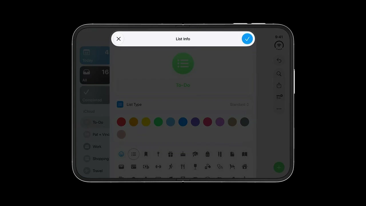
Use standard horizontal sheet bars on the inner display in both landscape and portrait.
The roomy inner canvas does not need the outer display's vertical-bar optimization.
Build move: Keep system horizontal sheet bars on the inner display. Remove custom fixed sheet frames that block resizing.
Pass condition: Present the sheet in inner landscape and portrait; bars remain horizontal, content resizes, and dismissal behavior is unchanged.
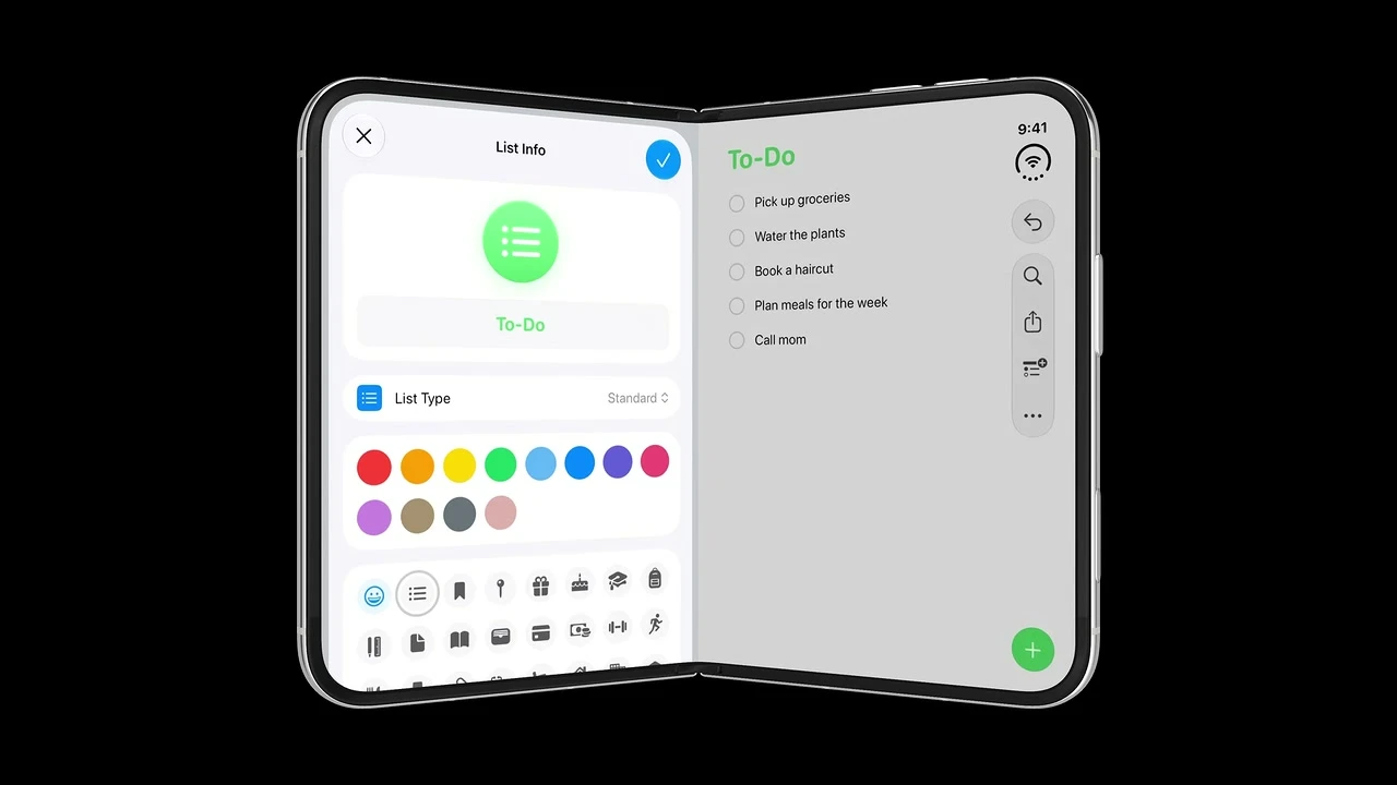
Move sheets away from the fold instead of centering them across it.
Buttons and form controls remain flat, legible, and easy to tap.
Build move: Use system presentations so the sheet shifts around the fold. If custom, place it wholly inside one usable region.
Pass condition: Partially fold with the sheet visible; all controls remain on a flat usable side and the sheet returns smoothly when opened.
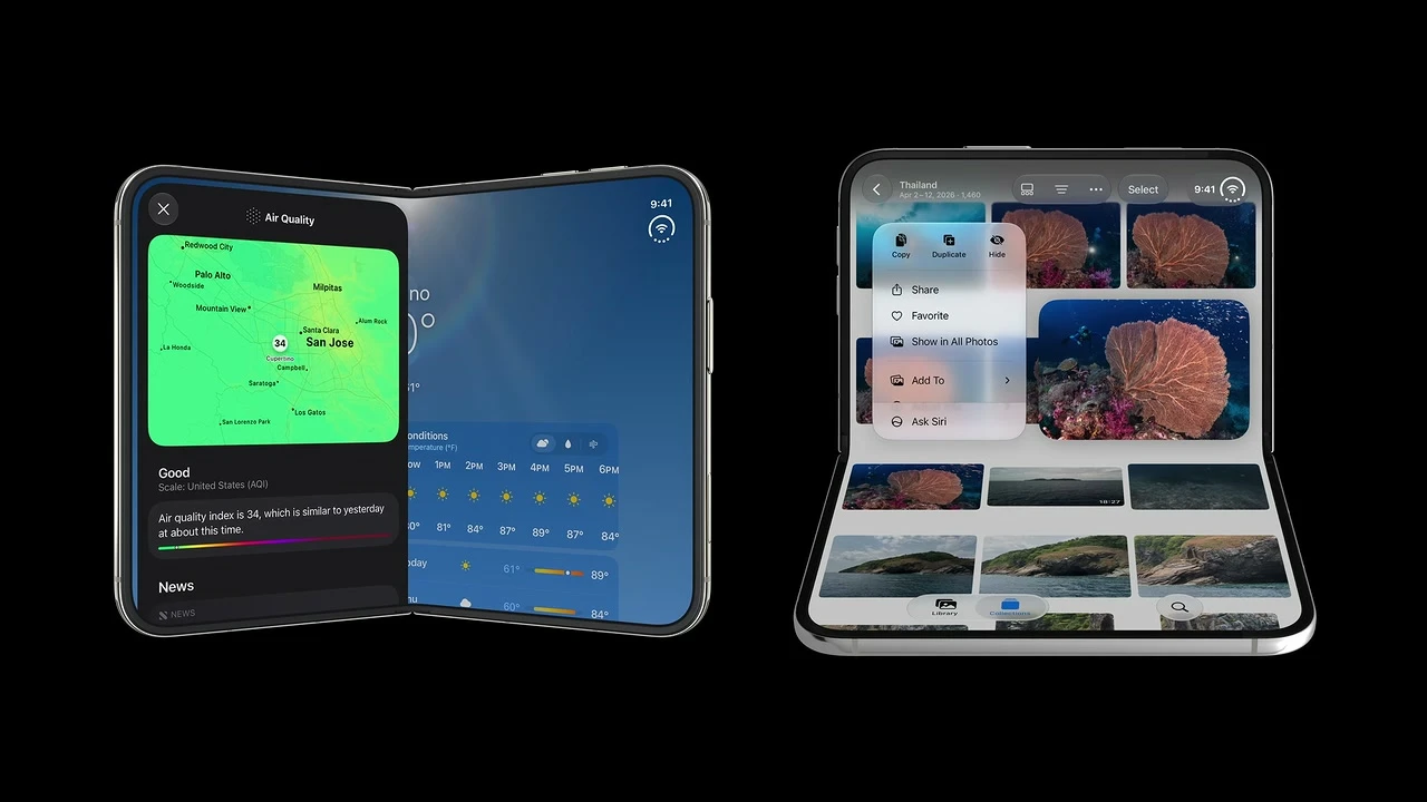
Prefer system sheets, alerts, menus, toolbar buttons, and related components that include fold avoidance automatically; scrollable content may cross the fold.
Interactive targets need protected placement, while allowing passive scrolling content through the center avoids unnecessary dead space.
Build move: Use system fold-aware components first. Let continuous scrolling cross when readable; protect every precision target with reserved-region logic if needed.
Pass condition: Test sheets, alerts, menus, and toolbar targets near the fold; interactive elements move aside while scrolling content remains usable.
Publishing assets
Image plan and suggested dimensions
The package contains both new images at their generated size plus every 16:9 reference frame. I would upload the originals, let the CMS create responsive derivatives, and keep the listed display ratio.
| Asset | File supplied | Native size | Suggested publish size | Use |
|---|---|---|---|---|
| Editorial hero | images/iphone-duo-hero-original.png | 1672 × 940 | 1600 × 900, 16:9 | Article hero and section landing image |
| Posture and safe-region map | images/iphone-duo-posture-map-original.png | 1586 × 992 | 1600 × 1000, close to 8:5 | Core mental-model diagram |
| Apple video frame | images/*.jpg | 1280 × 720 | 1280 × 720 or 960 × 540 | Inline evidence and frame gallery |
| Side-by-side frame | Use two supplied frames | Each 1280 × 720 | Each shown near 600 × 338 | Compare compact and regular behavior |
| Social preview crop | Crop the hero | From the hero original | 1200 × 630 | Open Graph and social sharing |
App Store asset sizes are a separate checklist Apple currently lists 1398 × 2034 for outer-display screenshots and 2007 × 2853 for inner-display screenshots in App Store Connect. Those are upload dimensions, not panel measurements and not layout breakpoints. Recheck the official table before submission because store requirements can change.
Keep headline text as editable text rather than burning it into the image. This protects readability on mobile, improves accessibility, and lets the hero crop without losing meaning.
Copy and reuse
AI prompt for an iPhone Duo audit
Replace the bracketed fields, then attach your current screens, Figma file, flow map, or source repository. I wrote the prompt to demand evidence, separate current work from 27.1 work, and stop the model from inventing fold measurements or device breakpoints.
You are a senior Apple-platform product designer and iOS engineer. Adapt or audit the supplied app for iPhone Duo using current official Apple Human Interface Guidelines and developer documentation.

APP INPUTS
- App/product: [APP NAME AND PURPOSE]
- Primary user tasks: [3–7 IMPORTANT TASKS]
- Existing information hierarchy and navigation: [SUMMARY OR ATTACHMENT]
- Current screens/design file/source repository: [LINKS OR ATTACHMENTS]
- Implementation: [SWIFTUI / UIKIT / MIXED / DESIGN ONLY]
- Minimum and target OS/SDK: [VERSIONS OR UNKNOWN]
- Custom controls, bars, layouts, media, camera, or multitasking behavior: [DETAILS]
- Accessibility/localization requirements: [DETAILS]
- Deliverable needed: [AUDIT / REDESIGN SPEC / IMPLEMENTATION PLAN / CODE / QA PLAN / MASTER SHEET]

SOURCE RULES
1. Verify current claims and API names with official Apple sources. Start with:
   - https://developer.apple.com/design/human-interface-guidelines/designing-for-iphone-duo
   - https://developer.apple.com/videos/play/tech-talks/111466/
   - https://developer.apple.com/videos/play/tech-talks/111461/
   - https://developer.apple.com/videos/play/tech-talks/111462/
   - https://developer.apple.com/videos/play/tech-talks/111463/
2. Label the SDK/version required for every new API. If the toolchain or API is prerelease, unavailable, or unverified, say so and give a version-neutral design recommendation instead of inventing code.
3. Do not invent device dimensions, fold angles, safe-area values, breakpoints, or undocumented behavior.
4. If no source code, screenshots, or design file is supplied, label the result a provisional audit and claim only defects explicitly stated in the inputs.

DESIGN MODEL
- Treat the product as one continuously adapting iPhone experience, not separate apps for each pose.
- Use compact width for the outer-display foundation and regular width for the inner-display foundation. Refine custom layouts with available bounds, aspect ratio, safe areas, and active reserved regions.
- Preserve functionality, state, navigation hierarchy, labels, and relative action placement while opening, closing, rotating, folding, entering Split View, showing the keyboard, and using Picture in Picture.
- Prefer standard system navigation, bars, presentations, and content containers before custom implementations.
- Do not use device-locked root widths, device-name routing, orientation-only layout logic, UIScreen.main, or assumptions that opposite safe-area insets are equal. Keep useful local constraints such as media aspect ratios and readable maximum text width flexible within the container.

AUDIT AND DESIGN TASKS
1. Inventory every screen and flow. Identify fixed frames, centered layouts, custom bars, tab/toolbar items, sheets, alerts, menus, popovers, full-bleed regions, floating controls, and content near the future fold.
2. Build an environment matrix containing at least:
   - outer display, closed, compact width;
   - inner display, fully open, regular width;
   - inner portrait, where bars remain horizontal;
   - partially folded book pose;
   - tabletop/laptop-like pose;
   - Split View with the app on the left and on the right;
   - top-pinned Picture in Picture or other dynamic height changes when relevant;
   - keyboard, expanded Dynamic Island/Live Activity, large Dynamic Type, VoiceOver, and right-to-left language.
3. For the outer display, keep ordinary foreground and interactive content inside horizontal safe-area insets. Permit full-width treatment only for suitable non-scrolling visual interfaces, or use a full-width background/header with inset scrolling and interactive foreground content.
4. For the inner display, avoid a stretched phone layout. Evaluate NavigationSplitView/UISplitViewController, a stacked-to-two-column layout, a sidebar tab placement for information-dense apps, or an ArrangementView/UIArrangementViewController for an existing split or overlay relationship.
5. Audit vertical bars. First classify every custom bar item as destination, navigation, task action, playback/accessory, or status. Then map primary navigation and top-bar actions toward the top, bottom actions and tabs toward the bottom, preserve groups, supply both symbols and titles, keep wide/text-only/segmented controls horizontal where needed, and define overflow visibility priority from task frequency and status importance.
6. Treat cameras and the folding region as reserved regions. Keep precision interactions and content that must be perceived as a single unit out of the active fold. Let continuous scrolling content cross only when it remains readable and operable. Prefer system fold avoidance; use reserved-region APIs only for important custom UI.
7. Review sheets and transient UI in every pose. Outer-display sheets normally use vertical controls; a one-action sheet may justify opting out. Inner sheets use horizontal bars. Partially folded sheets and system components should avoid the fold.
8. For an optional tabletop-specific layout, place view-at-a-distance content above and controls on the stable lower region while preserving the same controls and hierarchy available elsewhere. Never trigger layout from a guessed hinge angle.
9. Architect continuity: keep navigation, presentation, playback, selection, editing, focus, and scroll state above adaptive compact/regular branches. When an arrangement can hide its secondary view at compact width, provide an explicit way to reach the same content.

IMPLEMENTATION TASKS
- Produce a phased plan that first removes brittle layout assumptions, then adopts standard containers, then handles size classes and safe areas, then audits bars and overflow, and only then adds reserved-region or arrangement APIs for remaining custom behavior. Split it into current-SDK work and work gated on a newer SDK when necessary.
- For SwiftUI, consider current documented forms of horizontalSizeClass/verticalSizeClass, NavigationStack, NavigationSplitView, TabView, defaultTabBarPlacement, toolbar, visibilityPriority, toolbarVerticalBehavior, safe areas, reservedRegions, and ArrangementView.
- For UIKit, consider traitCollection, UINavigationController, UISplitViewController, UITabBarController, per-edge safeAreaInsets, the active UIWindowScene screen, UIBarButtonItem visibility priority, preferredVerticalBarBehavior, UIView reserved regions, and UIArrangementViewController.
- Give small focused code examples only when the API signature and availability have been verified. For each new symbol, state the official evidence, build SDK, minimum runtime, beta/stable status, fallback, and date verified.

REQUIRED OUTPUT
A. Executive recommendation: 5–10 concise points.
B. Assumptions and unresolved product decisions.
C. Pose matrix table with columns: configuration, size class, content structure, control axis/edge, safe or reserved-region behavior, continuity requirement, and acceptance test.
D. Screen audit table with columns: screen/flow, current risk, affected configurations, design change, SwiftUI path, UIKit path, priority, and evidence needed.
E. Screen-by-screen adaptive specification. Separate background, scrolling content, navigation, primary actions, secondary actions, and transient UI.
F. Bar and overflow inventory. State which controls remain visible, move to overflow, remain horizontal, or can justify disabling vertical bars.
G. Fold strategy. Identify which content can flow, which must displace, and which standard component provides automatic avoidance.
H. Phased implementation plan with dependencies, owners if supplied, and testable completion criteria.
I. QA matrix covering static layouts and transitions. Include state continuity, keyboard, Live Activity/Dynamic Island competition, Split View on both sides, Dynamic Type, VoiceOver, reduce-transparency behavior, and RTL.
J. Official sources with direct links and the date checked.
K. Evidence still needed for any provisional finding, listed by screen or code location.

QUALITY GATES
- Do not remove or hide functionality in any pose.
- Do not call a larger layout “responsive” if it only scales a compact screen.
- Do not mark a row complete without a concrete observable acceptance test.
- Distinguish confirmed Apple behavior from your product recommendation.
- If supplied evidence is incomplete, continue with labeled assumptions and end with the exact screenshots, flows, or code locations needed for a final decision.

If screenshots or a design video are supplied, inspect every meaningful visual state change, capture representative frames, and connect each frame to one design rule, one implementation action, and one acceptance test. Do not reproduce a full transcript when a structured scene-level analysis is more useful.
Download the skill or add your spreadsheet
iPhone Duo design skill
The ZIP includes SKILL.md, design rules, implementation patterns, a review checklist, a video scene index, and agent metadata.
Download the skill ZIP from here.
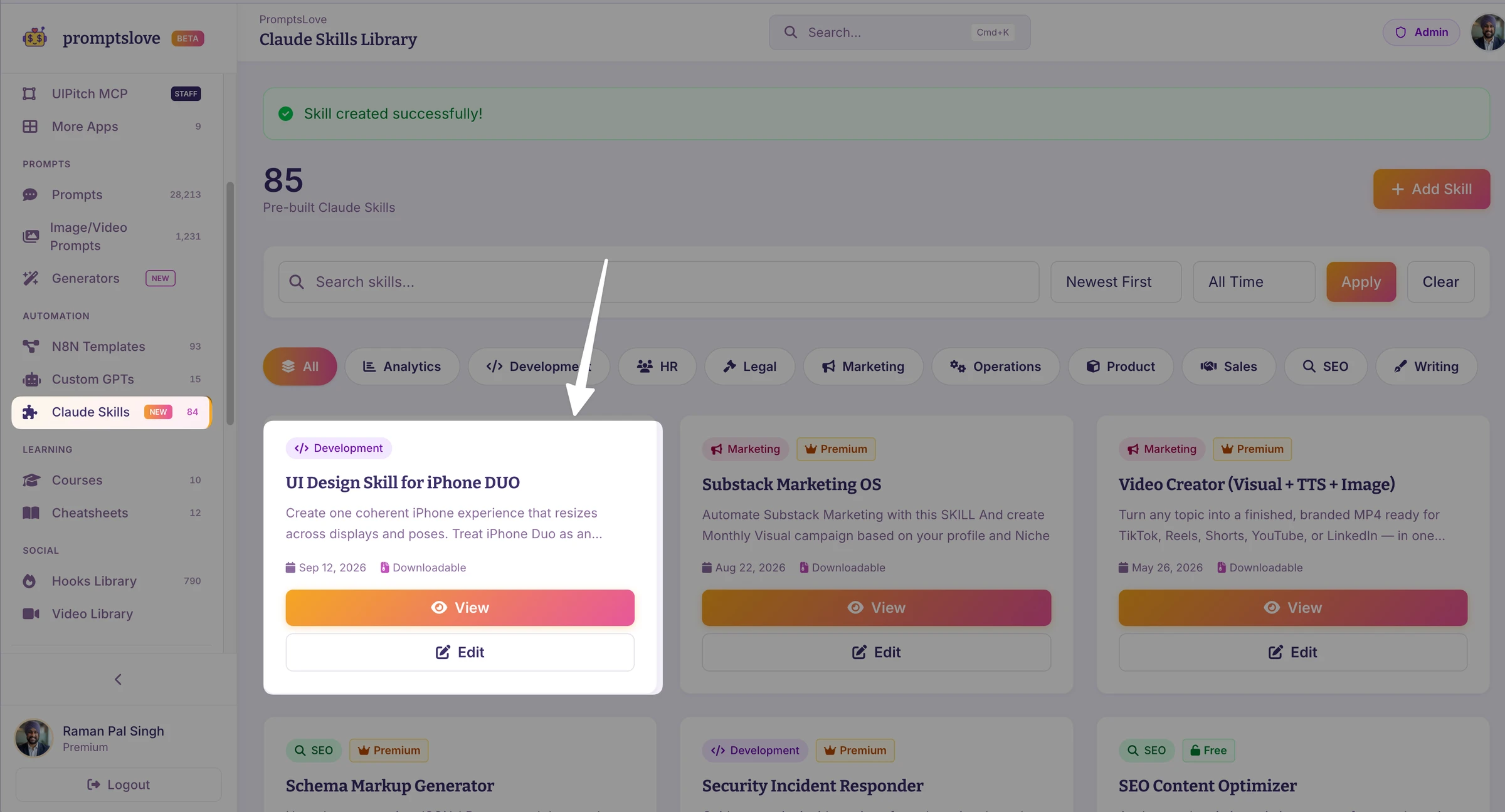
After unzipping, add the folder here:
[YOUR-CODEX/CLAUDE-SKILLS-DIRECTORY]/iphone-duo-design/SKILL.md
Sources and verification notes
I based the design and technical answers on Apple sources. Community posts helped me identify the questions people are asking, but they did not decide the technical answers.
Question discovery sources
I used the threads below to capture the questions and wording that designers and developers are using. I answered those questions from the Apple sources above.
Questions designers and developers are asking
Frequently Asked Questions (FAQs)
Do I need a separate design for every iPhone Duo pose?
No. Build one adaptive interface from compact and regular structures, then respond to current geometry and active reserved regions. Use pose-specific arrangements only where the physical context gives the task a clear benefit, such as media above and controls on a stable lower region.
Will my existing iPhone app work without a full rewrite?
Apple says an existing app can run without recompilation, but it will not receive the best use of the displays and system controls. Start by removing fixed-screen assumptions, adopting standard containers, and testing flexible width and height. Rebuild with the newest suitable SDK after verifying availability.
Should I detect orientation or the Duo model?
No. Read size classes and the current scene or container geometry. The inner display does not honor supported interface orientations in the usual way, and multitasking can change your available space without a useful model-name rule.
How do I keep controls clear of the fold and cameras?
Use standard system containers first. Keep ordinary interactive foreground content inside the safe area. For priority custom UI, use the announced reserved-region direction after you verify the released 27.1 APIs. Treat the fold as a division region and cameras as occlusion regions.
What happens to tab bars and toolbars?
Supported standard controls can move into a shared vertical region on the outer display and inner landscape. Inner portrait keeps horizontal bars. Provide symbols and useful titles, preserve semantic groups, and rank visibility so frequent or status-bearing actions stay visible before overflow.
Can I use the simulator instead of buying hardware?
Use the Duo simulator for broad layout and transition coverage once Apple releases it, then run a physical-device pass after the hardware ships. As of 12 September 2026, Apple still lists Device Hub support through Xcode 27.1 beta as coming later this month. Do not label simulator-only evidence as a physical-device result.
Final Thoughts
I do not see iPhone Duo as a request for five versions of your app. I see it as a sharp test of whether your hierarchy, layout, controls, and state can survive real changes in available space. If you make the compact task complete, let regular width reveal useful context, trust system containers, and verify transitions with evidence, most of the work improves your app everywhere. Use the prompt and skill in this package to keep that review consistent, then replace every provisional 27.1 note with compiled and tested evidence as Apple releases the toolchain.